10 kitchen cabinet color mistakes to avoid for a cool and contemporary result
Don't make these kitchen cabinet color mistakes, according to design pros
- 1. Too many color combos
- 2. Avoiding the dark side
- 3. Opting for a cool toned white
- 4. Being too on trend
- 5. Choosing a color that doesn’t work with the light
- 6. Sticking with white
- 7. Not considering the practicalities
- 8. Forgetting adjacent spaces
- 9. Not sampling colors
- 10.Matching the cabinet color to the walls
Avoiding pivotal kitchen cabinet color mistakes can make or break your space. Designing a kitchen is an exciting process but it can be really expensive. It’s easy to be swept up with trends and what’s hot right now, but you don’t want to end up getting bored with your design.
To avoid making mistakes, especially when it comes to the color of your cabinetry, design experts have offered their invaluable advice to tell you what you should and shouldn’t be choosing.
Once you’ve decided on the color of your kitchen color ideas, the rest of the design should fall into place.
Kitchen cabinet color mistakes
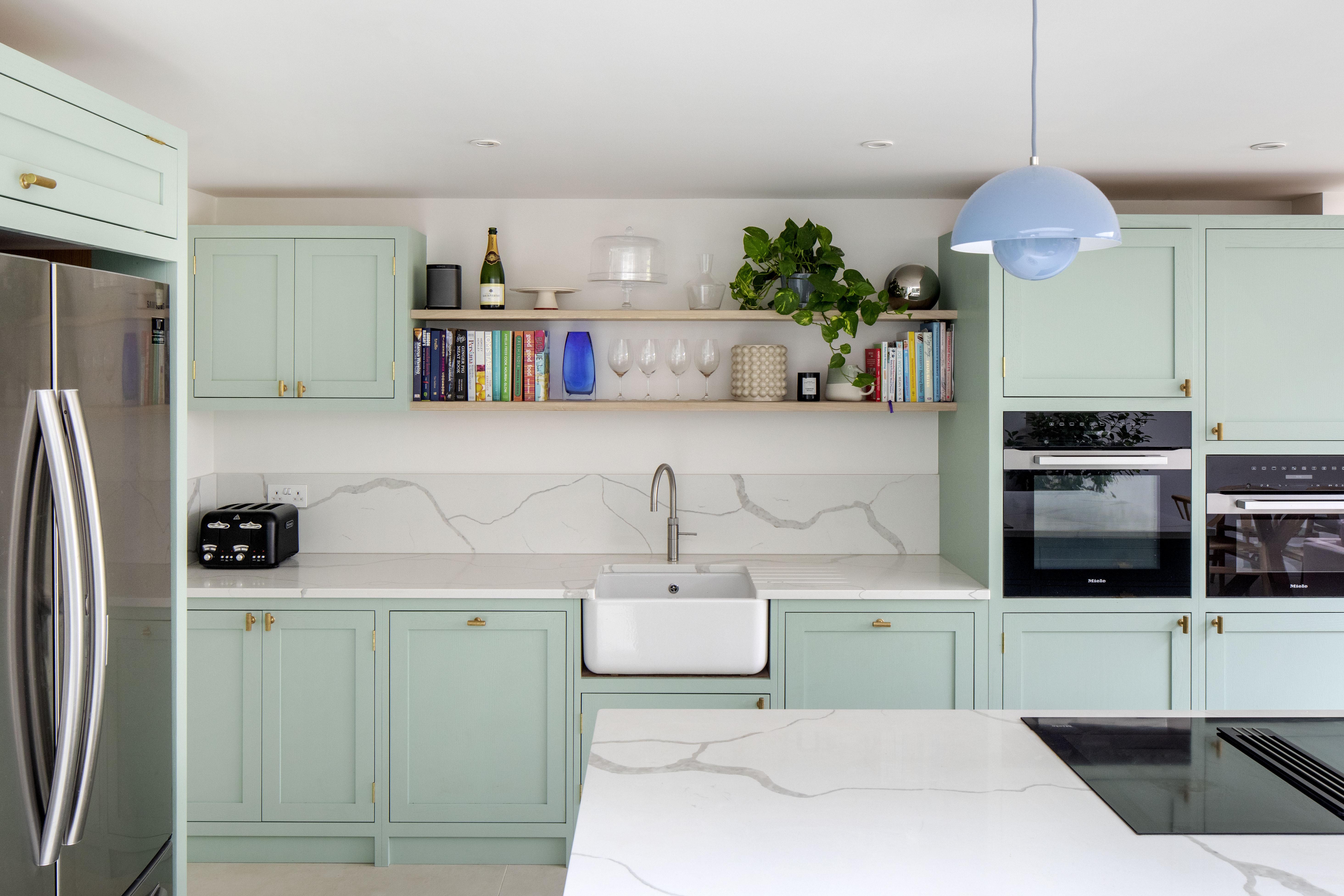
As one of the main features in a kitchen, the cabinets can really make an impact on the overall look. There are some common pitfalls to look out for before decorating your dream space. Our design pros explain what to avoid and give easy solutions for problematic designs, including kitchen cabinet colors that make a small space look bigger.
1. Too many color combos
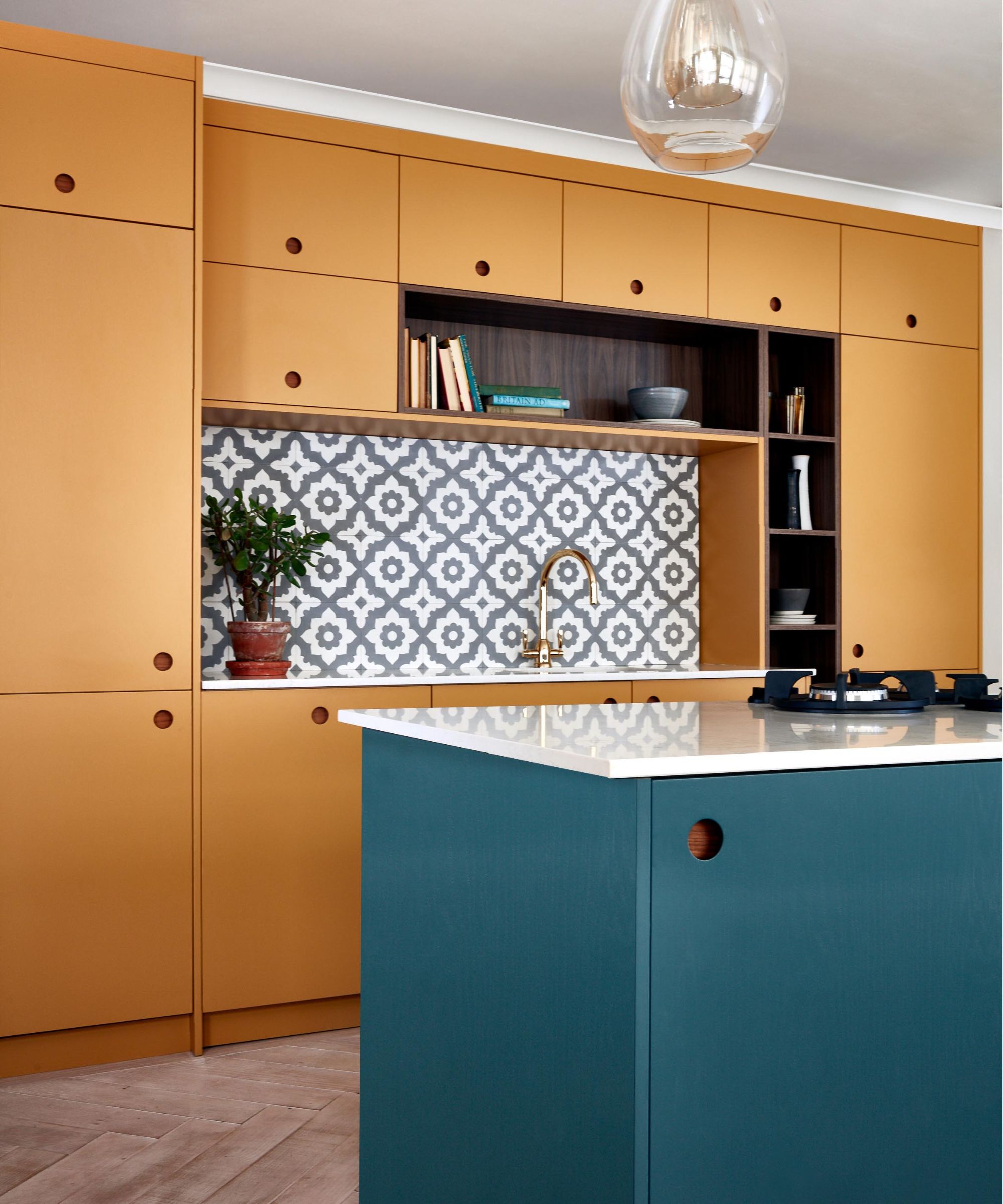
Two-tone kitchens definitely became a trend and we love the idea of contrasting wall units and base units. However, try not to overwhelm your kitchen with lots of different color combinations.
Helen Parker, creative director of deVOL Kitchens says, "Color can make your head spin, it can keep you awake with its possibilities. Our philosophy is not to give you endless choices, but a small curated selection of colors that work together in harmony, however, you choose to mix them up."
"It’s quite daunting picking colors for cabinetry, but with a little consideration and a little bit of impulse, you can really make an impact."
Get small space home decor ideas, celeb inspiration, DIY tips and more, straight to your inbox!
2. Avoiding the dark side
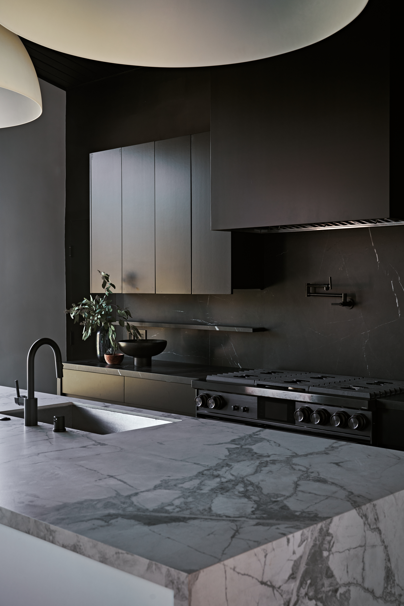
A lot of people opt for an all-white kitchen, as after all it is a highly functional space. However, you don’t have to totally disregard a darker color palette.
"Dark cabinets are always used to create mood and drama, so small or big, you will achieve this look with dark cupboards. There is a sense that big is better, but in actual fact, a small richly colored kitchen can be the most alluring of spaces, holding a certain charm and beauty that is hard to achieve in a large space," explains Helen.
As long as you’re clever with lighting, darker kitchen cupboards could be ideal for you and your home. Thinking about painting kitchen cabinets? For a dark color, we love Black 02 from Lick which is a dark velvet black with red undertones.
3. Opting for a cool toned white
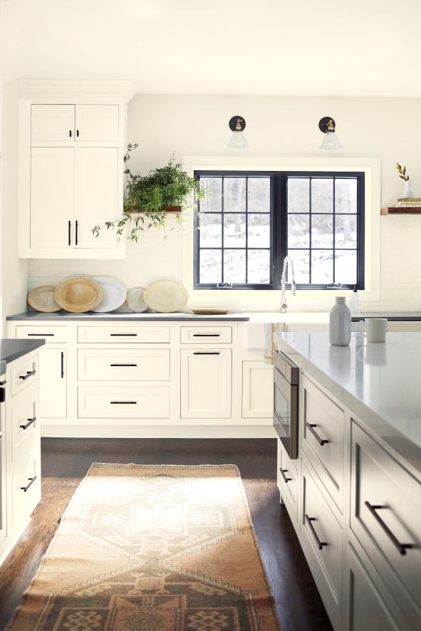
White kitchen cupboards are timeless but are you opting for the right shade of white for your space? It may sound silly, but white comes in many different variations with varying undertones.
"Although white is a safe and easy option in kitchens that have less natural light, opting for whites with warmer undertones will help avoid a room looking overly sterile, particularly when working with a pure brilliant white," says Helen Shaw, director of marketing at Benjamin Moore.
Therefore, opting for a white with red or yellow undertones, like White 03 from Lick, is a great choice for those looking to avoid the clinical feel, while still creating a clean and understated look.
Our social media editor detailed what she should have done in her kitchen during her apartment makeover and the regrets she had.
4. Being too on trend
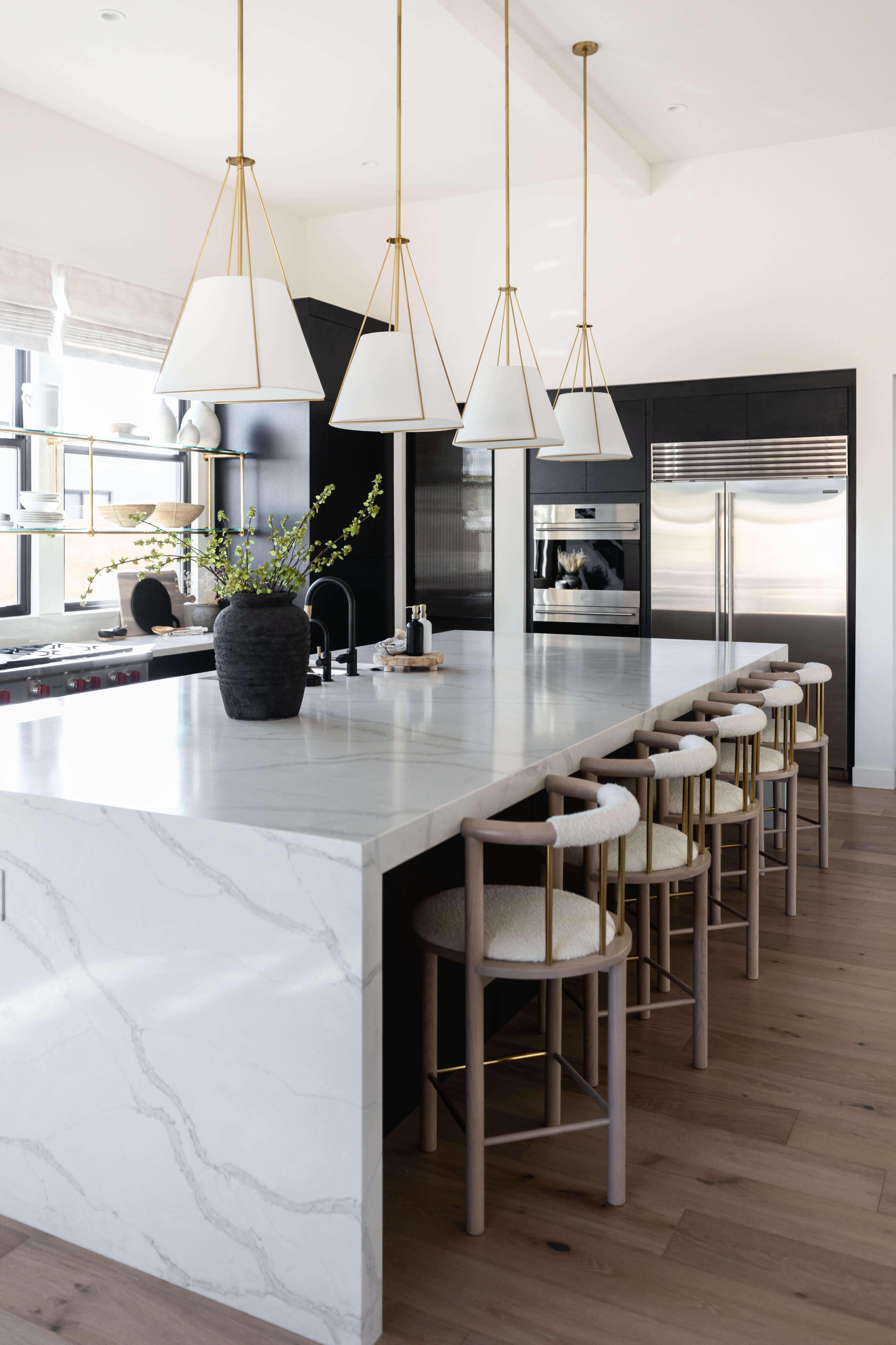
When designing a space, it can be all too easy to fall into the trap of following the latest kitchen color trend. You may think you love it at the time but if it has taken you by surprise, chances are you’re not going to be too keen in years to come.
Patrick O’Donnell, brand ambassador at Farrow & Ball suggests to "keep color schemes simple in a kitchen to prevent clashing in a room that usually has lots of adornment with utensils and crockery already on show. Use colors that are easy to live with, as kitchens tend to be the most used room in the home."
Patrick goes on to say, "Look to schemes that have integrity and that you won’t tire from. This doesn’t mean bland, just restful."

Patrick O’Donnell has been bringing his impeccable eye for color to Farrow & Ball since 2012. Over that time, he has been a showroom manager, global color consultancy manager, and now brand ambassador
5. Choosing a color that doesn’t work with the light
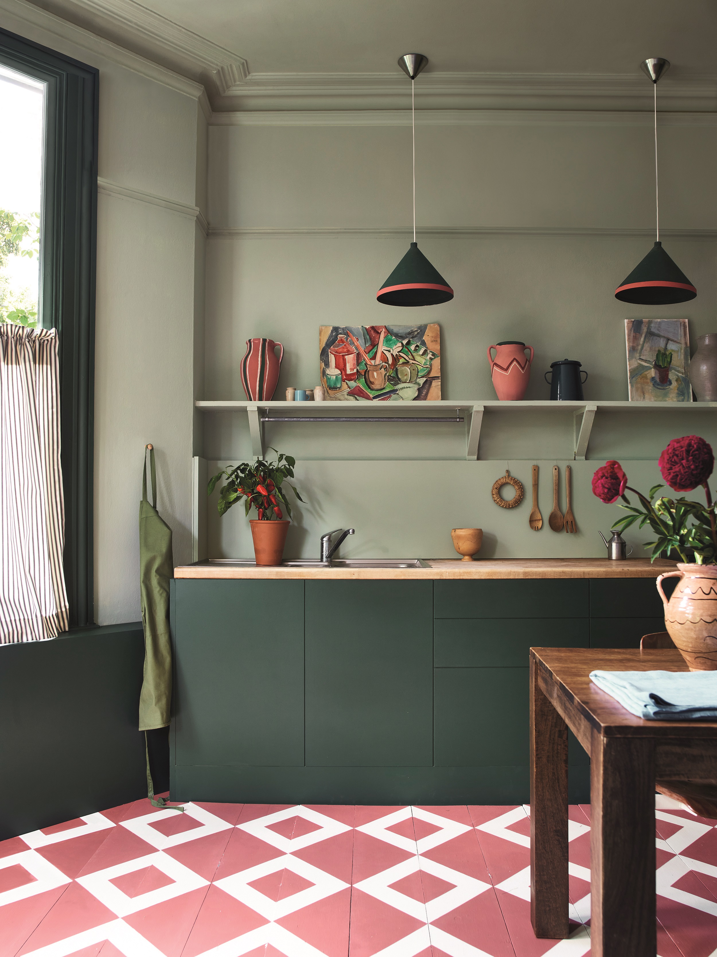
You may love a certain color and want to express this through your choice of kitchen cabinetry but is it going to work with your specific space?
Every color looks different depending on where it is placed and how much natural light is available in that space. Ayten Nadeau, founder and principal designer of i-TEN Designs says, "Even the best paint can look drab under poor lighting. Enhance your space with layered lighting: under-counter lighting strips, ambient lighting, and pendants over the sink or island."
"Opt for LED lights between 2700K-3000K for a soft, warm glow that highlights your paint colors beautifully."
6. Sticking with white
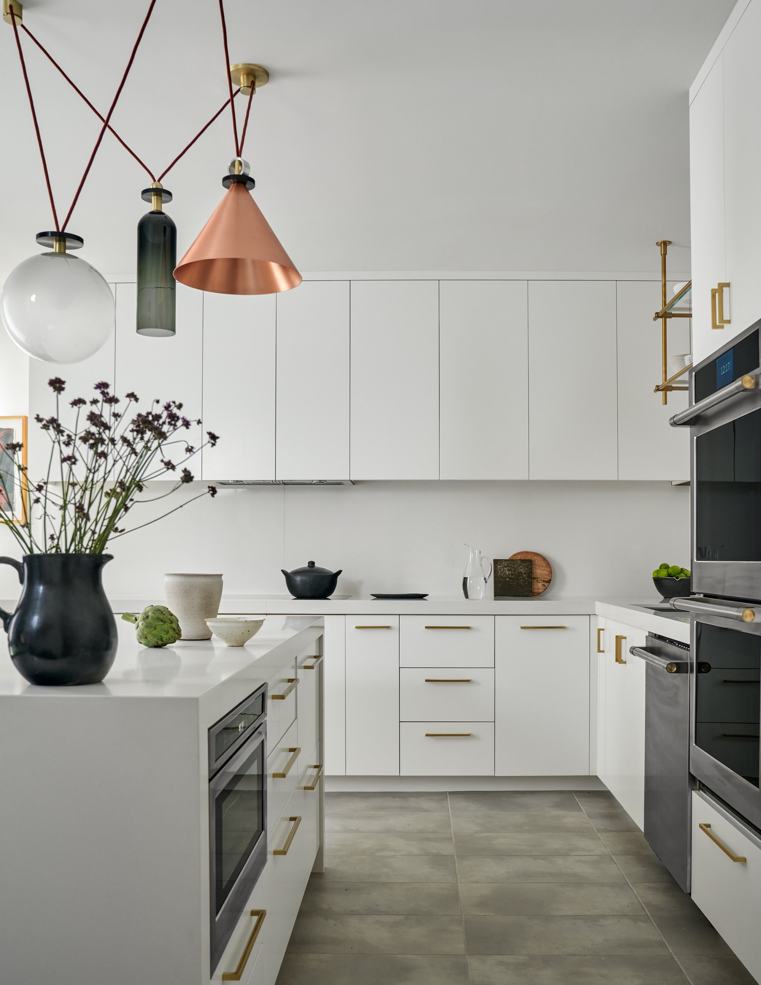
White cabinets are a kitchen classic but have you considered other options? When it comes to interior design as a whole, we encourage you to step outside of your comfort zone and try something a little different.
This doesn’t mean you have to make a bold statement, but introducing some form of color with colorful kitchen ideas, however subtle, can transform a space.
Jasmine Mirahmadi, lead interior designer at Pedini LA says, "Colors have a profound impact on our emotions and perceptions. Warm tones like light oaks, and neutral lacquers create intimacy, perfect for dining areas. Cool tones like ash gray real wood veneers, or deeper beige lacquers evoke calmness, ideal for cooking spaces."
7. Not considering the practicalities
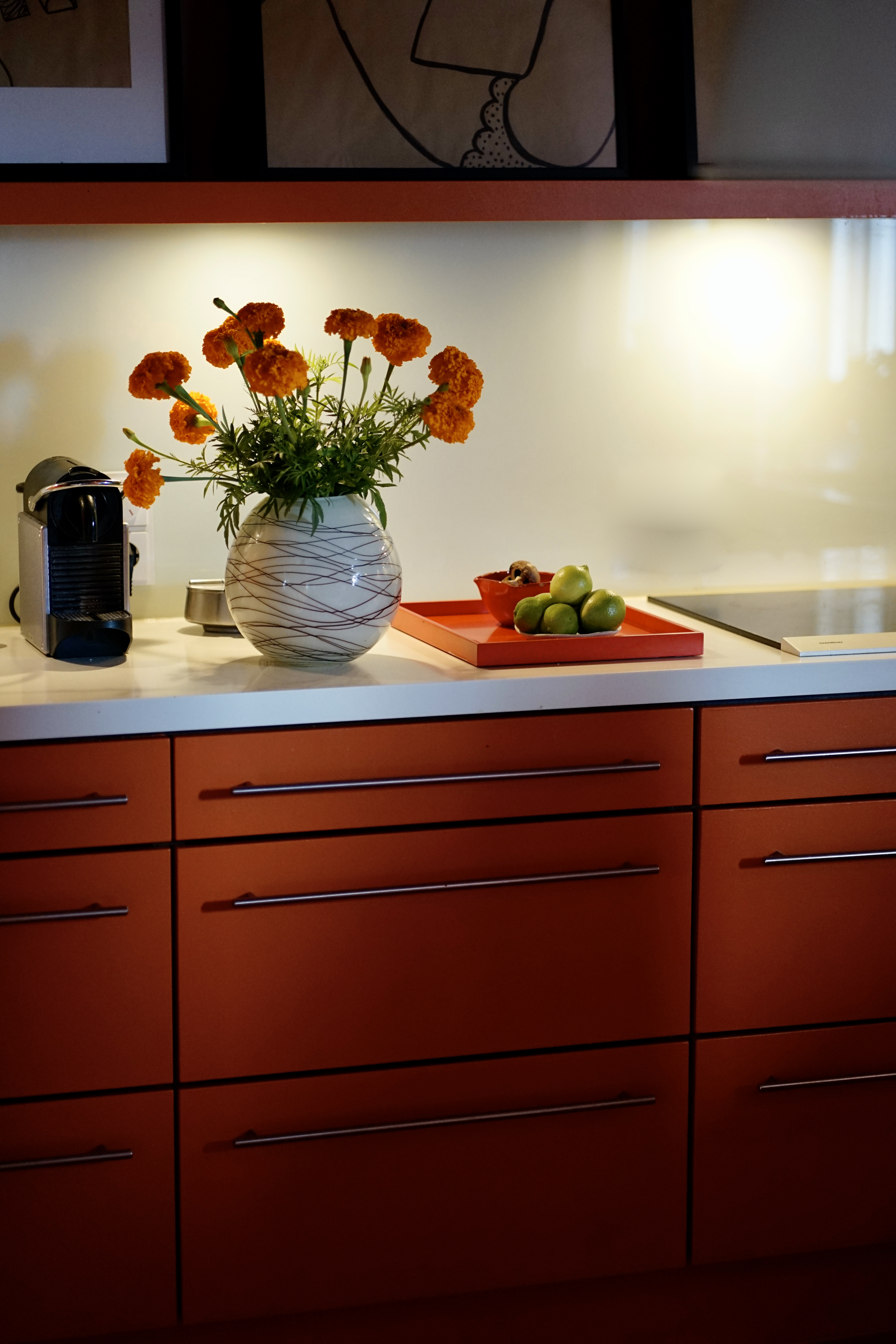
A common mistake when it comes to choosing the color of kitchen cabinetry is forgetting how the color is going to age over time.
You’ve got to remember that if a color is exposed to bright sunshine for a significant amount of time then it’s likely to fade and become distorted.
If you’re likely to love the color just as much as when it fades then it’s not a problem, but it’s definitely something to consider when you’re going through the design process.
8. Forgetting adjacent spaces
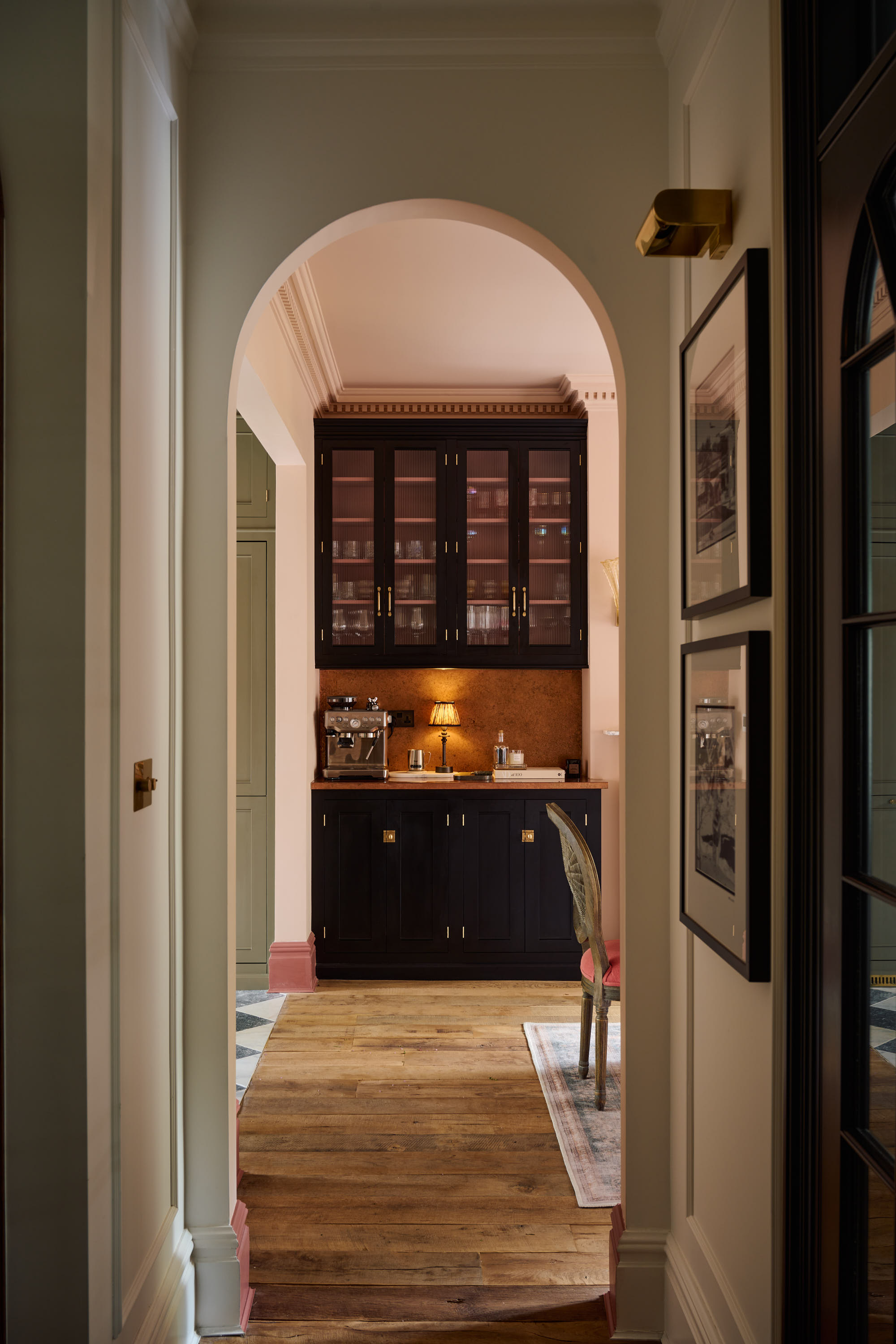
Kitchens are often closely connected to other areas of the home, whether it be a dining area or a kitchen pantry. Try and be aware of this when choosing the color for your cabinetry.
"Your kitchen should feel like the heart of your home, harmonizing with surrounding rooms. Ensure your kitchen color scheme coordinates seamlessly with the rest of your home's decor and furniture," explains Ayten.
9. Not sampling colors
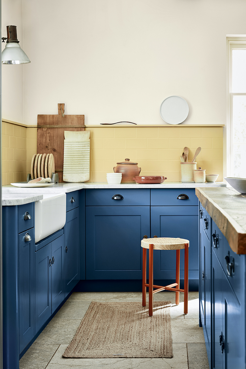
Before committing to a color for your kitchen cabinets, be sure to gather at least three samples beforehand to see how they work with the rest of your design.
Ayten says, "Always sample paint colors in your actual kitchen. Paint chips or buckets don't provide enough information. Observing the color in natural daylight and under your kitchen's artificial lights will give you a true sense of how it will look."
Remember to not just place it in one area of the kitchen, dot the sample color around to mimic the placement of your cabinets. You can pick up a warm neutral paint sample box from Lick which contains six peel-and-stick samples.
10.Matching the cabinet color to the walls
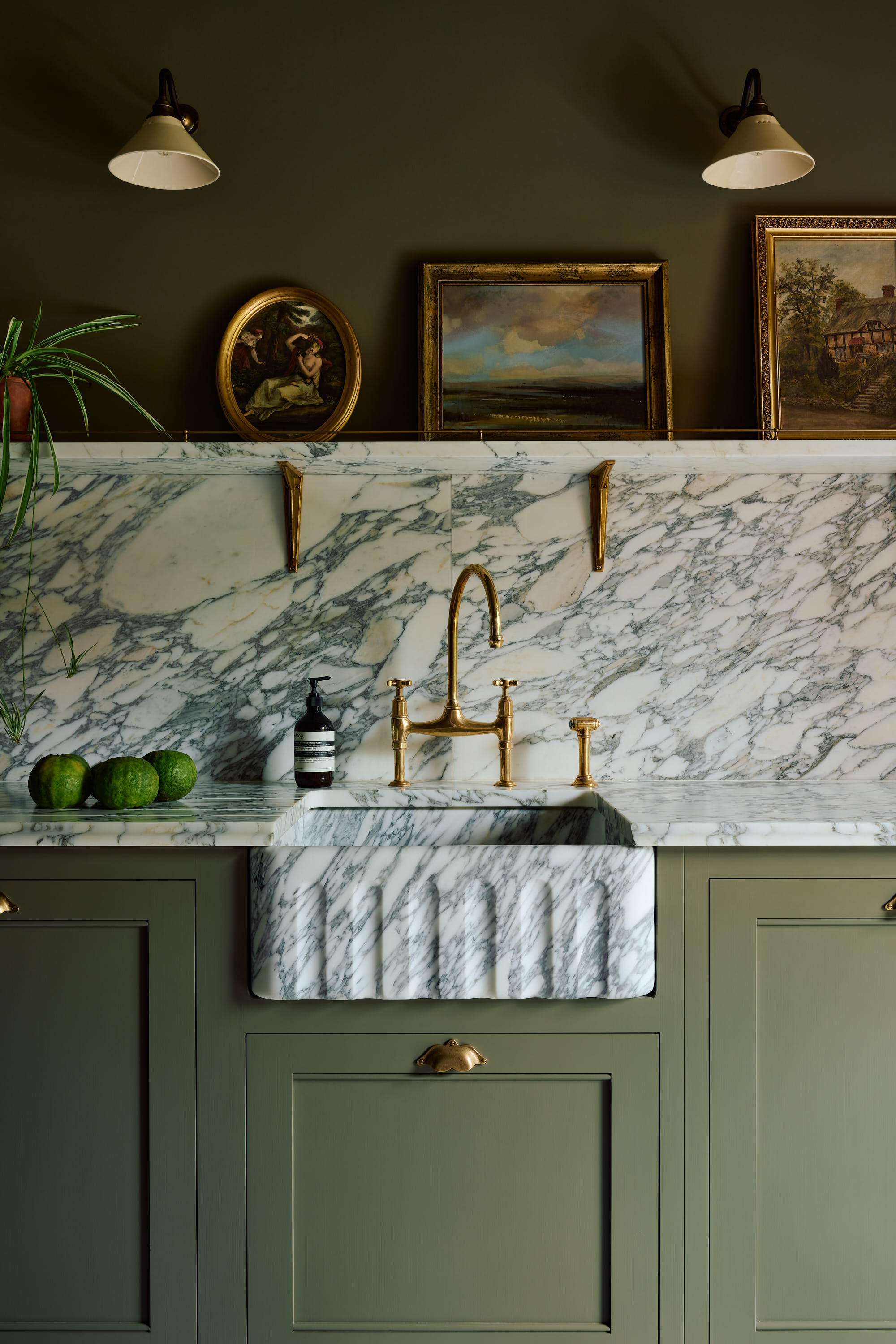
Color drenching has taken the world of interiors by storm. It’s the technique of using one color to paint everything in a particular space. However, it can be argued that this isn’t the best approach for kitchens.
Ayten says, "This approach can make the space feel flat and monotonous. Contrast is important for adding depth and differentiation, especially in a small kitchen."
Instead of using one flat color, use two shades of the same color. One for the cabinets and one for the walls. This will create a perfect base for the rest of your kitchen scheme.
Try to avoid outdated kitchen cabinet trends and choose a color that works well with your particular kitchen space.
Follow the advice from our experts who know the common mistakes people make to stop you from making the same ones.
Whether you love pastel colors, dark-colored kitchens, or something in between, make sure you listen to what the interior experts have to say to help steer you in the right direction.
Becca Cullum-Green is a freelance interiors content creator and stylist. She fell in love with interiors when she landed her first job as an editorial assistant at a leading UK homes magazine fresh out of university. You can find her renovating her 19th-century cottage in the Suffolk countryside, consciously trying not to paint every wall with Farrow and Ball’s ‘Pitch Black’. Her signature style is a mix of modern design with traditional characteristics. She has previously worked for House Beautiful, Grand Designs, Good Housekeeping, Red, Good Homes, and more.

