
-
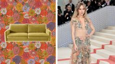
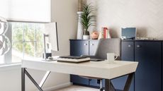
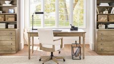
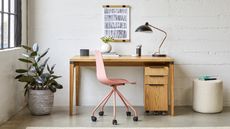
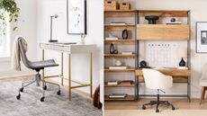
 Gigi Hadid's office space is so sleek — designers love its elegant and practical solutions
Design pros love Gigi Hadid's workspace decor, praising its simple yet functional style, as well as sharing how to get the look in your own office
-
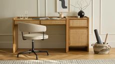
 Emily Blunt and John Krasinski’s home office is “a space where industrial design meets personal warmth,” say interior designers
This celeb office space is filled with design features that are sleek and functional. We ask designers why they love it and how to recreate it
-
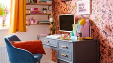
 Suki Waterhouse's cozy studio is full of 'eclectic charm' — how to get the look on a budget
Suki Waterhouse's cozy studio is creative and fun, so we asked a designer how to ace the retro look in a small space
-
 7 narrow office ideas that will help you style an awkwardly-shaped workspace
Looking for narrow office ideas? We've asked designers for the best ways to make the most out of this slim space, plus picked out decor buys to match
-
 Easy small office upgrades — 7 ways to zhuzh up your WFH space
Looking for easy small office upgrades? We've spoken with design experts to find out what they use to elevate these spaces quickly and picked out matching buys
-
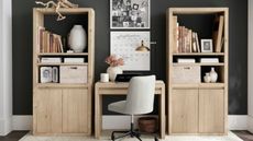
 Small office storage ideas — 15 ways to get the job done
Looking for small office storage ideas? Our experts have plenty of them, guaranteed to increase productivity without compromising on style
-
 How to make a small office look bigger — 7 easy-peasy effective tips
Want to learn how to make a small office look bigger? We've spoken with design experts to find out how to do this with clever tips and tricks
-
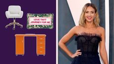 Jessica Alba's Honest Company office glow-up is perfect inspiration for a colorful WFH space
Leave it to Jessica Alba. Honest Company office HQs is a colorful design dream. Here's how to recreate the look while you WFH, according to designers
-
 Sabrina Carpenter's mid-century office chair offers 'retro charm', say design experts
Sabrina Carpenter's mid-century office chair has design elements designers love. Here's what they like about it and how you can style a chair like hers
-
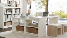
 5 small office layout ideas you've never thought about before
Get creative and try some new small office layout ideas. Our expert design tips cover everything from area rugs to furniture
-
 5 best colors to paint a small office — expert advice for a productive, stress-free space
The best colors to paint a small office — boost your mood, spark creativity, or channel tranquility. Whatever your vibe, our experts are here to help
-
 How to make a calming small office space at home
Learn how to make a calming small office space at home for increased productivity and a less stressful work environment. See our expert-approves tips.
-
 5 worst colors to paint a small office
Avoid the worst colors to paint a small office to lower stress and maximize productivity. Give your home office a makeover with our expert-approved advice
-
 5 ways to make a small office look luxurious
Learn from the experts how to make a small office look luxurious. These intentional design tips will elevate your office space
-
 Ashley Tisdale's office chair is the perfect cozy WFH setup
Ashley Tisdale's office chair is the coziest choice for getting work done in style. We explain why it's great, plus pick out buys so you can get the look.
-
 How to refresh a small office without spending money
See how to refresh a small office without spending money if you're cutting back on budget. Our expert-approved ideas include easy tips and tricks
-
 How to fit a desk chair into a small office — expert advice for picking the right style
Learn how to fit a desk chair into a small office with these tips and tricks from design experts. Plus, see our top office chair picks for your workspace.
-
 8 modern small office ideas to WFH in style
We share our favorite modern small office ideas to help you achieve a more minimalistic and chic home office environment. Start WFH with these tips
-
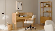
 Minimalist small office ideas to create a sleek and stylish WFH space
See the best minimalist small office ideas to help spark some inspiration, plus tips from design experts on how to achieve a sleek and stylish look.
-
 Neutral small office ideas to create a calming aesthetic
If you're feeling stressed, these neutral small office ideas will help you get your zen on. See expert advice for opening up your space.
-
 How to fit a desk into a small office without feeling cramped
Learn how to fit a desk into a small office with our expert recommendations. Plus, see which desks are great for this tiny space, as picked by our team.
-
 How to fit a desk in a small space, according to interior designers
Want to know how to fit a desk in a small space? Here are five expert-approved ways to do that, plus three desk buys that are perfect for small spaces.
-
 I'm obsessed with the Rare Beauty office — here’s how to copy Selena Gomez's office style while you WFH
Selena Gomez's Rare Beauty office is the stuff of dreams. Its feminine and chic aesthetic is envy-worthy, so we asked designers how to recreate the look.
-
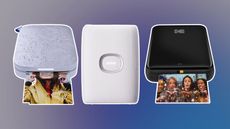 7 of the best small printers for making paper copies at home
7 of the best small printers from HP, Canon, Kodak, and more well-known brands. See our top picks for your home office, including top tips.
-
 These 12 Urban Outfitters desks redefine the meaning of hot desking
Our freelance contributor's twelve favorite Urban Outfitters desks from mid-century modern models to boho chic. Shop our selection for your WFH set-up.
-
 These are the Target desks I wish my college room came with
Expect more, and pay less with these chic and affordable Target desks. See my fave picks like standing desks, small desks, white desks, and more.
-
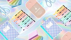 Cute AF back-to-school stationery to start the semester right
Get off to a good start this semester with some cute back-to-school stationery. Stock up on our fave notebooks, pens & pencils, and desk supplies.
-
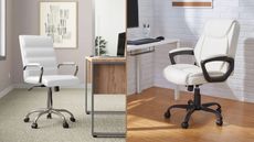 12 of the best office chairs to straighten those croissant-shaped backs 🥐
WFH on the best office chair and thank us later. These are the designs real shoppers rate the best, which are also hella chic
-
 Desk organization ideas to nail your WFH or study set-up
Looking to upgrade your WFH set-up? See our best desk organization ideas to keep clutter away. See how to utilize drawers and shelves.


