The recent Color of the Year announcements from paint experts like Farrow & Ball and Behr gave us an insight into the way the nation will be decorating this year. With pared-back terracotta, olive greens and rich yellows topping the list, you could be fooled into thinking warm, sun-kissed hues are having a moment.
Apparently not, according to Modsy's 'Interior Wellness Report'. The design company's survey has revealed that when it comes to living room paint color ideas, orange and pink are America's least favorite colors.
Bright orange, we can understand, but pink? We'll simply never stop loving its versatile, flattering qualities.
Modsy's recent report suggests that we prefer calmer colors, from blues and greens to neutrals for decorating our homes. Over a third, (36%) of participants in the survey said pink and orange were their least desired colors.
Social psychologist Lindsay T. Graham offers her two pennies on where this aversion to orange might come from. 'We associate orange with things that need our attention — traffic cones and construction signs — which can sometimes be overstimulating in a home,' says Lindsay.
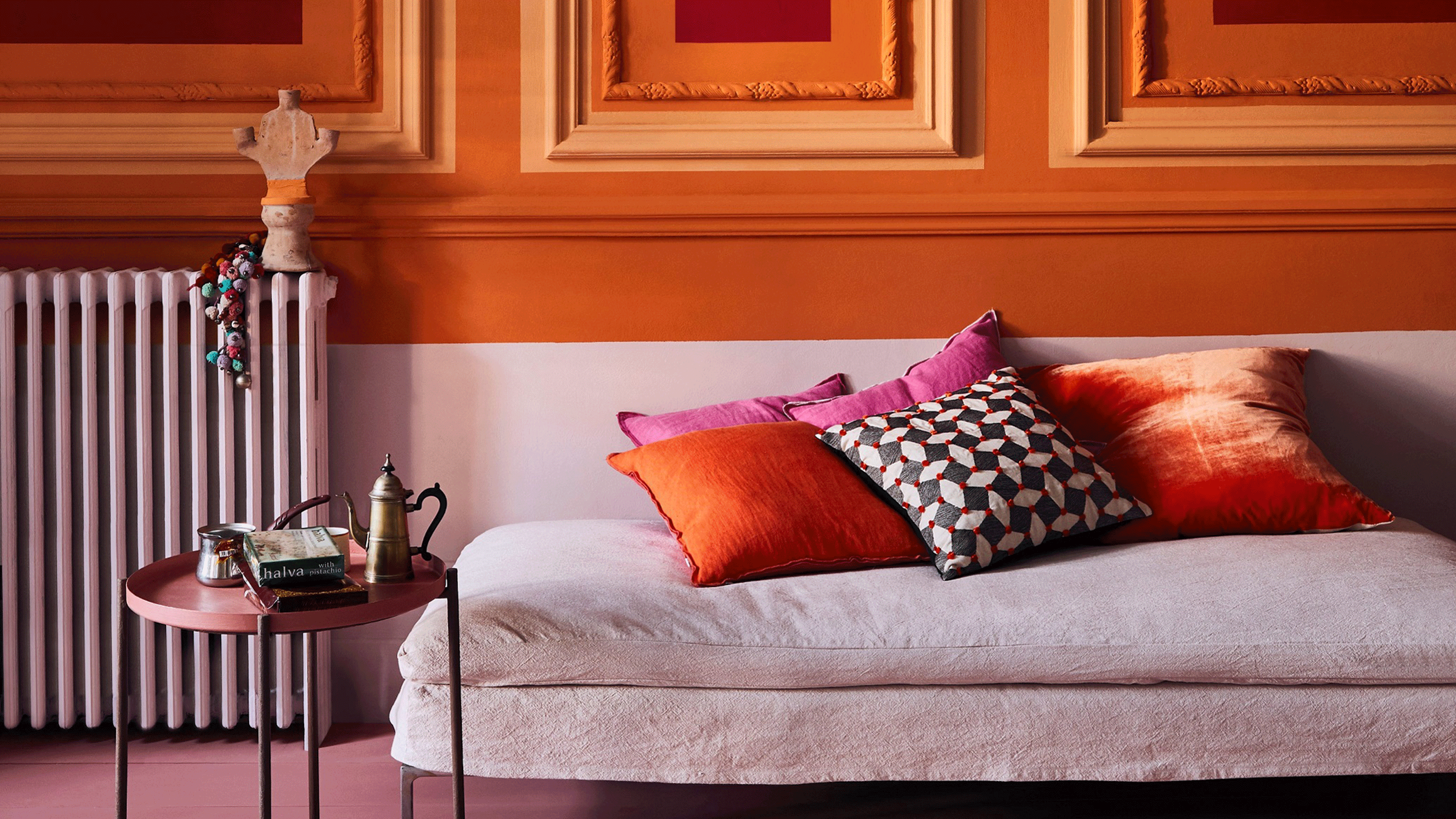
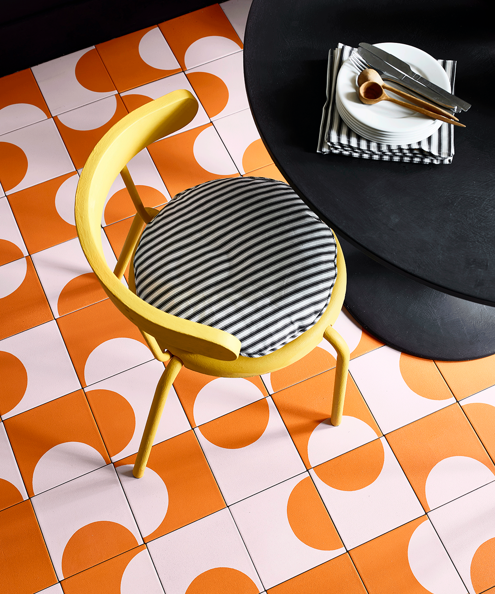
Often used in advertising and to tell us to exercise caution, bright orange interiors are a bold move - particularly when painting our homes. We think orange can often get a bad rep because of the fact it's made up of yellow and red - two stimulating and somewhat 'Marmite' tones.
Orange's associations with fall and seasonal fall decor are a redeeming factor, and it all depends on what we really mean by 'orange'. It's all about saturation, with richer, 70s shades that remind us of the Central Perk sofa bringing warmth and optimism.
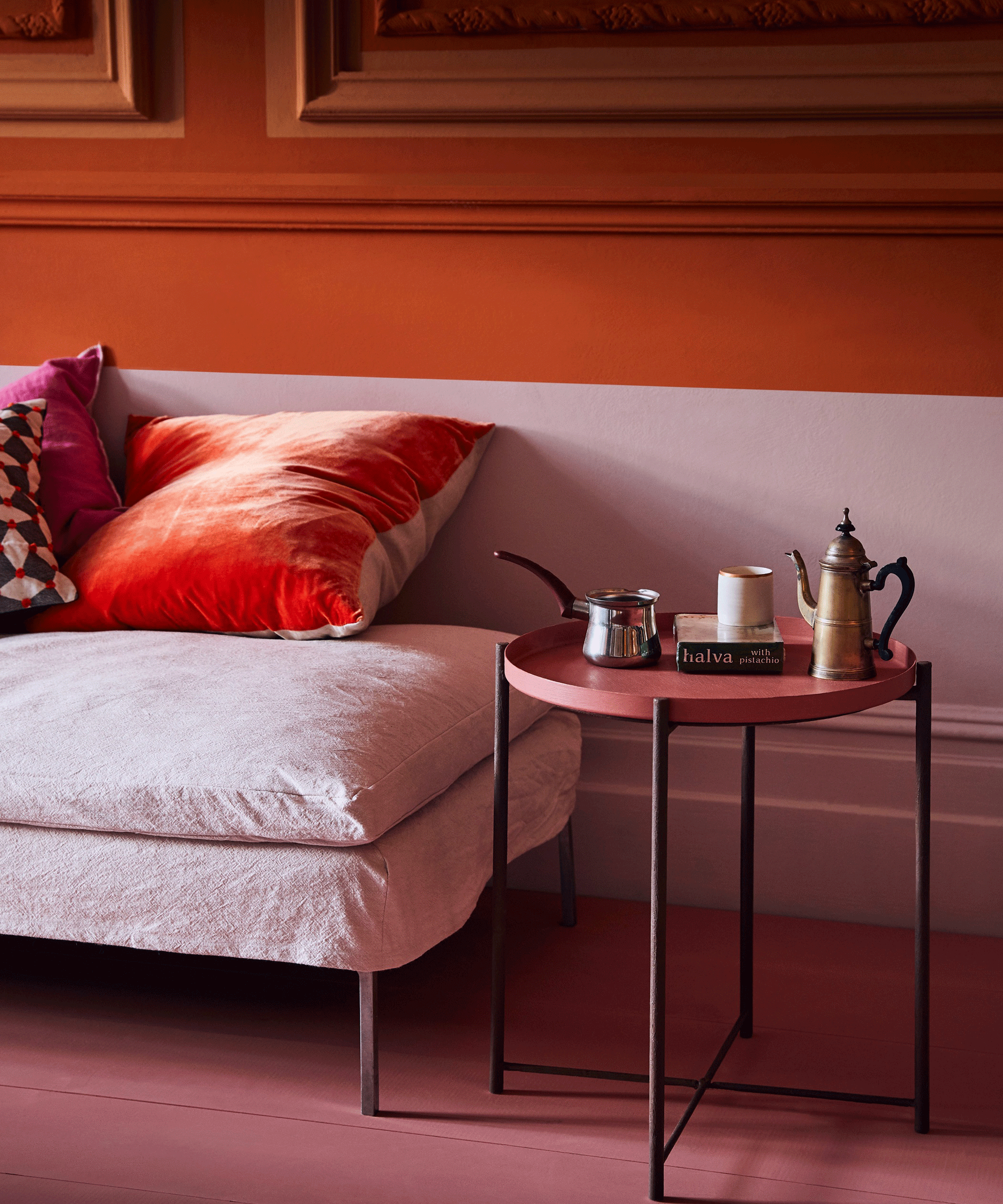
As for pink, we are shocked to see it among the least popular colors. Pink and orange together might be too much in our living rooms, owing to the fact that they are close together on the color wheel. But paler pink room ideas can create a calming and romantic mood.
Not to mention the fact pink - from fuchsia to setting plaster - is all over Instagram.
'Pink has become very gendered,' comments Lindsay. 'We're conditioned to think of pink as denoting something demure and feminine, and that association is so strong that it feels like a big statement to use it in a space.'
A statement we're happy to make.