The new neutrals pushing out gray and how to actually decorate with them
The toasty shades you need for a cozy home

Get small space home decor ideas, celeb inspiration, DIY tips and more, straight to your inbox!
You are now subscribed
Your newsletter sign-up was successful
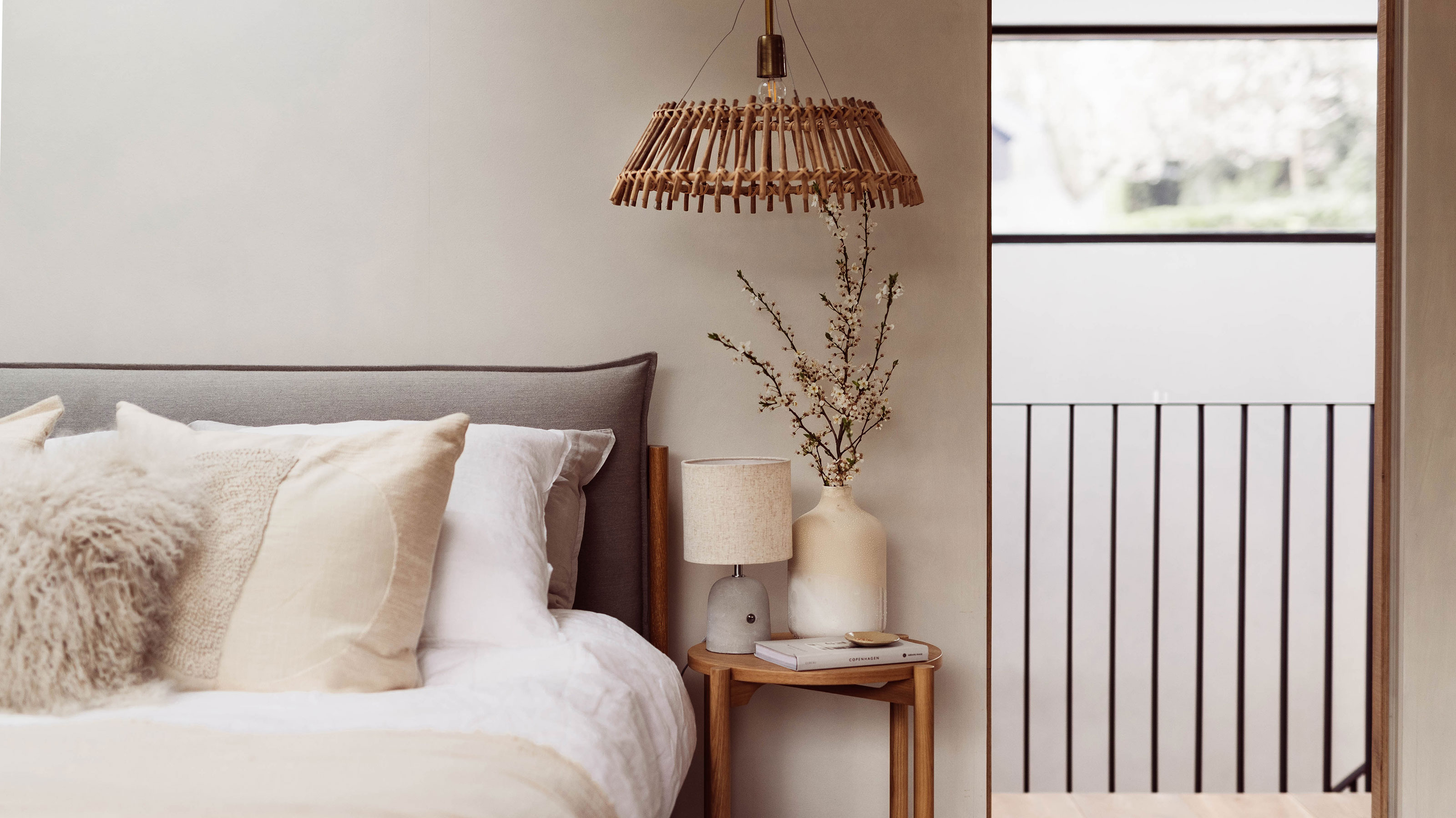
When you hear salted caramel, your first thought is probably a Frappuccino, not a paint or home decor color.
However, in the world of interiors, neutral hues like "salted caramel" and "toasted oatmeal" have taken a leap forward and are now among the most popular shades to decorate with.
We've been wondering if gray is going out of style for a while, and it's no secret that neutrals are essential if you want to create a clean and classic look. But are yummy, food-inspired shades going to become the new staples in our home color palettes? We spoke with Lick's director of interior design and color psychologist Tash Bradley to find out.
"The salted caramel look is here to stay," Bradley says. "What I’m really excited about is that people are moving away from gray and becoming braver. I’m seeing a huge shift in people being bolder in their color choices and wanting to see more color and life in their homes."
The positives of decorating with neutrals
Take a look around the world of interiors and you’ll see that decorating with neutral tones is big. If mindful living is a priority for you (and your home), we have good news: according to Bradley, the reason for us moving more towards salted caramel rooms over gray could actually be its benefits for wellbeing.
"Gray doesn’t give any positive psychological connections, so I’m excited that this color is leaving," Bradley explains. "Other neutrals such as caramel, beiges, oaks, and sandy colors are coming in and they’re a lovely warming neutral for a grounding, calming space."
According to Lick's trend specialist Matilda Martin, another positive of introducing neutrals into your home is that the tones are intrinsically connected with nature and conscious living.
Get small space home decor ideas, celeb inspiration, DIY tips and more, straight to your inbox!
"Salted caramel colors and calming neutral tones are not going anywhere," Martin says. "We are seeing more and more people wanting to incorporate earthy, calming colors into their decor schemes."

How to decorate with the new neutrals
A warm neutral wall feels like the perfect way to incorporate these cozy tones into your home. But if you're renting and aren't able to paint your walls, don't stress. There are other ways to bring the new neutrals into your space.
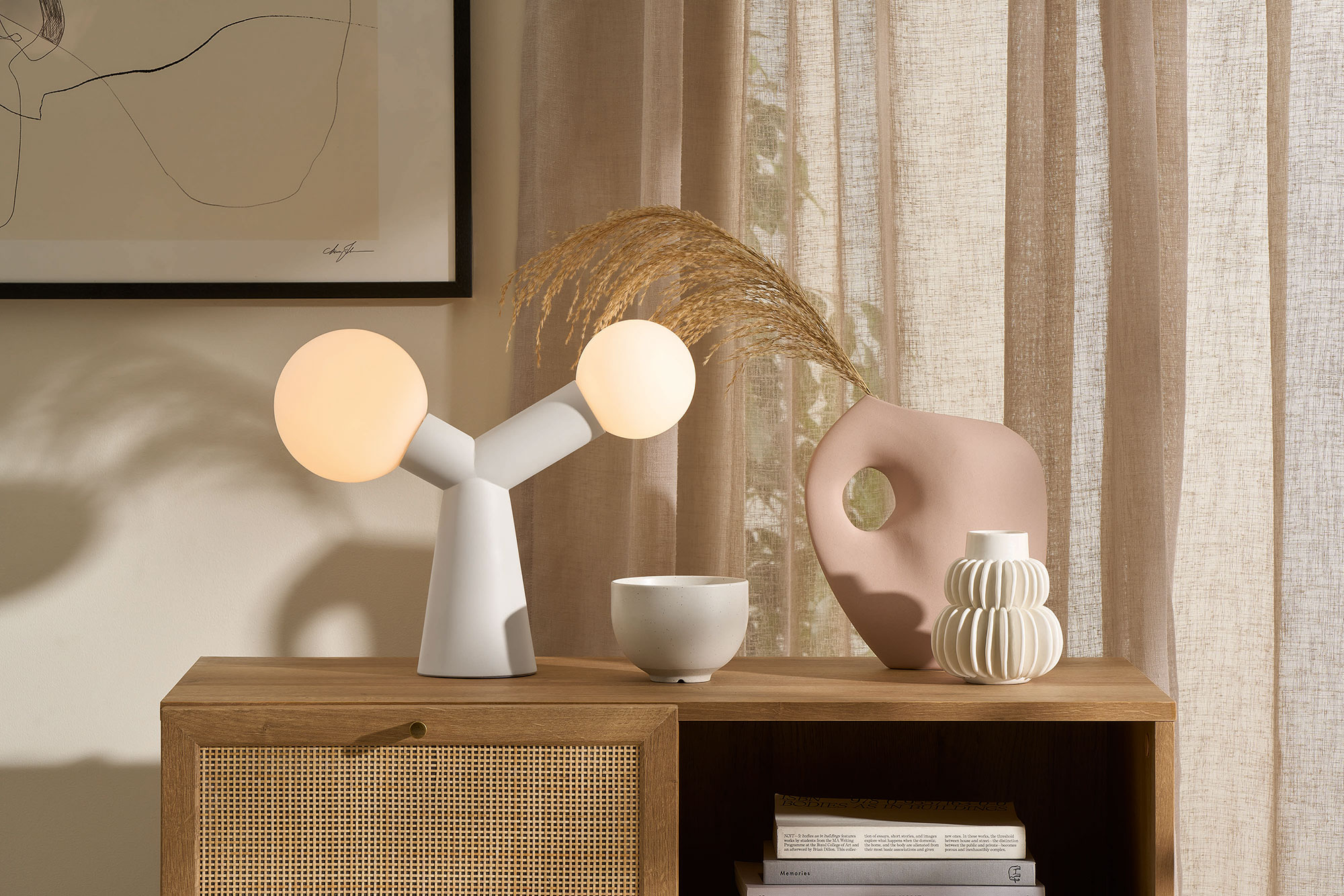
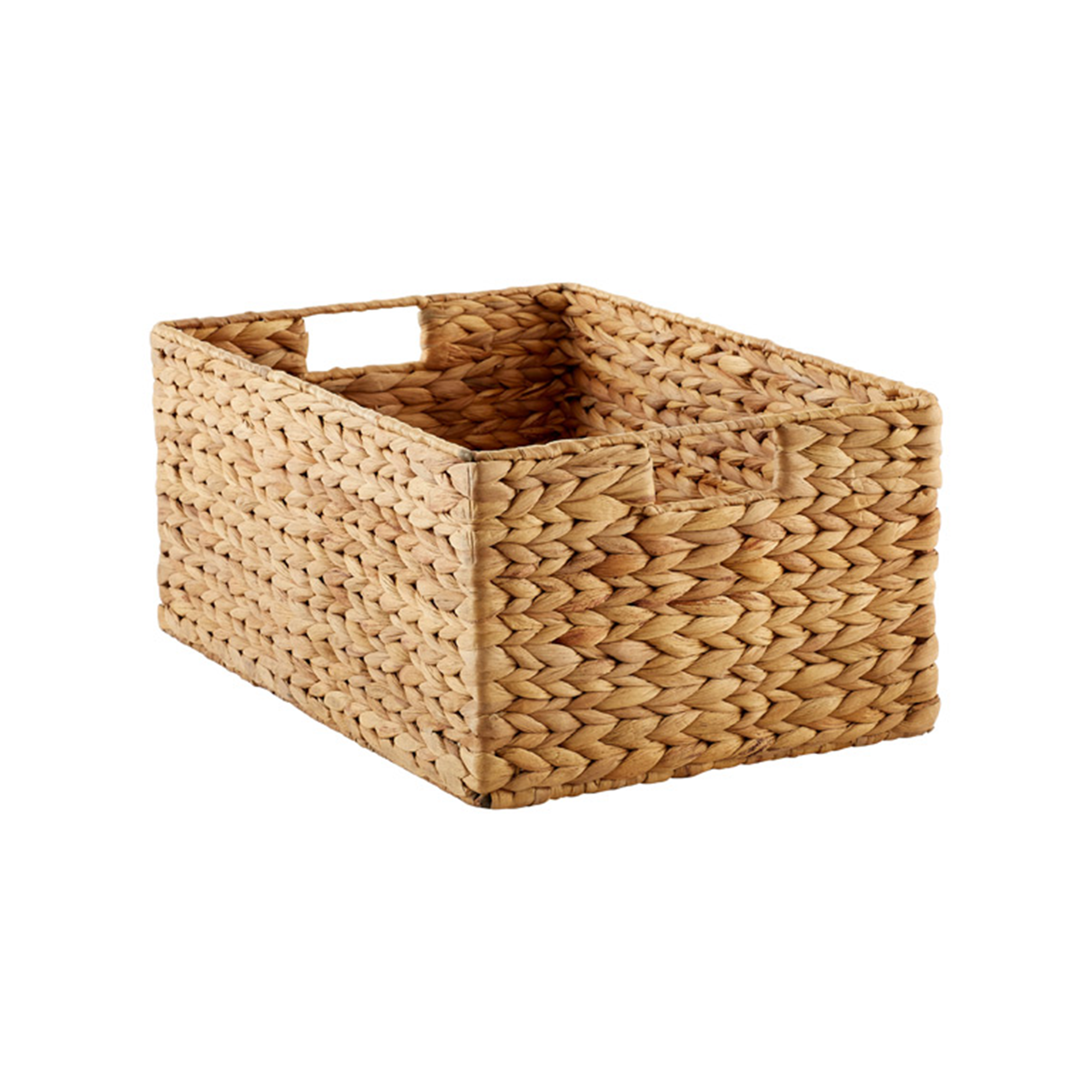
"You can also incorporate them into your home through the use of natural undyed linens, wicker, and rattan," Martin says. "With the '70s interior aesthetic on the rise, the use of caramel, earthy tones, as well as natural textures and materials, is only going to persist."
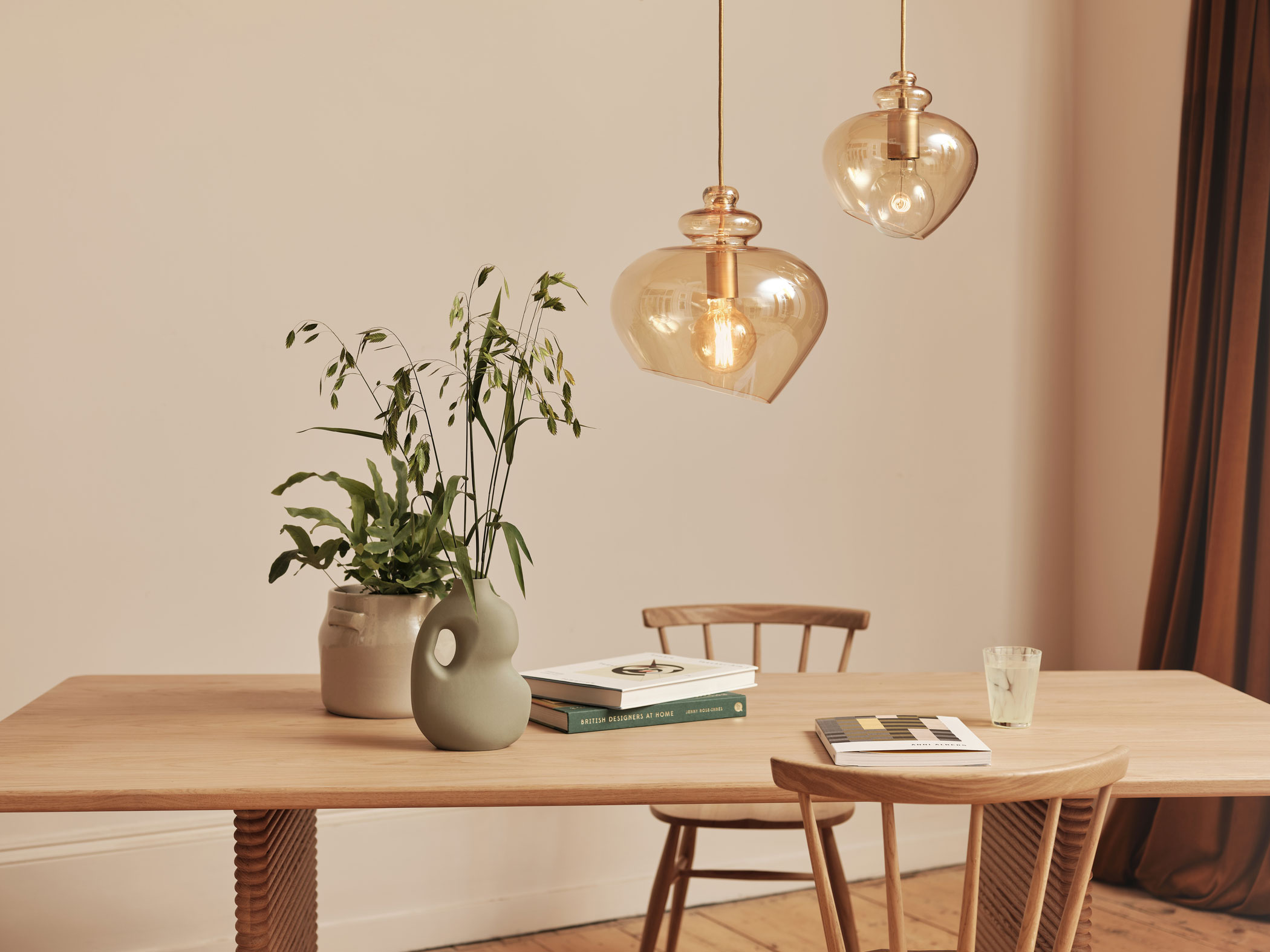
We love the soothing atmosphere this look brings, and like Martin, we would recommend bringing it to life with warming terracotta, deeper browns, and other rich earth tones.
Shopping edit
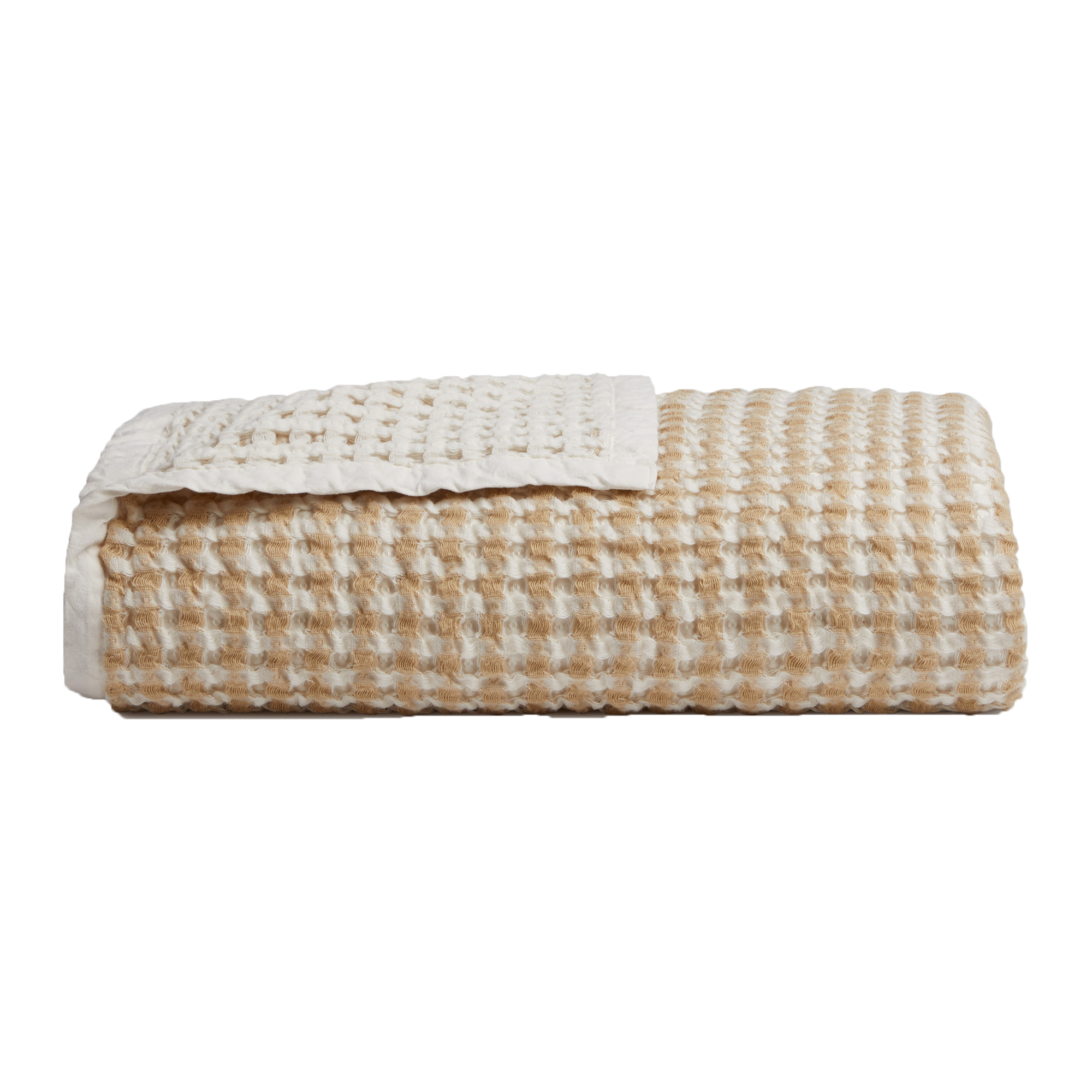
Whether it's creamy vanilla tones or warm, melty beiges and browns, we’ve rounded up our favorite pieces to help you create the look.
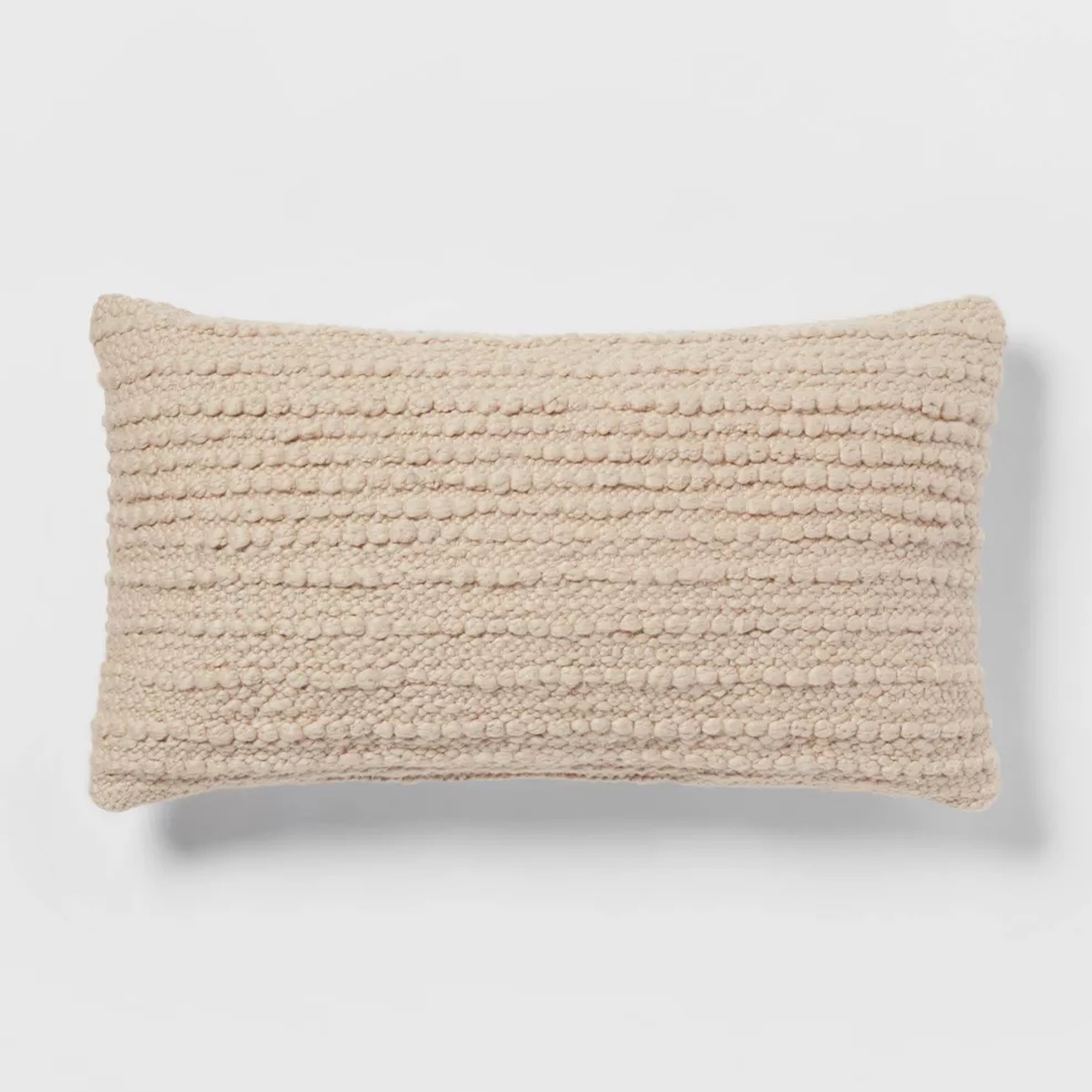
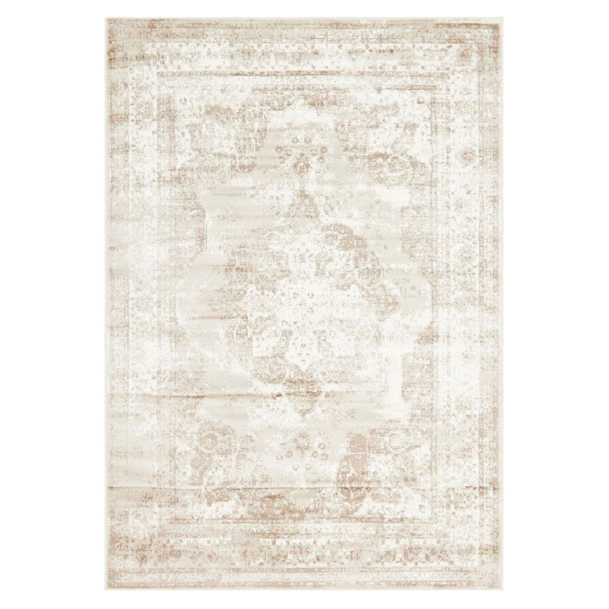
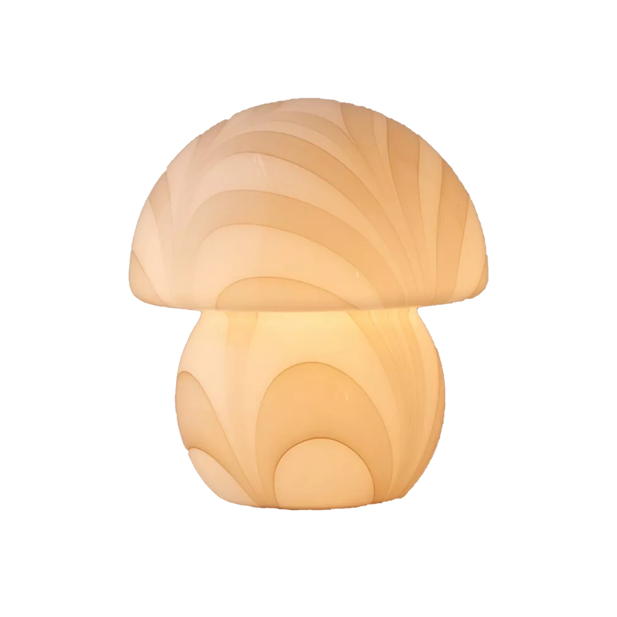
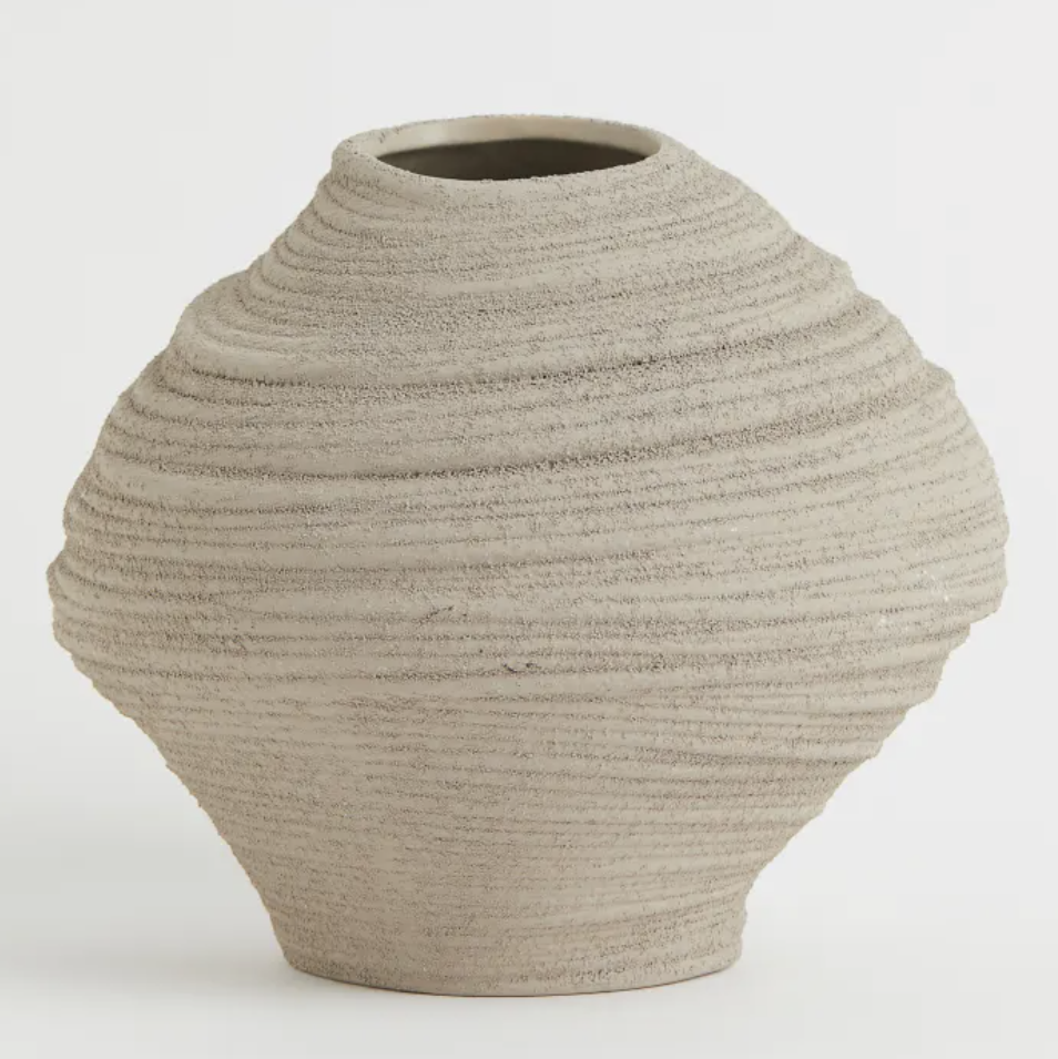
Real Homes spotlight on the new neutrals
So, are you a lover of this look? We asked the team if they were feeling the salted caramel and oatmeal vibes:

"This look is so calm and serene, but for me personally, I'd need some pops of color and pattern in the mix too. I see these neutrals as a blank canvas, and a splash of burnt orange or olive green would bring the scheme to life for me."

"I'm actually into salted caramel, and I don't think the name does it justice. It's a rich and soft addition that will set off other neutrals, and perhaps one of two brights also, without being too overindulgent."

"Having a foundation like salted caramel sets you up for a plethora of different trends, and like the capsule decorating trend, this creates a super versatile foundation — it's the chameleon of hues. For example, you could totally swap this scheme from Scandi chic in the spring, to rustic chic in fall/winter simply by subbing out soft furnishings and accessories."

"I used to be a huge fan of neutrals but recently have been more excited about brighter colors. That being said, I can very much get behind these warmer tones. I can't stand gray, so these are much friendlier and more welcoming shades than their cooler counterparts and even greige, in my opinion. So I can see why 'salted caramel' shades or 'oatmeal' hues are gaining popularity and becoming fast favorites in people's homes."

Anna has over a decade of experience styling and art directing photo shoots of readers homes and of beautiful homeware products. She discovered her passion for interiors after living and working in L.A. and upon her return to the UK, started a career in magazines and photography. She now lives in the Leicestershire countryside with her young family.
- Nishaa SharmaFreelance social media editor
- Camille Dubuis-WelchFormer Deputy Editor