Real home: a terraced home transformed with a loft and rear extension
Along with a team of architects, Matt Jones transformed his house into a bright and open modern home


Get small space home decor ideas, celeb inspiration, DIY tips and more, straight to your inbox!
You are now subscribed
Your newsletter sign-up was successful
Finding an innovative way to transform something as ordinary as a terraced home can be difficult. But occasionally, we come across something that stops us in our tracks. With its clever layout, minimalist plywood storage and sunny yellow kitchen, Matt Jones’ architect-designed home does just that.
Moving into the house with a clear vision of a modern family home, Matt was keen to enlist the services of Gruff Architects and create an open-plan layout to replace the property’s awkward arrangement of rooms. Previous homeowners had extended upwards and outwards, so Matt and the architects set to work making the most of the space, as well as designing a home office space in a disused outbuilding in the garden.
The result is a creative, stimulating and fun house that uses a huge range of materials – from cork and concrete to zinc kitchen door fronts – for a contemporary finish. Read on for a tour of Matt's home, then get more inspiration from our other completed projects.
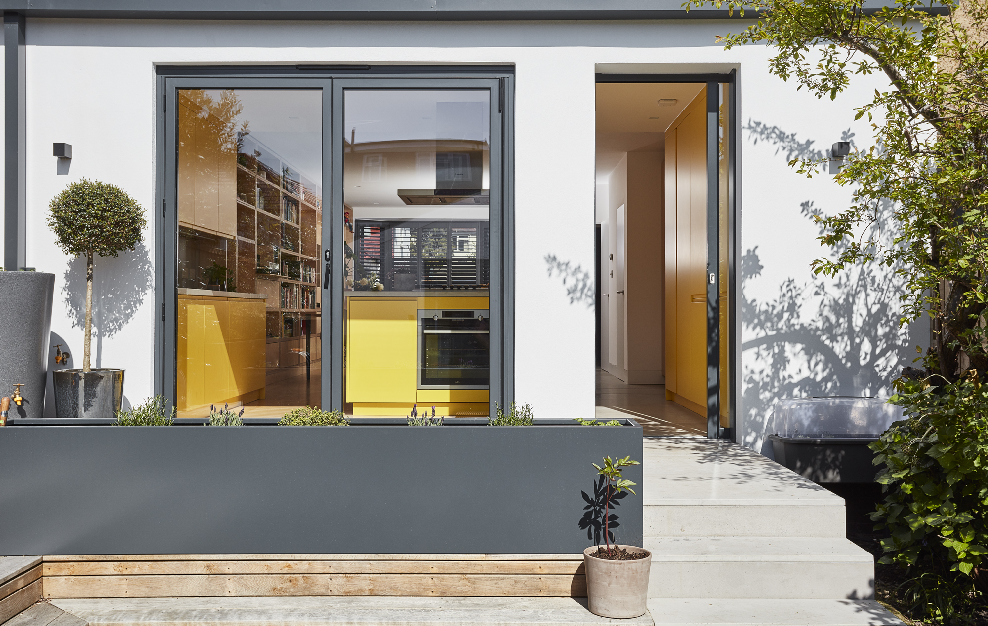
Thrutone fibre cement tiles, Eternit. Pocket door, Maxlight. Glazing, Express Bi-folding Doors
Project notes
The owner Matt Jones, a designer, lives here with his partner and his twin children, six
The property A 1930s terraced house in London
Project cost A similar project would cost in excess of £225,000
‘Gruff Architects did a good job with the insulation, and the materials are generally eco-friendly – we have cork, ply and zinc around the house. We also have a solar battery system that can generate nearly all the electricity we need on a sunny day. I’m interested in water conservation, and I would have liked to do more – it’s more difficult to do that when you’re in such an urban area.’
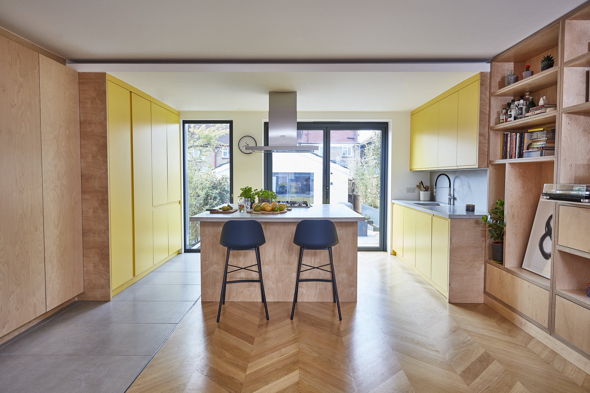
Kitchen, Naked Kitchens. Worktops and concrete tiles, Designer Stone. Tap, Teka. Sink, Franke. Engineered oak chevron flooring, The Natural Wood Floor Co. Bar stools, John Lewis & Partners
'We wanted a space that was pleasing and light, with a good kitchen and a decent play area for the kids. I specifically wanted to work with Gruff Architects. I used to walk past their shop window every day and I love the way they use materials and craft pieces that are sympathetic to the spaces they’re in.
‘I did some sketches and talked to one of the partners, then I had a few meetings with Coral McGarrigle, our architect, where we looked at materials and talked about the layout and the general design. The main concept was to open up the ground floor and connect it to the garden. The studio at the bottom of the garden opens up, too, so it turns into one big space.’
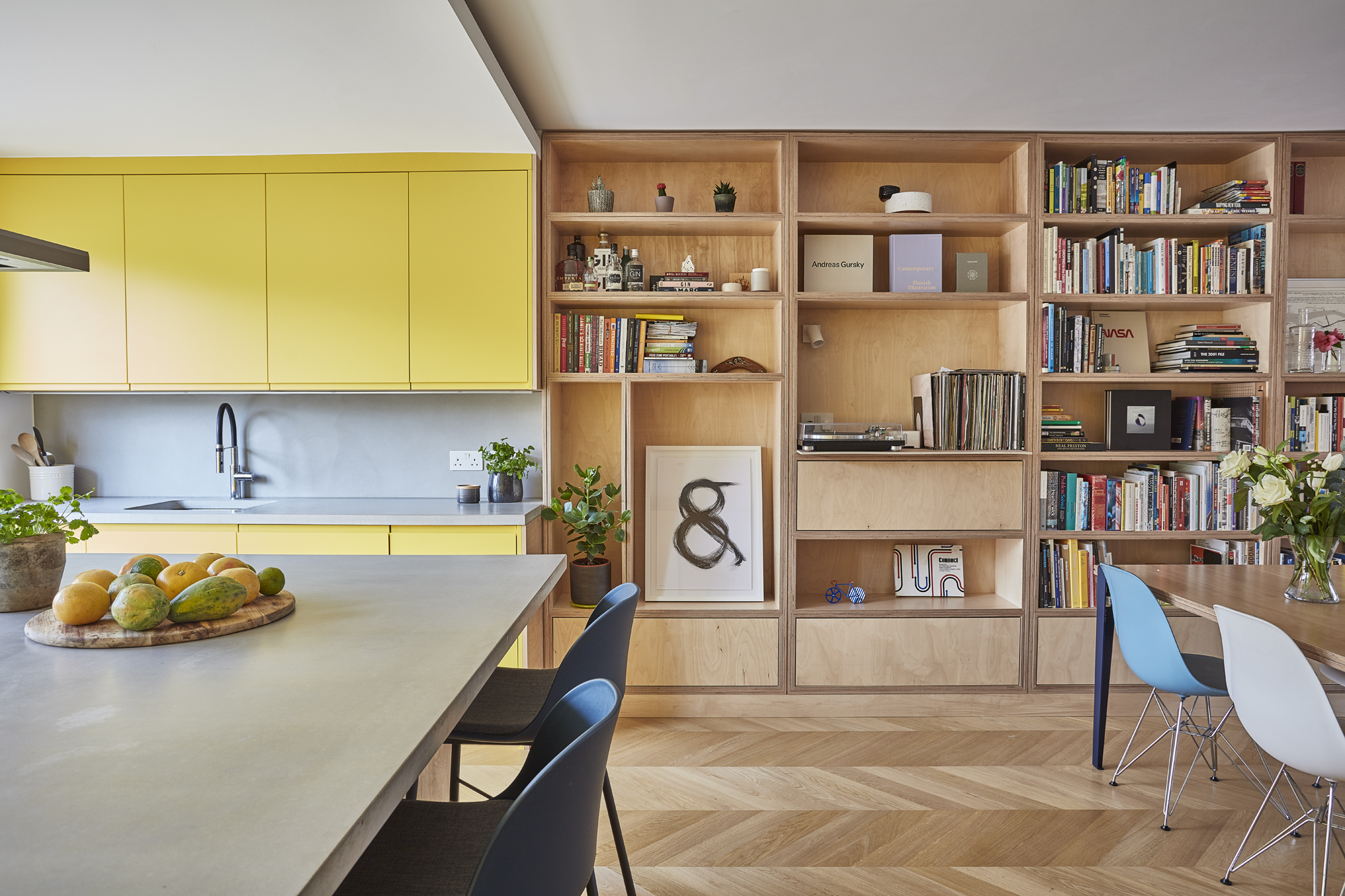
‘We’re super happy with the yellow kitchen. We didn’t want a neutral scheme everywhere – we wanted something interesting and expressive, even mood-altering. On a grey day, the kitchen is refreshing, but on a sunny day, it’s just amazing.
Get small space home decor ideas, celeb inspiration, DIY tips and more, straight to your inbox!
‘Choosing that colour was the best decision we made. We spend 80 per cent of our time here and I love cooking and baking, so it’s a pleasure to cook in here. The kids sit at the stools and we sit around there with our food – I think I can count on one hand the number of times we’ve actually eaten around the dining table.'
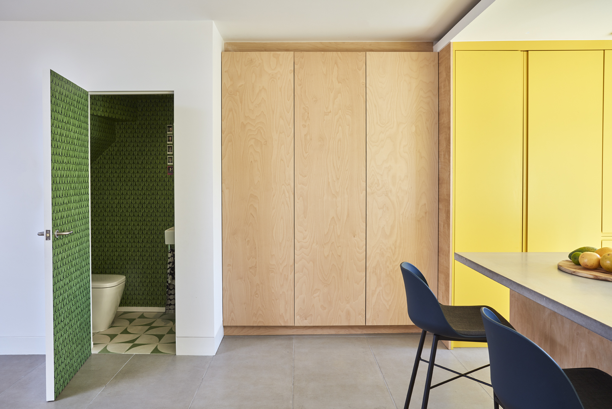
Narina Green wallpaper, Designer Wallpapers. Floor tiles, Bert & May
'Coral and my partner had the idea for the colour in the downstairs cloakroom. It’s a small space but the pop of pattern and vibrant green breaks up the neutrality of the
ply storage in the main living area, adding interest to the scheme.'
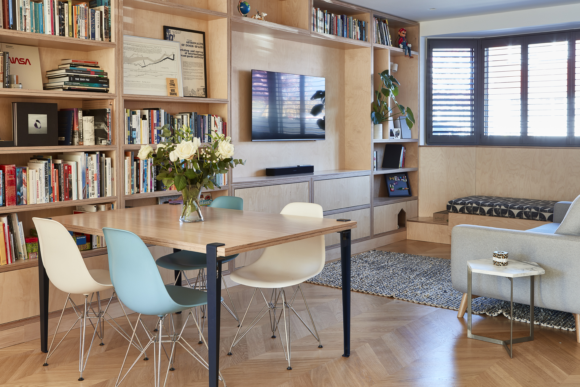
Acton Charcoal seat cover fabric, Ian Mankin. For a similar sofa, try Loaf. Side table, West Elm. For dining chairs, try Cult Furniture
More from Real Homes
Get inspiration and advice for your own renovation, plus tips on the hottest decorating trends, delivered every month with a subscription
'The kitchen is the heart of the home, and we spend most of our time hanging around the island. The front part of the space is for TV and games – it’s more like a nook, I suppose. We have a lot of books and play a lot of board games; the fitted open storage helps to accommodate all of that. Our contractor made the dining table out of ply and bolted on some legs, so that’s where we play together.
‘It all comes together as one living space, but the nice thing is that we tend to spend more time around the kitchen. As the weather gets better, we can throw the doors open and mill around on the deck.'
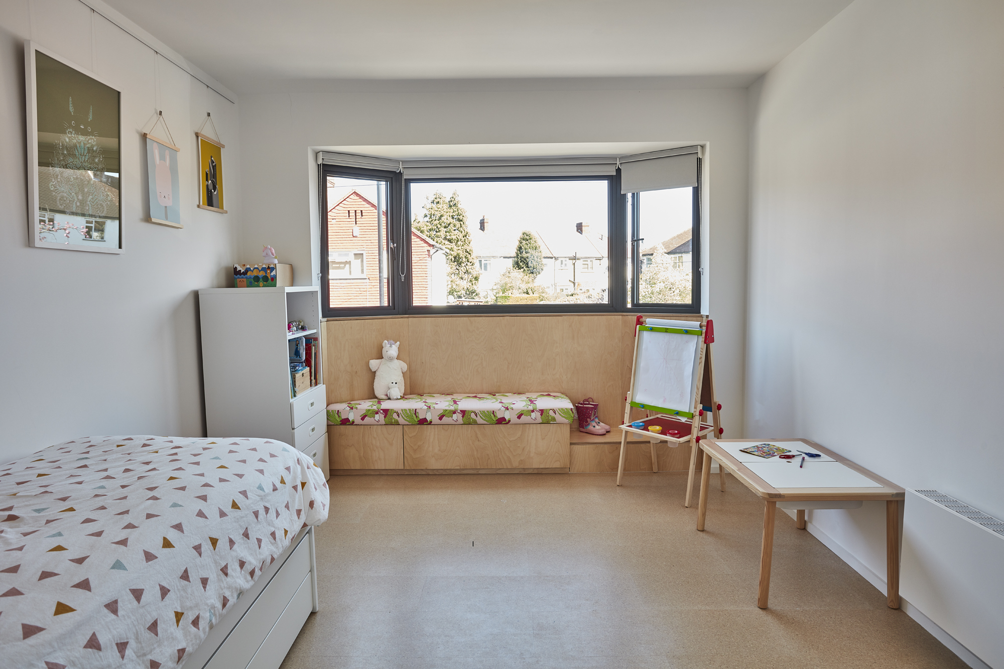
Children’s beds, Ikea. Cork tiles, The Cork Flooring Co. Theatre dark blue seat fabric, Jane Clayton. Phoenix Dawn seat fabric, Korla. For a children’s easel, try Ikea
'I had the kids choose their fabrics for the window seats in their room. My son has a lot of allergies, so we chose materials with that in mind. They’re twins, so they play together a lot. It was Coral’s idea to have the connecting door between their rooms. The whole of the first floor basically opens up, and it’s theirs to have as a play space. The rooms only really become bedrooms at night.'
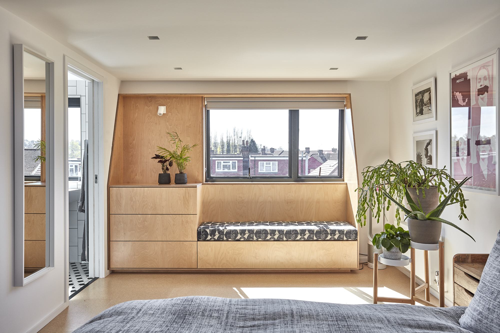
Plant stand, Ikea. Acton Charcoal seat fabric, Ian Mankin. Cork tiles, Cork Flooring Co. Bathroom floor tiles, Tiles Direct
We have a lot of prints, artefacts and pieces of memorabilia that we wanted space for, so we had plenty of fitted storage put in around the house. The bedroom gets really good light from the south-facing window. We went for a neutral scheme to emphasise that brightness. My partner and I both lived in Brooklyn, New York, so we wanted to capture the feeling of the apartments we had when we were over there.
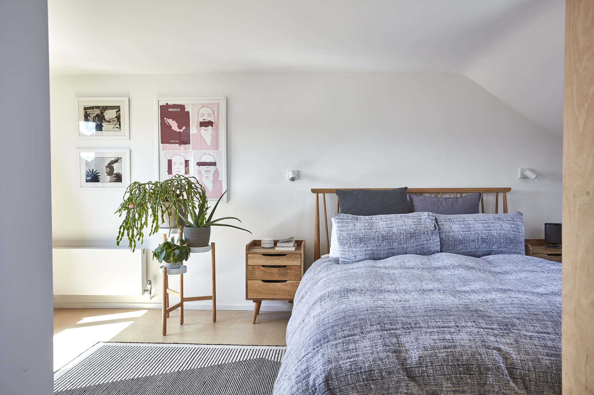
For an Ercol bed, try John Lewis & Partners. Bedside table, Swoon Editions. For a similar monochrome rug, try Modern Rugs
Contacts
- Architect: Gruff Architects
- Contractor: Lewel Construction
- Pocket door: Maxlight
- Glazing: Express Bi-Folding Doors
- Kitchen: Naked Kitchens
More project advice:

Formerly deputy editor of Real Homes magazine, Ellen has been lucky enough to spend most of her working life speaking to real people and writing about real homes, from extended Victorian terraces to modest apartments. She's recently bought her own home and has a special interest in sustainable living and clever storage.