Real home: take a tour of this boldly decorated period cottage
This cottage in Yorkshire may have been built in the 1800s, but its interior style is distinctly contemporary. Find out how its owners stamped their signature mark on the home
Get small space home decor ideas, celeb inspiration, DIY tips and more, straight to your inbox!
You are now subscribed
Your newsletter sign-up was successful
Profile
The owners
Gemma Medden, who works in a building society and runs quirky homewares website Luxeology.co.uk, lives here with partner Gareth Fisher, a business development director, children Darcey and Beau, plus French bulldog Maisie, cat Sonny and seven chickens.
The property
A three-bedroom, semi-detached cottage with parts dating back to 1800 in the village of Hornby, North Yorkshire.
Project cost
£82,000
From the outside it looks like a cute, compact cottage, but visitors expecting rustic beams, low ceilings and a warren of cosy rooms are in for a surprise when they step inside Gemma and Gareth’s Tardis-like North Yorkshire home.
Find out how they created this gorgeous contemporary home – and don't forget to check out more real home transformations and find out more about extending a house.
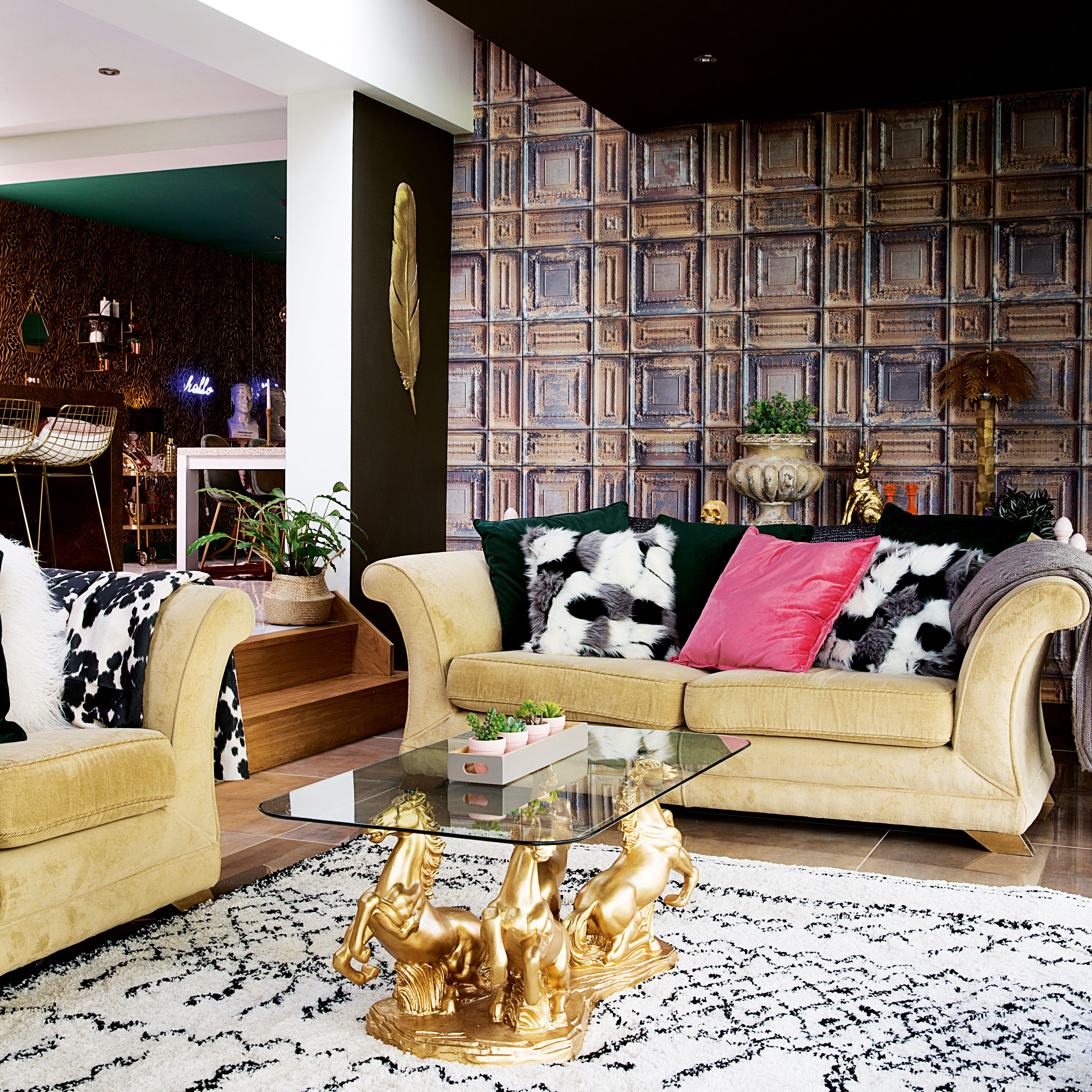
Living room walls and ceiling painted in Bedford Brown, Abigail Ahern. Delancey Tobacco wallpaper, Woodchip & Magnolia. For a similar sofa, try Sofa.com. Palm tree light; plant pot; animal print throw; metallic feather wall decoration; gold hare, all Luxeology. Afaw Berber-style rug, La Redoute. For a Roman horse Italian-style coffee table, try Modernique
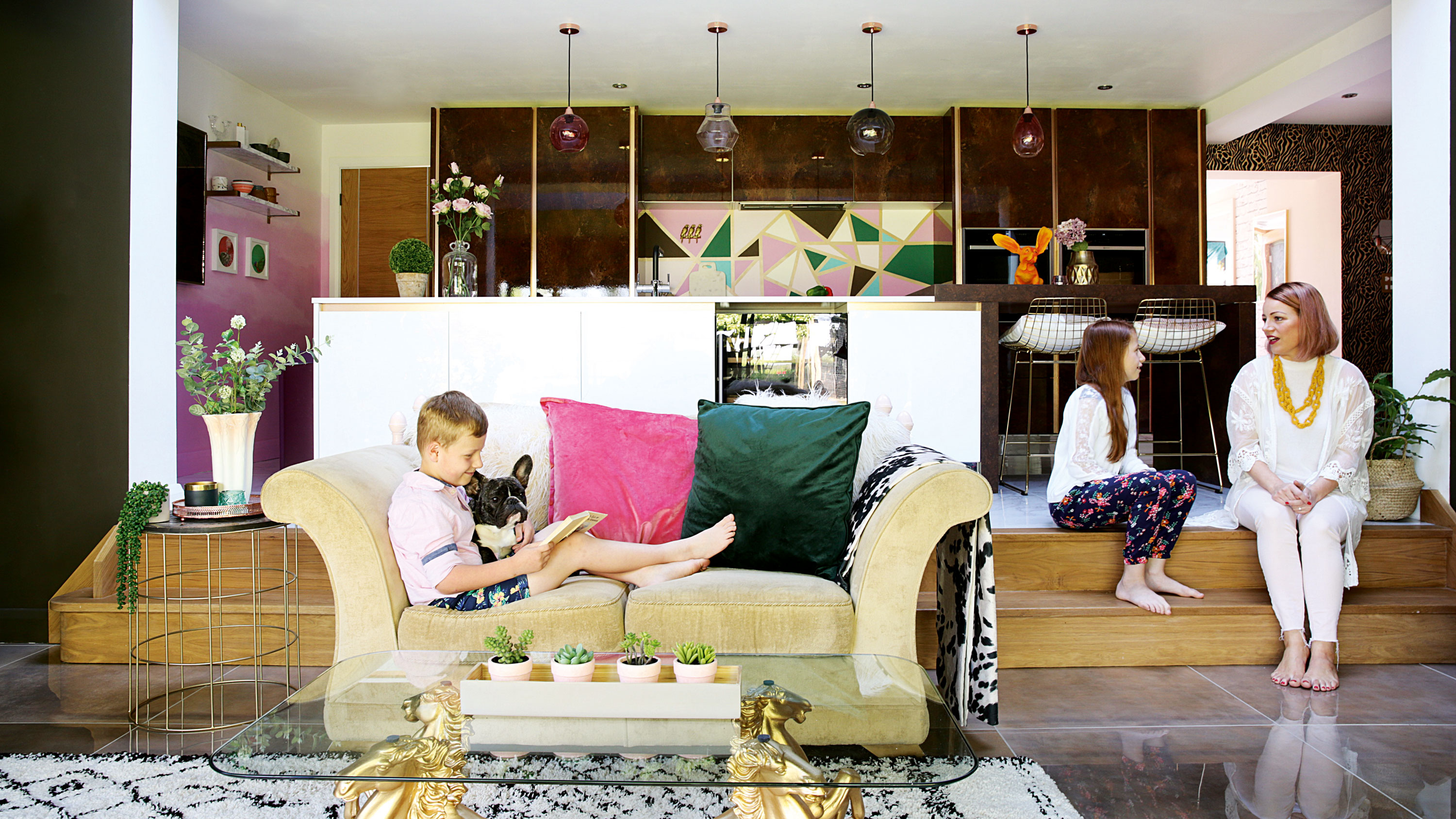
After renting for several years in nearby Appleton Wiske while waiting for the right property to buy, the couple has unleashed a plethora of design ideas on this humble house in Hornby village, almost doubling the ground-floor footprint with a large rear extension to create a stunning open-plan kitchen, living and dining space that’s ideal for family life.
Article continues below 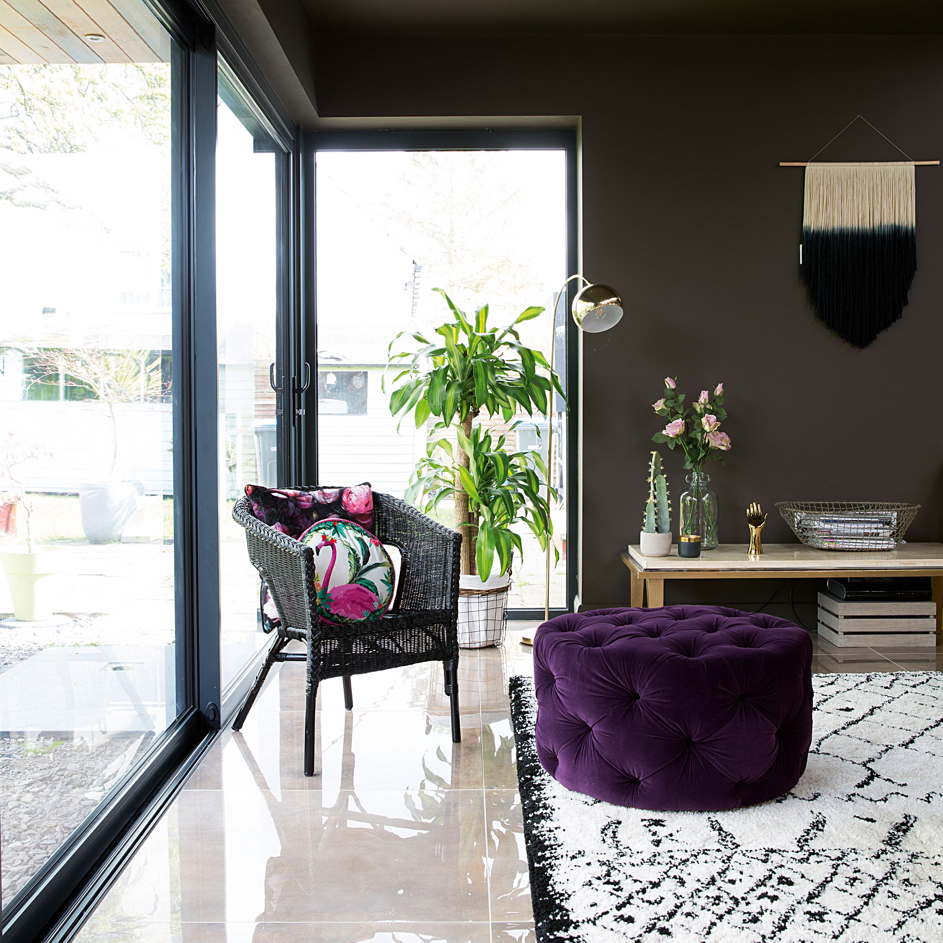
For a similar pouffe, try the Round Chesterfield at Chic Concept. For a black wicker chair, see the Belton at Lloyd Loom
What makes this home really stand out from the crowd, however, is how Gemma’s colourful personality and design ethos shine through in every room. She begins by thinking about how she wants to feel in each room, before picking a starting point for the scheme. This might be a swoon-worthy wallpaper, a statement light or an upcycled piece of furniture, all of which have been used to incredible effect throughout the house.

A change in levels in the open-plan living, kitchen and diner helps define the room's zones
Painting everything white and having a breather after the builders left was a wise move, as it allowed the family to get a better feel for their home before the fun 'colouring in’ part. The combination of paint shades, wallpaper, flooring and lighting illustrates a real knack for zoning, and we love how they’ve successfully embraced maximalism while still making it feel like a welcoming family home. We couldn’t wait for Gemma to reveal some of her top tips for creating such a bold yet easy-to-live-with scheme.
'I love how the living room is on the same level as the garden, when the sliding doors are open it feels like one big indoor-outdoor room. I’ve been bold with the décor in here, painting the walls and ceiling dark to match the frames on the sliding doors, enhancing the view,' says Gemma.
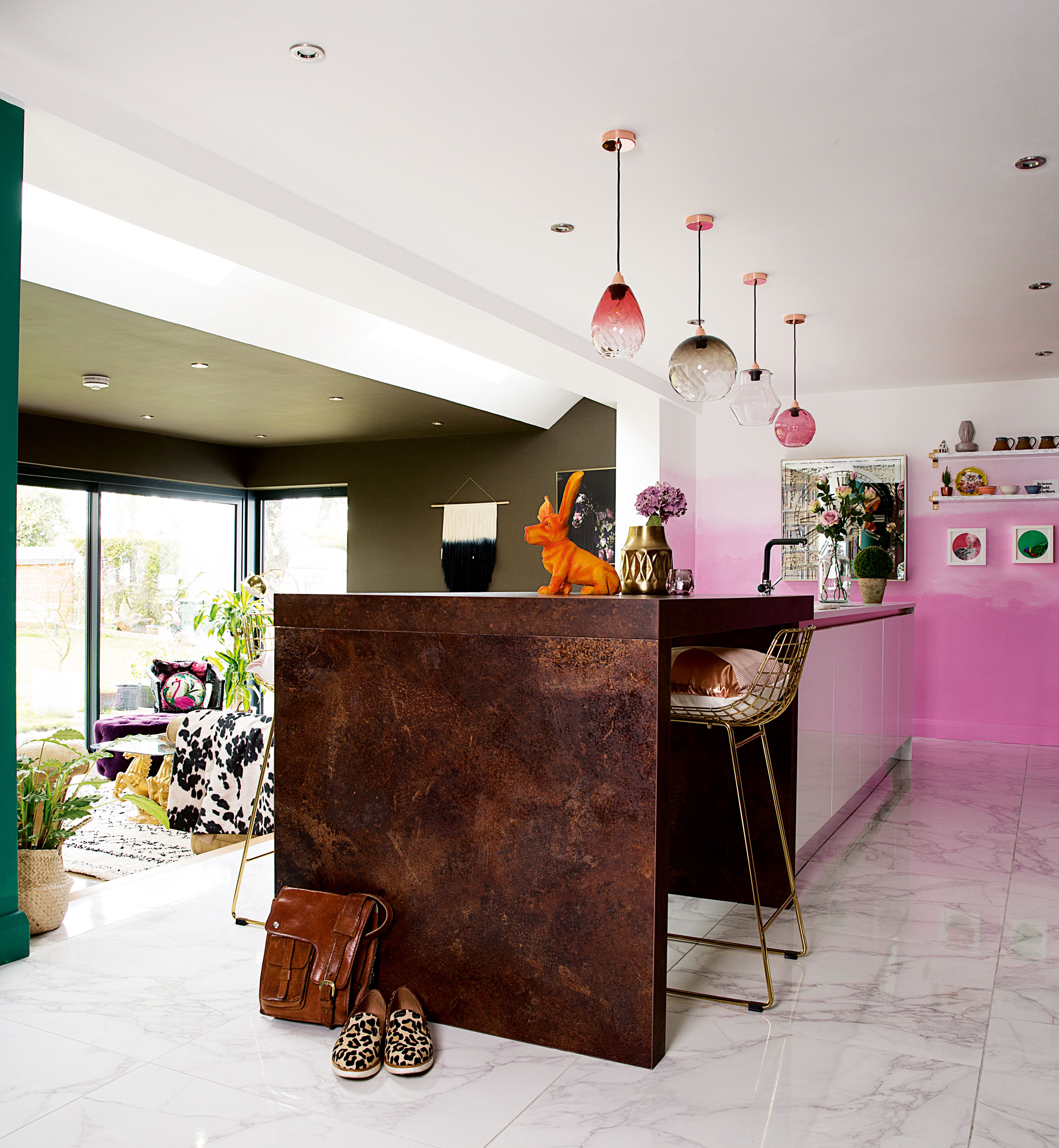
Orange Bassett hound ornament; mirror clock, Luxeology. Ilaria pendant shades, Made.com. Marble floor tiles, Northallerton Tiles & Bathrooms. Kitchen units in Milano Elements in copper slate and Infinity in white, Wren Kitchens. Bar stools, Luxeology. Steaming hot water tap, Insinkerator
'The furniture is a mishmash of old and new as we didn’t have much money left when the build went over budget. We got creative with upcycled and second-hand furniture. One of my favourite pieces is the £20 coffee table from a salvage yard, which I sprayed gold.'
Get small space home decor ideas, celeb inspiration, DIY tips and more, straight to your inbox!
'We wanted the kitchen to feel separate from the living area so I loved the idea of having steps down. People comment on the geometric splashback as they presume it’s tiles, but I created it myself using tester pots and masking tape. I love Terrazzo mosaics so that’s my inspiration, and it ties in with the pink ombre and green walls nearby.'
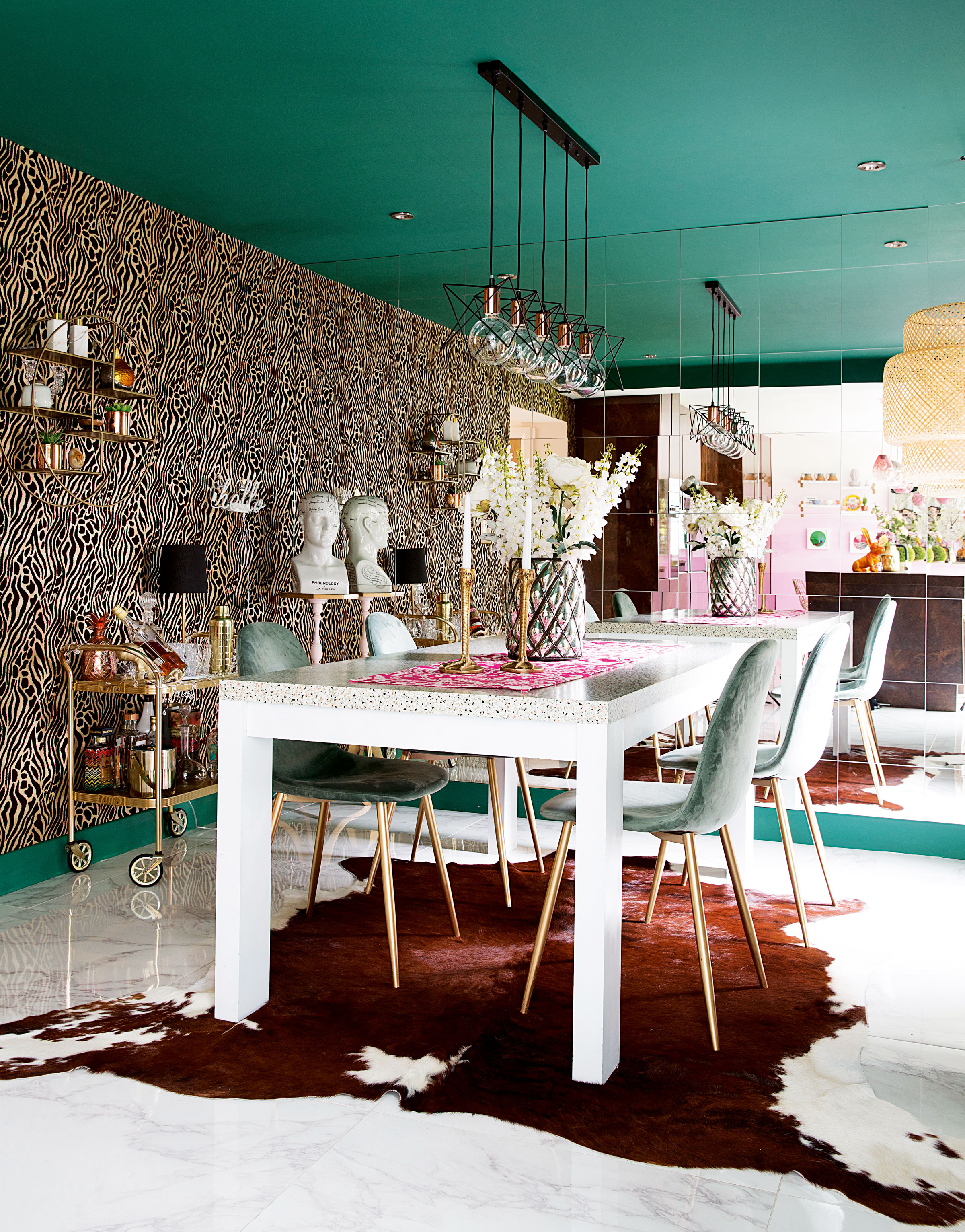
For an extending white marble dining table, try the Ginostra from Barker & Stonehouse. Candlesticks, Luxeology. For a gold drinks trolley, try Woodpecker Interiors
'Although Gareth and I spent a long time drawing our dream kitchen layout, our overall approach was a bit gung-ho as we just rang a few architects before picking one we had a good rapport with. There were plenty of challenges during the build, which involved digging out 100 tons of earth.'
'The older part of the house needed underpinning, some of the internal walls had to be rebuilt and we came across an ancient field drain, which meant it ended up taking six months rather than four. There were days when I felt like I had no house – just four walls! Thankfully we were able to move into a rented cottage nearby during the build.'
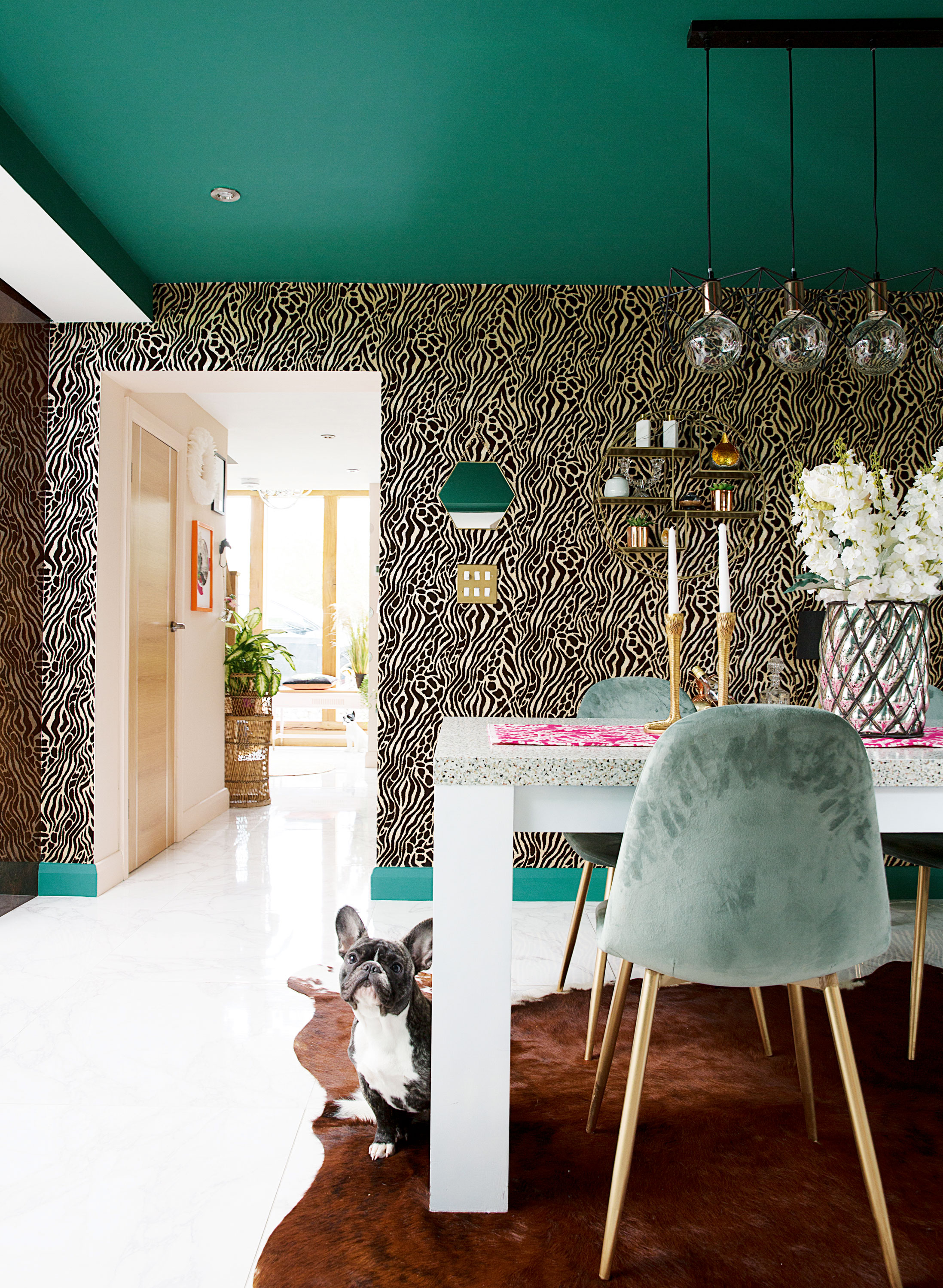
Walls and ceiling painted in Mercer Green by Abigail Ahern. For similar leopard-print wallpaper, try Graham & Brown
'Our hearts were set on an open-plan layout, and we picked Carrera marble flooring in the kitchen and dining areas with darker tiles in the living area to help with zoning. Getting the kind of kitchen we wanted for the right price was a challenge. Eventually we chose two different ranges from Wren Kitchens, costing around £13,000, and bought appliances online. It was worth all the hard work in the end.'
'The dining area was originally part of the living room and had an open fire, but we removed the whole chimney breast to free up space in the new bathroom above and partitioned the room to create a study next door. I really wanted a big bold feature, so we installed a mirrored wall using Ikea tiles – which was much cheaper than a bespoke piece of glass.
'The table was my parents'; I sprayed it white and put Terrazzo marble-effect contact paper on top. I went for it by painting the walls and ceiling green and adding a tactile animal print wallpaper. The décor’s always evolving, though.'
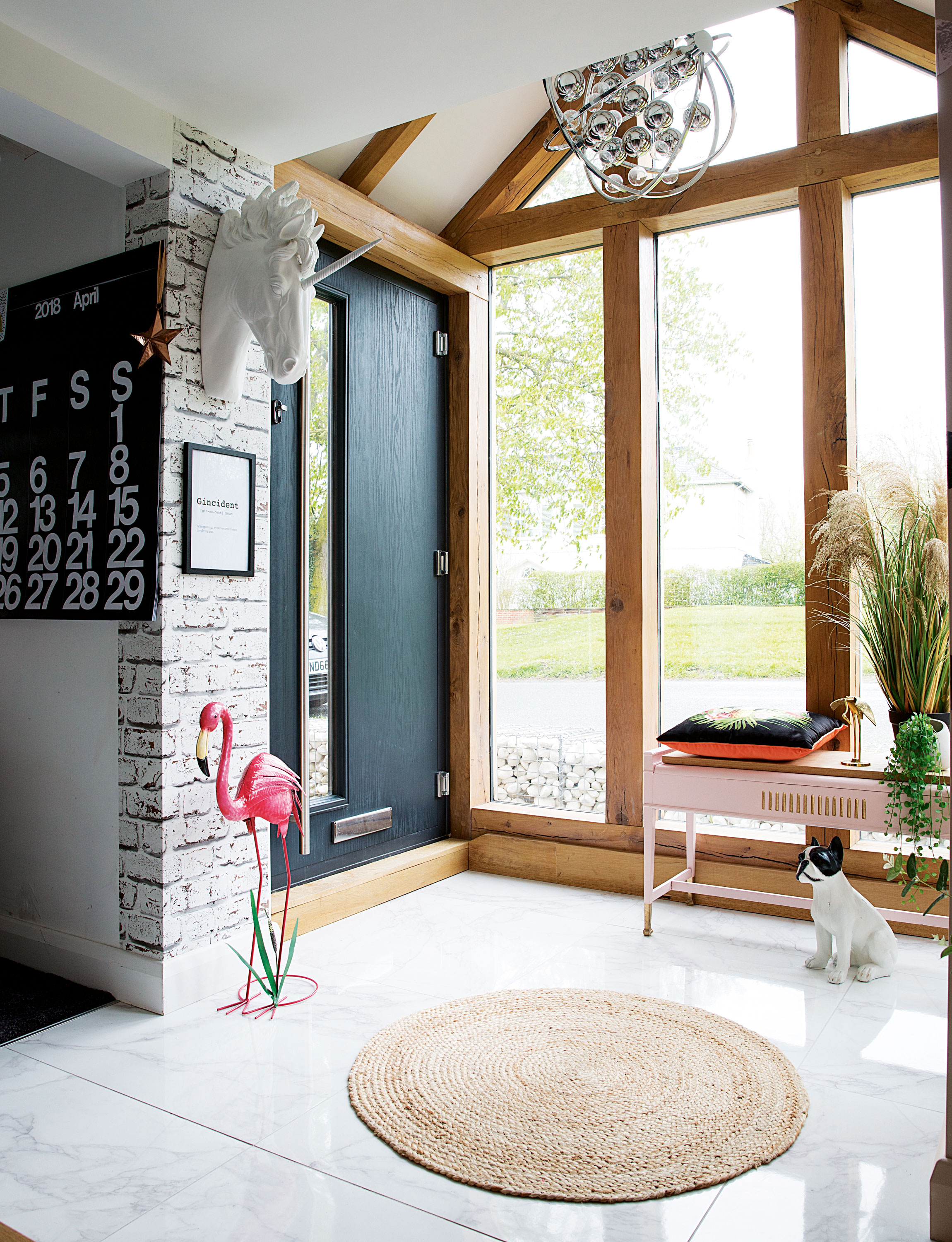
Arthouse rustic brick wallpaper, Homebase. Round jute rug; unicorn head; wall hanging, all Luxeology. For a similar light, try the LED chrome pendant with glass ball detail, Simple Lighting. Arthouse Tropics Amazonia cushion (on bench), Very. For a similar pink flamingo sculpture, try Candle & Blue
MORE FROM REAL HOMES
Get inspiration, ideas and advice straight to your door every month with a magazine subscription.
'My absolute favourite part of the house is the new porch. When it finally went in, I could’ve cried. We used to have a tiny little hall but we were always banging into each other trying to get out the door in the mornings. It was so small, we even had to widen the front door to get the digger inside during the building work.
'We considered relocating the stairs but it would have been too costly, so when we came across Oak by Design at a homes exhibition, we fell in love with its chunky oak framed porches and decided to go for it. It was a big expenditure but we’ve essentially created a large hall out of nothing. We get so many comments from passers by, plus it lets loads of light into the house, from front to back.'
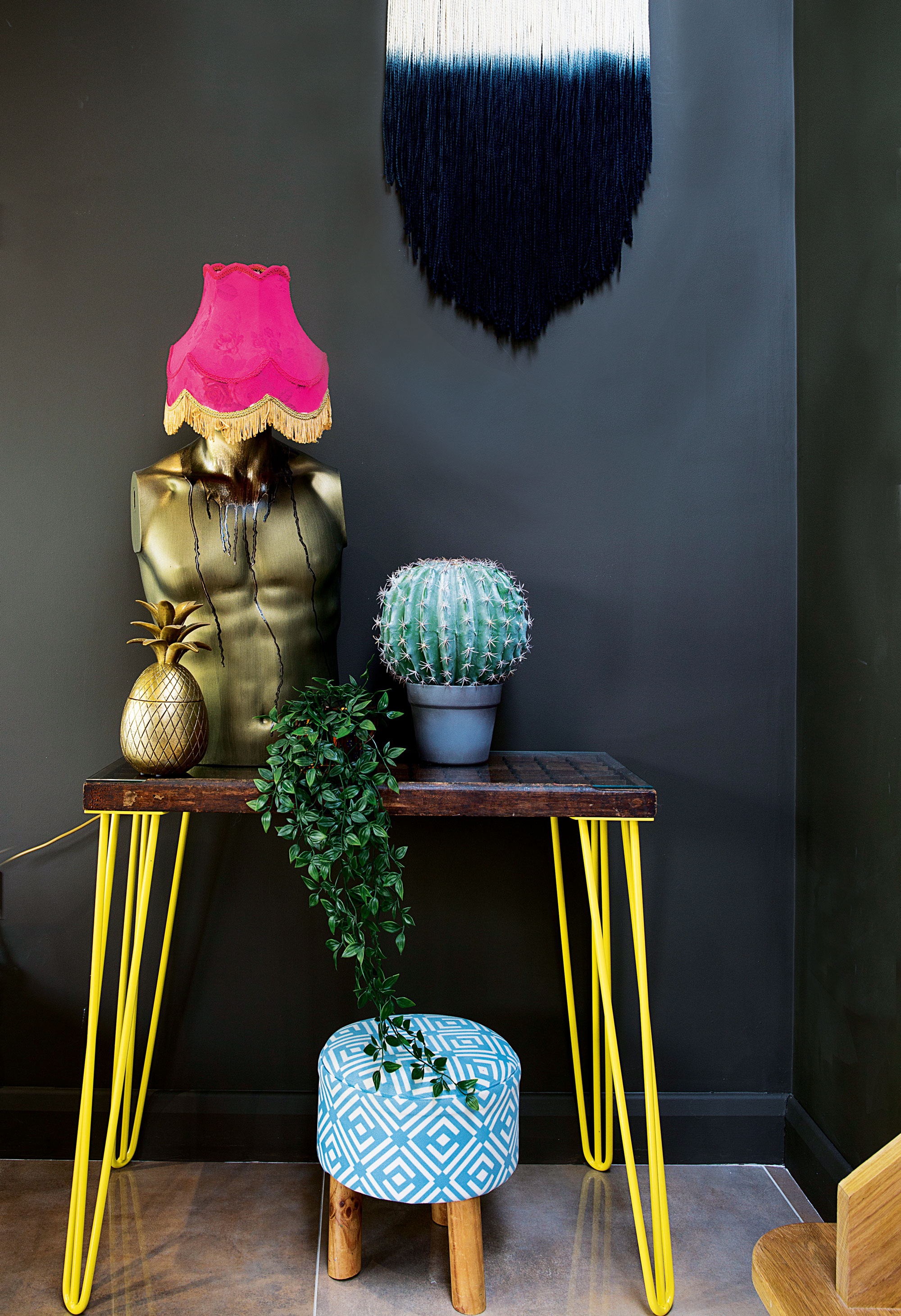
Torso lamp, Muck n Brass. Dip dye wall hanging, Fern Art & Interiors. For yellow hairpin legs, try The Hairpin Leg Co. For similar flooring, try Lounge beige polished ceramic floor tiles, Tons of Tiles
'My style is a bit of bling, a bit of maximalism, and a mix of light and dark colours. The older I’ve got, the more confident I’ve become. I used to hold myself back but now I don’t care what anyone else thinks, so I went for it in our bedroom! I saw the oversized fringe lights on Instagram and loved the idea of them on either side of the bed combined with white fringe curtains.
'The ivy print wallpaper from Rockett St George looked a bit different, and led to a green and ochre colour scheme. Having rented for a while, it’s been liberating to go for it with the decorating.'

Gabriela yellow boho lampshades, The Knotted Touch. Koziel Ivy wallpaper, Rockett St George. Gold cubes wall art; cushions; bedside tables; throw, all Luxeology. For similar curtains, try 247 Curtains
'As having just one tiny bathroom would never have worked when the kids became teenagers, we decided to turn the fourth bedroom into a family bathroom and revamp the horrendous pink 1980s bathroom to use as our en suite instead. It was tricky because of the sloping ceiling, but we managed to fit in a walk-in shower with a black tinted glass shower panel plus a freestanding bath. To begin with, the walls were painted white, but I decided to go dark in here for a cocoon-like feel.'
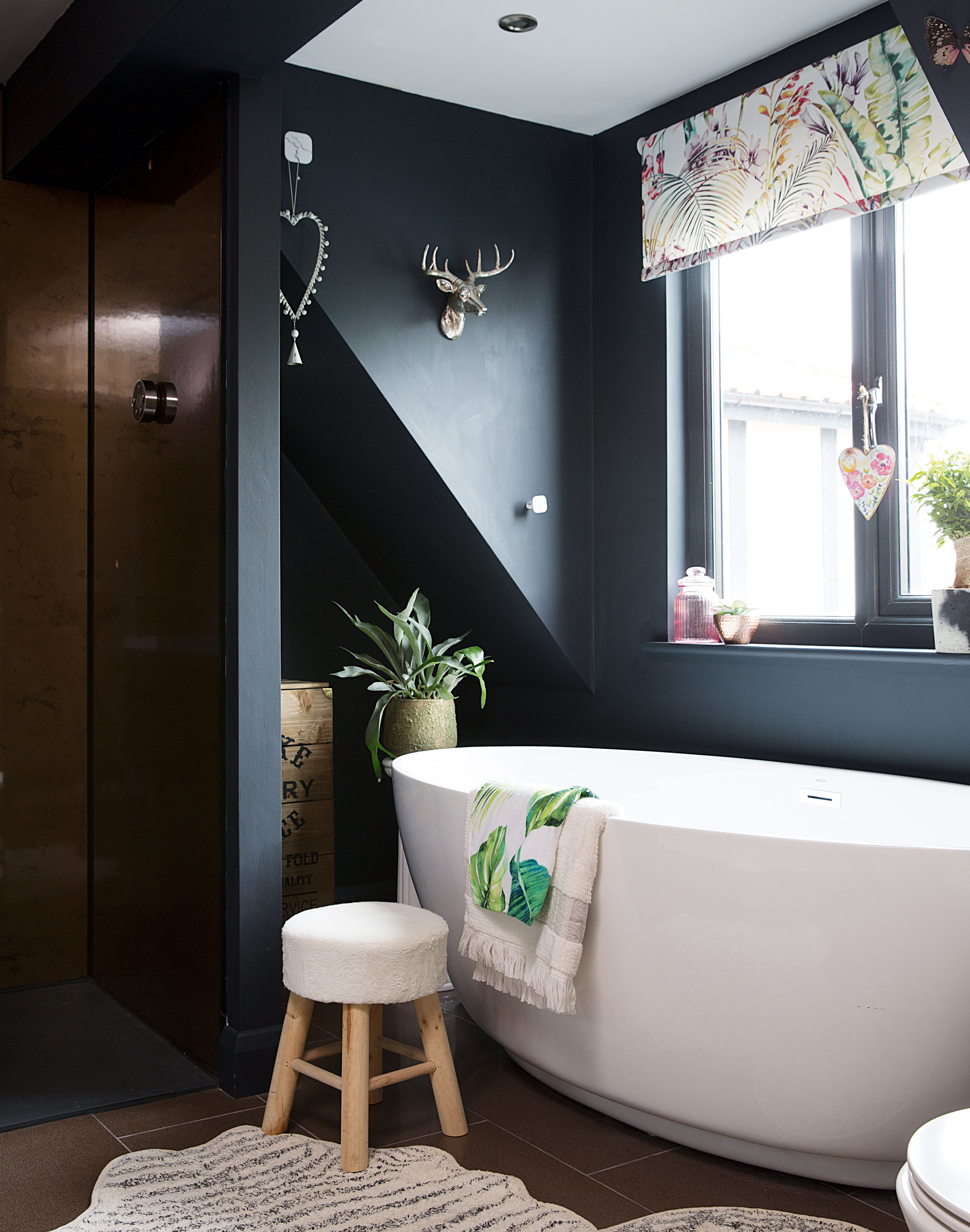
Walls painted in Railings, Farrow & Ball. Shower panel, Aquaglass. Mode Harrison freestanding bath, Victoria Plum. Paradise Flamingo roller blind, Blinds2Go. Small stool, The Range. Zebra bath mat, Luxeology
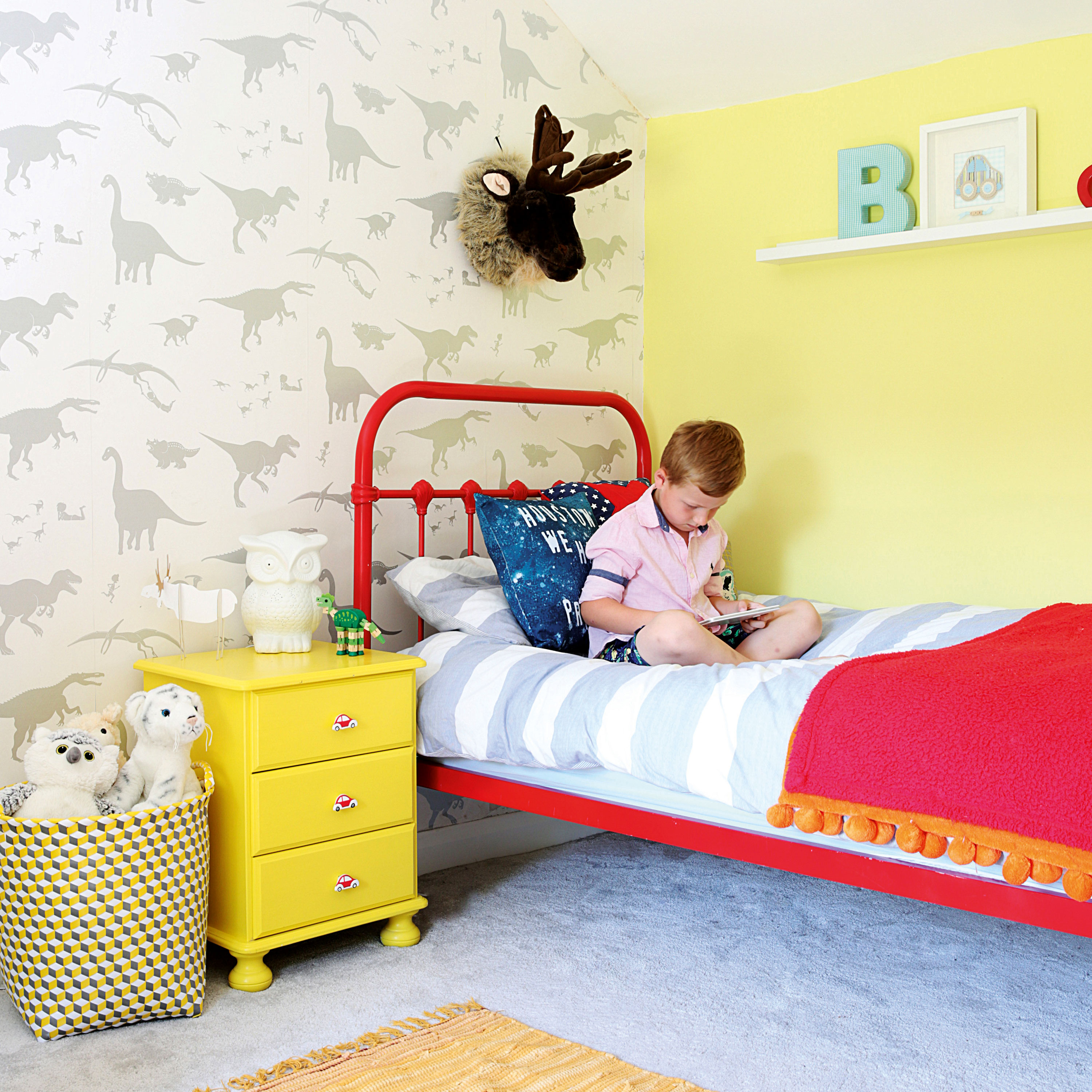
D’ya-think-e-saurus dinosaur paper, Paperboy Wallpaper. For a red bed, try Maisons du Monde. Try Primrose Colours matt emulsion at Wickes for a similar wall paint. For a moose head, try Cuckooland
Contacts
Architect DKS Architects, 01642 715763, dksarchitects.com
Kitchen Wren Kitchens, 0345 127 7008, wrenkitchens.com
Porch Oak by Design, 01423 593794, oakbydesign.co.uk
'After the rewiring, new windows and plastering were finished, I couldn’t wait to decorate the children’s rooms. Dinosaur wallpaper was the starting point in Beau’s bedroom as I wanted something classy and age appropriate but didn’t want the typical cartoons.
'He loves yellow, so I painted his bedside table and added new knobs, which contrasts well with the red accents. But I’m sure it’ll change as nothing stays the same for long in this house!'
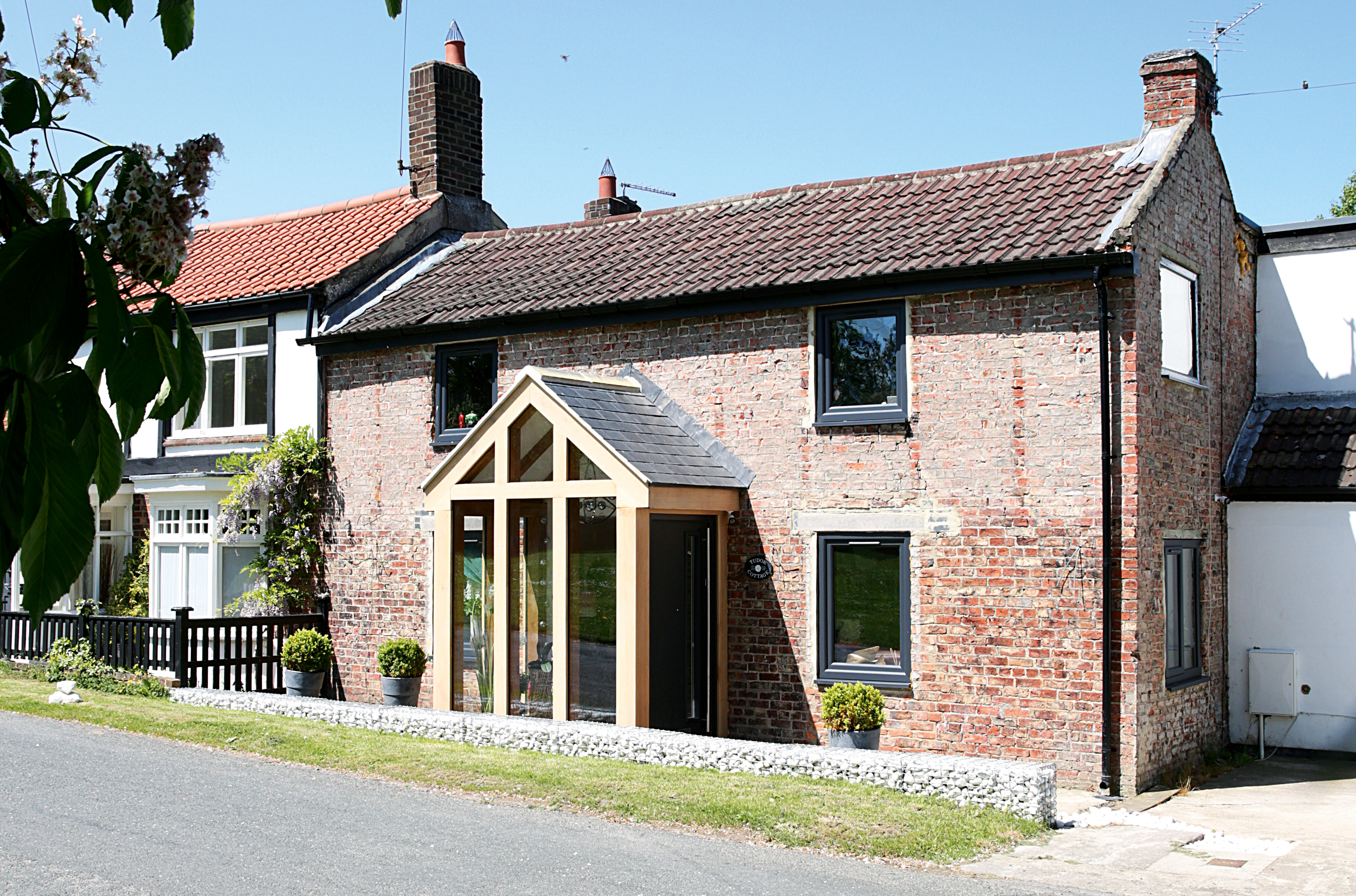
Porch, Oak by Design
More real homes to browse:
- A restored Dutch farmhouse – cute but chic
- An old holiday home becomes a stylish lakeside retreat
- A restored Swedish holiday home brings you Scandi style