Real home: a Mid-century style family home in London
Sara and Ben restored and extended their Victorian terrace to create the perfect home for their family

Profile
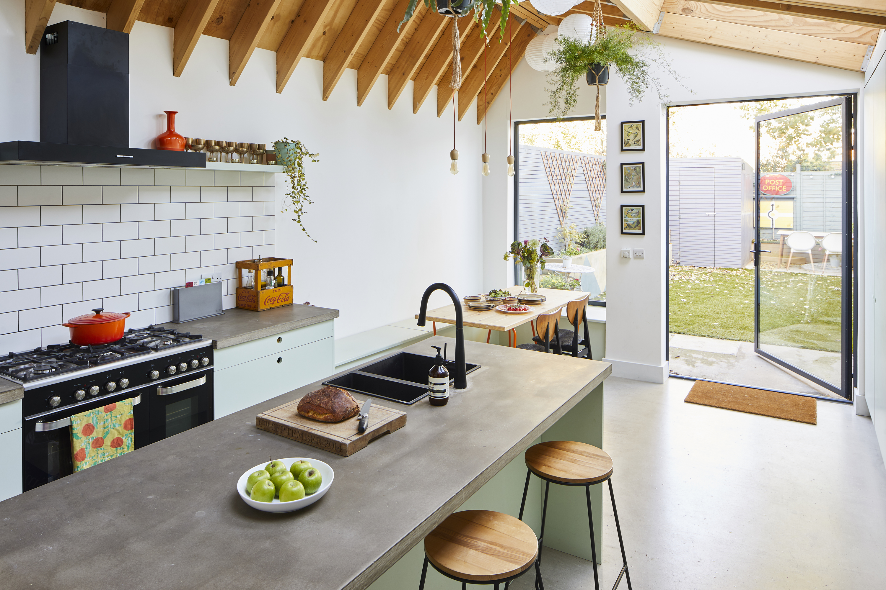
The owners Sara Moody, an architect, lives here with husband Ben, a lobbyist in health tech, and their children, Stanley, three, and Nancy, six months.
The property A four-bedroom mid-terraced Victorian house in Walthamstow, east London.
Project cost £170,000.
Every so often here at Real Homes HQ, we come across a project that makes us stop in our tracks. Sara and Ben’s Victorian terrace does just that with its fresh take on a typical family home. As an architect, Sara’s spent some time developing dream homes for other young families. The result is a toolbox of tips and tricks that she’s used to mastermind her own space.
On a budget of £170,000, they’ve successfully extended upwards and outwards and modernised the layout of the house to create a space that works for their growing household. Opting for DIY cupboards and second-hand furniture has allowed them to go big on architectural features like glazed doors and rooflights. How did they do it? Sara reveals all...
Looking for more inspiration? Browse our real home transformations. Read our guide on renovating a house, too, for more guidance.
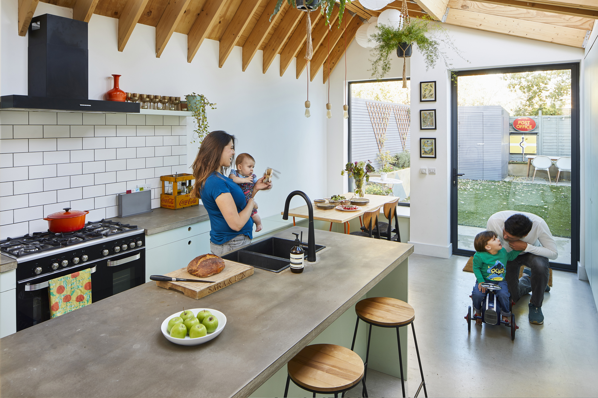
Stools, Homebase. Dining table, Ikea. Pendant lights, Cult Furniture
'I work with a lot of young families on their houses, and the beauty is that you get used to working with this type of property. We wanted to strip everything and bring back the original character.
'The house needed more work than we initially thought – it looked fine, but when you peeled back the layers, it wasn’t okay. We didn’t need planning permission because the house already had a loft conversion, so we could demolish and replace it under permitted development.'
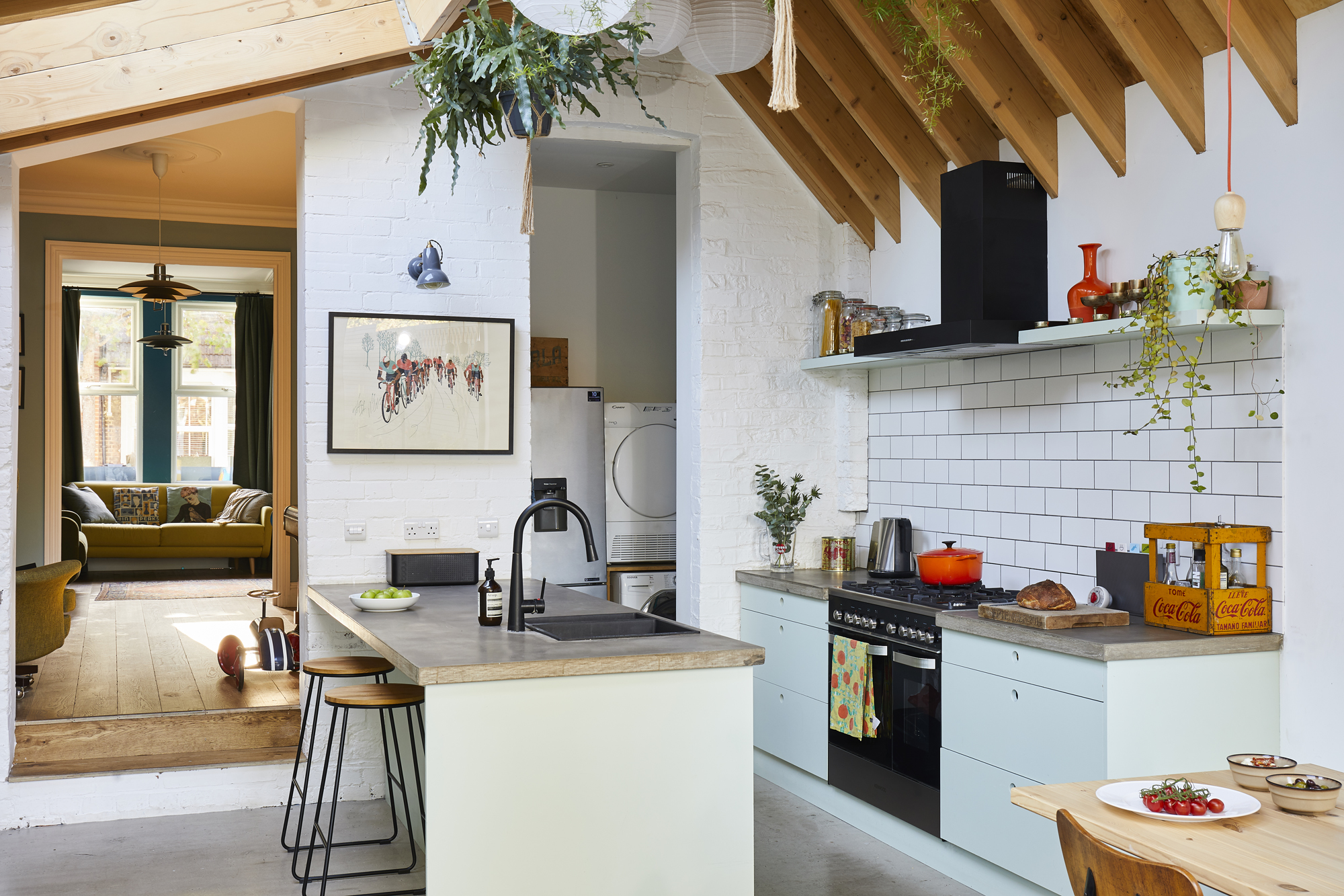
Rooflight, Velux. Kitchen units, Howdens, painted in Cupboard Green, Little Greene. Oven and extractor, Kenwood. Sink, TapsUK. Tap, Taps Empire. Splashback, Walls & Floors
'Because we made use of the Neighbourhood Consultation Scheme, we were able to build a larger rear extension than is normally allowed under permitted development, too.'
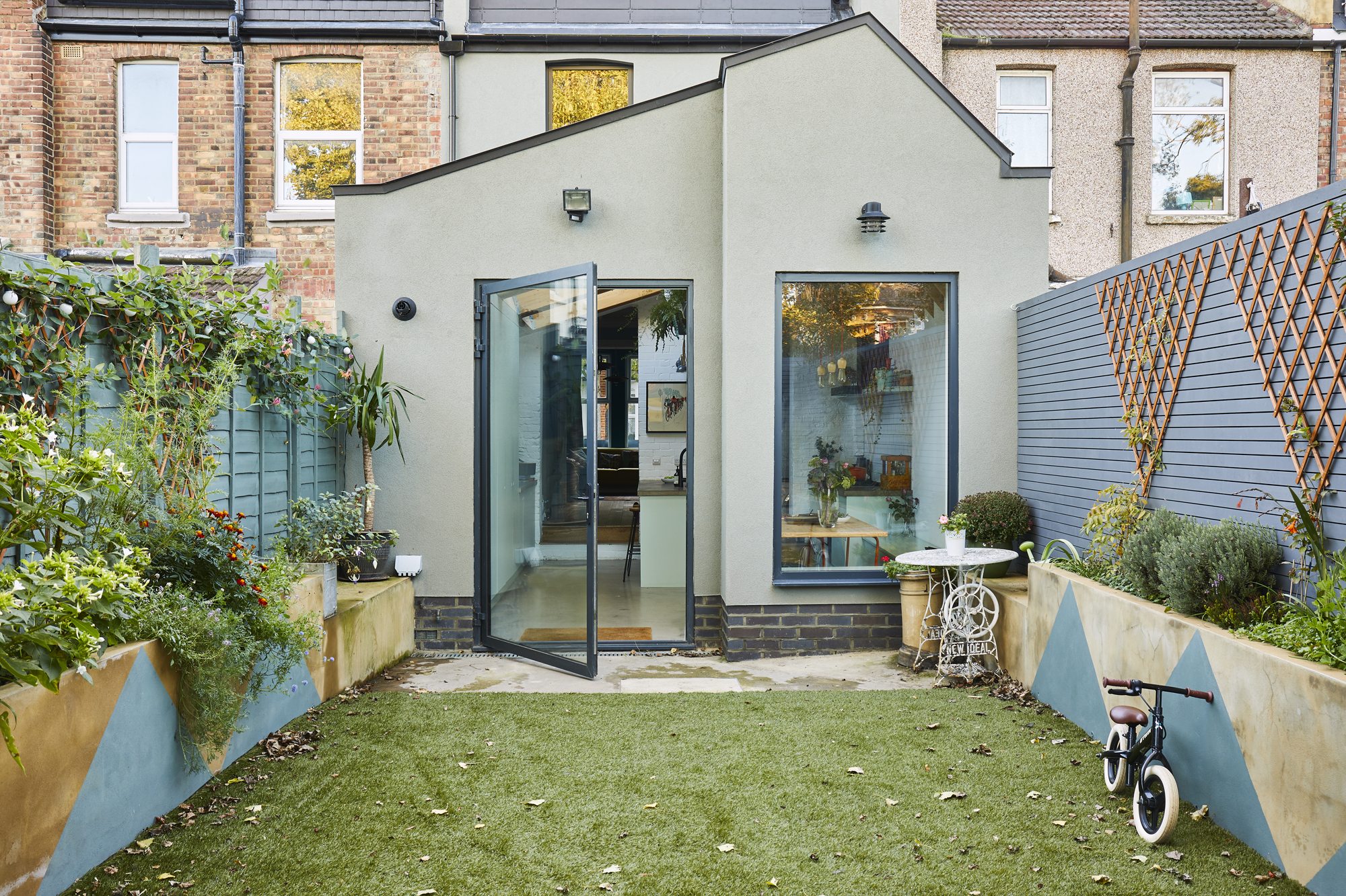
'We wanted the original part of the house to feel traditional, but I thought we should make it clear that the kitchen extension and the loft were new and different.
Get small space home decor ideas, celeb inspiration, DIY tips and more, straight to your inbox!
'I use our house to test ideas, like the exposed joists. We could have played it safer but we wanted to show the structure.'
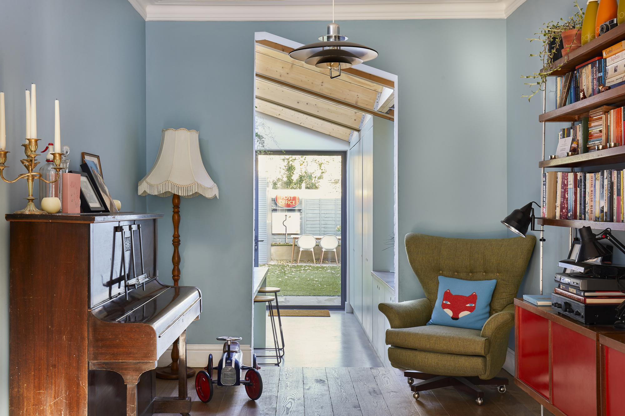
Vintage Clive Latimer sideboard, Heal’s. Armchair, G-Plan. Fox cushion, Donna Wilson. Ceiling light, John Lewis & Partners. Floorboards, Havwoods. Walls painted in Blue Reflection, Dulux
Subscribe to Real Homes magazine
Like what you see? Get inspiration, ideas and advice straight to your door every month with a magazine subscription
'We wanted to get the biggest rooflights we could, and Velux was the most affordable option. To fit them in and bring as much light as possible into the existing part of the house, the roof structure had to be bigger on one side.
'It divides the space well – the steeper angle is where the kitchen-diner area is. It also meant we could maximise height as much as possible. If we’d had a flat roof, we would have been restricted to three metres.
'We often have the doors between this room and the living room open to create one space. At night, we can shut them to be cosy in the front room. In a way, this room is a kind of transition into the family space. We fancied ourselves being sophisticated with the piano and the books, but in reality, it’s turned into more of a playroom – a sort of overspill from the kitchen.
'The sideboard was a client’s mum’s – they sent an email round asking if anyone was interested, and I was like, “Me!”. It’s a beautiful 1950s piece from Heal’s. I hadn’t seen one like it before. Ben and I both like old things as well as Ikea practical touches. It’s nice to have pieces with a story.'
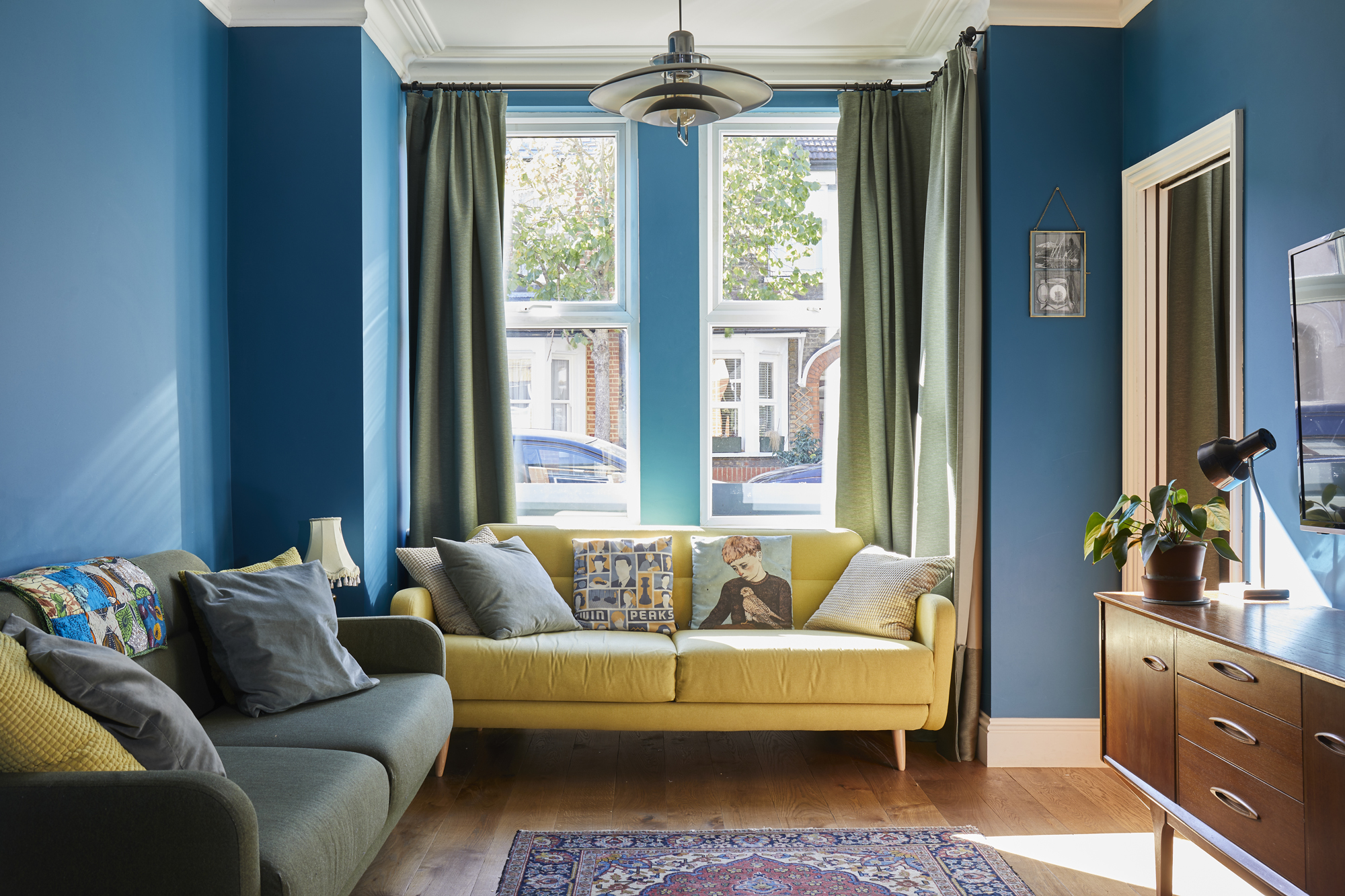
Walls painted in Teal Tension, Dulux. Flooring, Havwoods. Rug and Jentique sideboard, Ebay. Cushions, Ikea and Society6. Sofas, Habitat. Pendant, John Lewis & Partners. Curtains, Ikea
'It might have been sensible to go for white for our darker front room, but we wanted to have a more traditional sitting room. Darker colours were used more in Victorian design, so we opted for rich hues. I don’t think it makes the room feel any smaller.
'We added the ceiling roses and cornices, and the space certainly feels grander than before. We spend some time in here as a family because it’s the only room with a TV in it, but generally it’s a grown-up living room to retire to in the evening.'
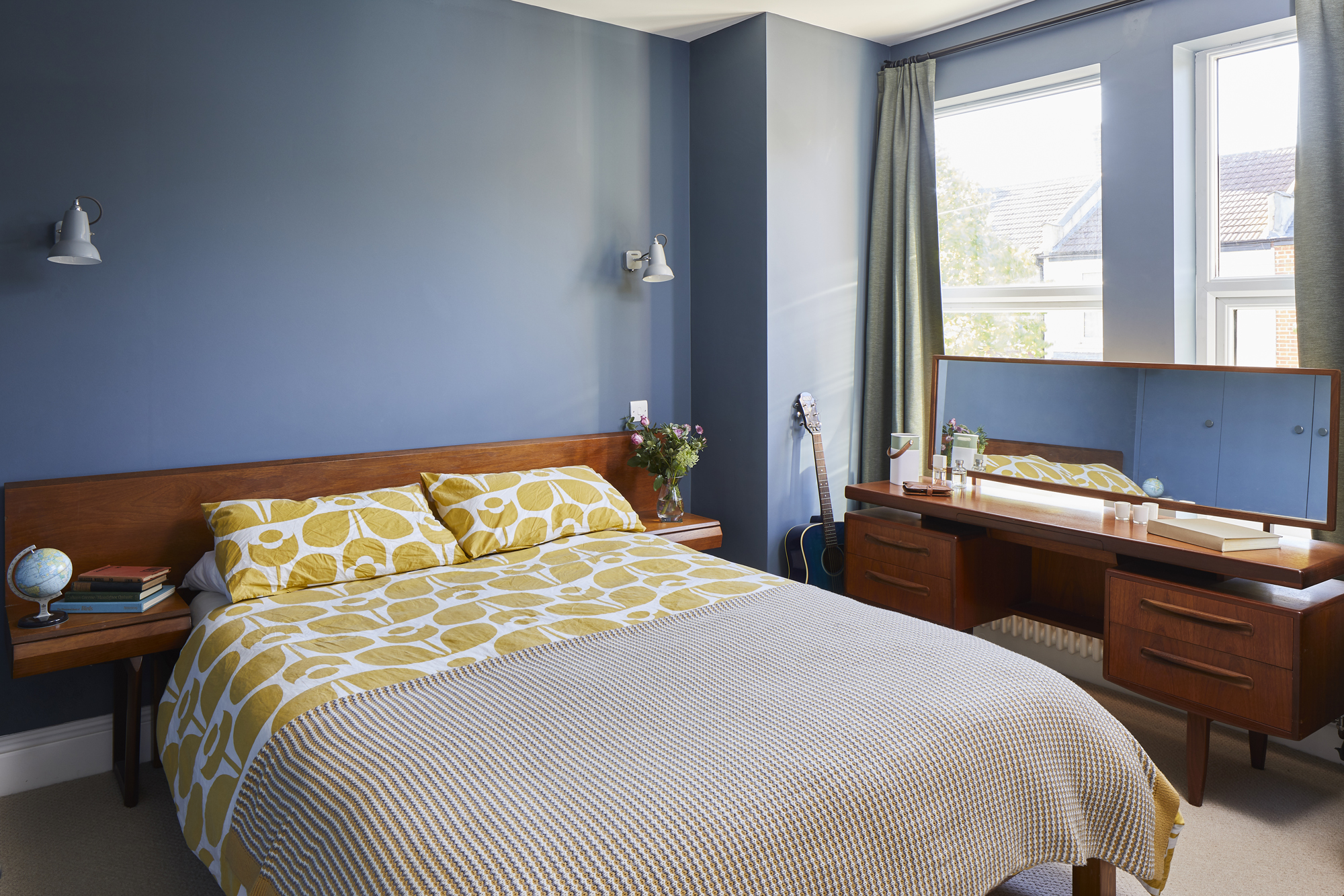
Walls painted in Steel Symphony 1, Dulux. Carpet, Hackney Flooring. Curtains, Ikea. G-Plan dressing table, mirror, headboard and side tables, Ebay. Wall lights, Anglepoise. Bed base, Warren Evans. Bedcovers, Orla Kiely
'Ben and I love mid-century furniture and our bedroom reflects that. We moved the position of the doors in both bedrooms to accommodate built-in wardrobes. We bought the headboard from Ebay and used that as our starting point for the scheme.
'I always wanted a dressing table, and I was thrilled to find this one on the site, too. It’s quite a grown-up room – it’s traditional with darker colours, but with a mid-century touch thrown into the mix.'
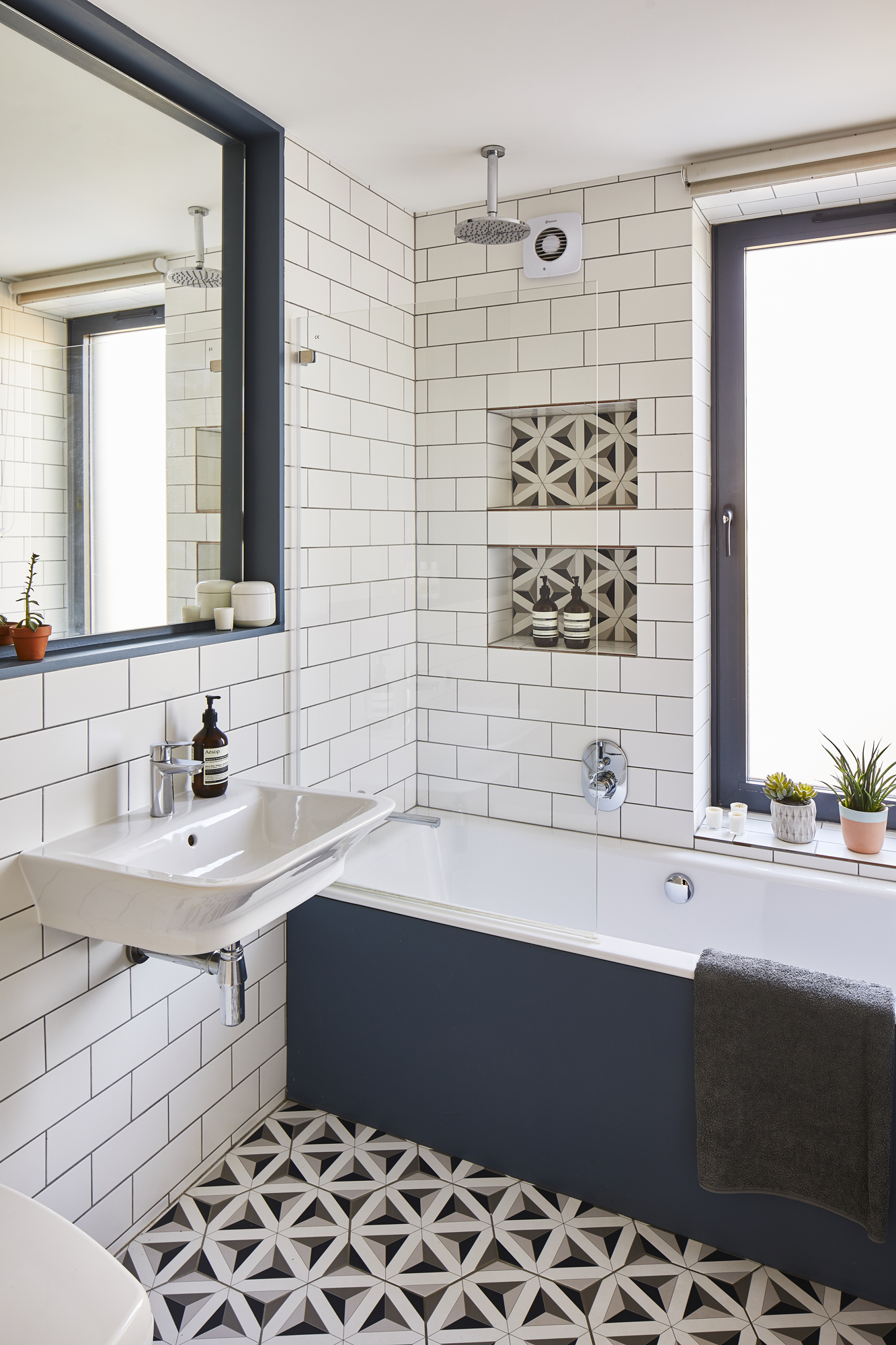
Wall tiles and flooring, Walls & Floors. Mirror surround and bath panel painted in Steel Symphony 1, Dulux. Bath, Bette. Showerhead, Bathrooms.com. Sink, Roca. Tap, Grohe. For similar planters, try Not on the High Street
'We had to move a wall to allow us to reposition the bedroom doors, so we took some space off the bathroom. We changed the window for a bigger one, and opted for 1930s touches in the rest of the space – we love strong patterns and geometric shapes, which is why we chose hexagonal floor tiles and bold colours.'
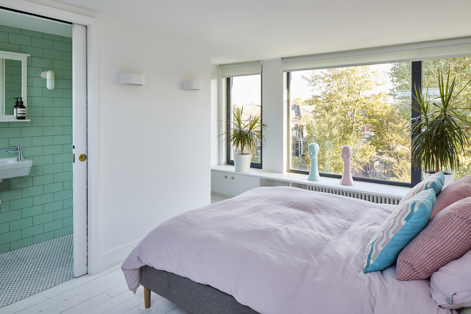
'This bedroom was intended to be the master bedroom, but while the kids are little, we want to be on the same floor as them. We designed the space before we knew what it was like to have two kids!
'Instead, the family stays here when they come to visit, or one of us will come up here if we’re desperate for a good night’s kip – it’s like being on a short but much-needed holiday.'
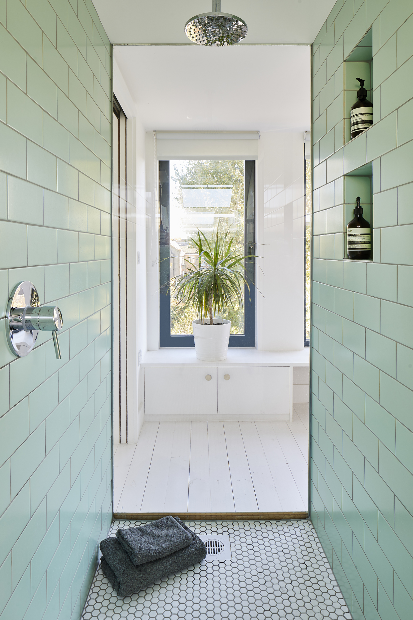
Wall tiles and flooring, Walls & Floors. Showerhead, Bathrooms.com. Thermostat and tap, Grohe
'Ben picked the tiles for the loft en suite. He’s a good Yorkshireman and a “wheeler dealer”, so he went off to find something we could afford based on what I said I liked. We loved the peppermint colour, and to make it feel less like a separate bathroom, we added peppermint touches in the bedroom, too.
'There’s glass at the end of the shower and you can see all the way out. It’s a bit more grown up than other areas of the house – it feels a little like a boutique hotel.'
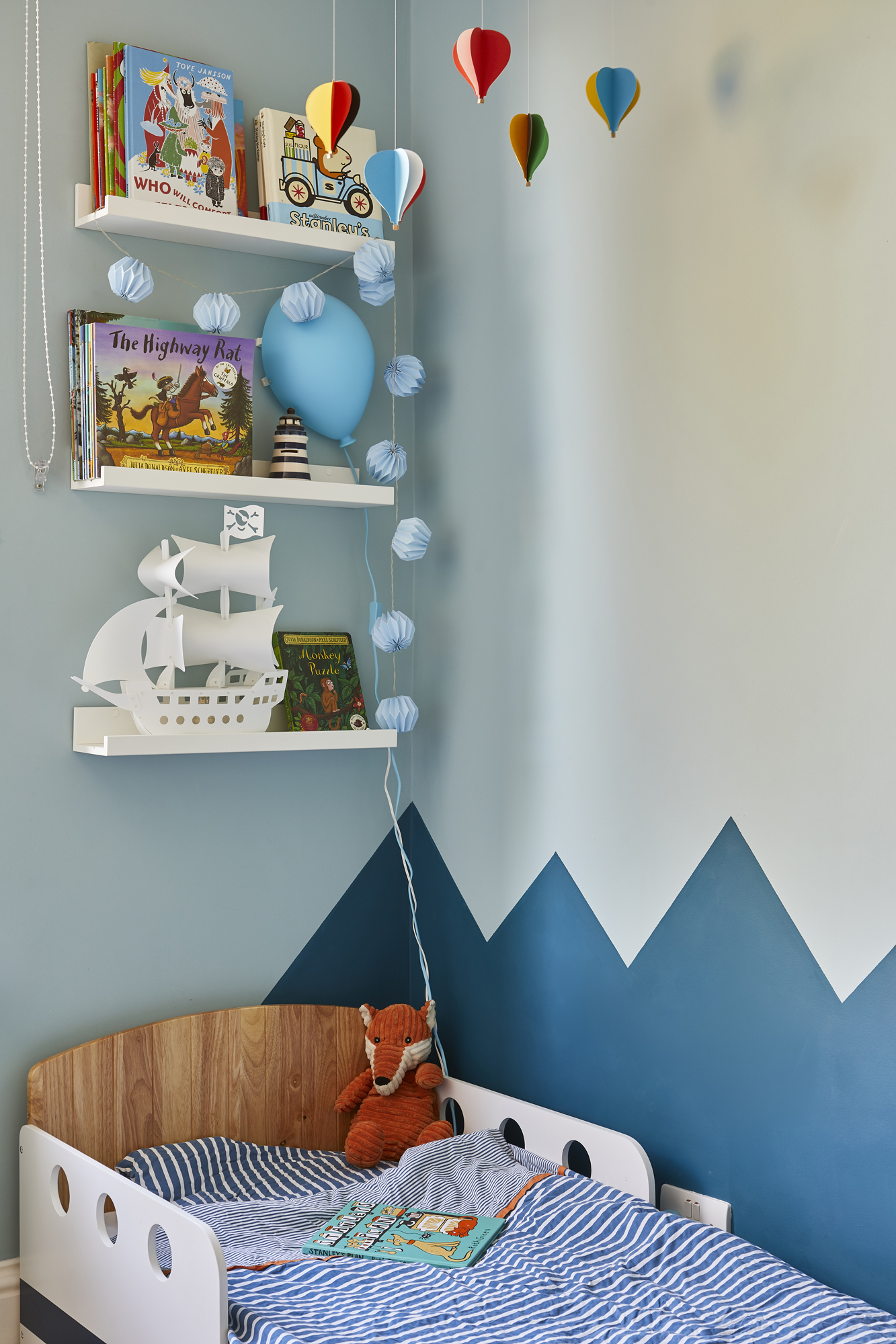
Walls painted in Blue Reflection and Teal Tension, Dulux. Teepee, KidKraft. Carpet, Hackney Flooring. Cupboards, Ikea
'Stanley’s room has geometric waves painted all the way around it. The sea theme came after we bought him a bed shaped like a boat. It was the first thing we bought for the room – we were trying to make bedtime more fun. He never talks about it as his bed, instead he says, “I’m going to my boat”. The scheme developed from there.'
Contacts
- Architect Shacklewell Architects
- Door Maxlight
- Windows Perfect Crystal Windows
- Structural engineer Constant Structural Design
More gorgeous homes to browse:

Formerly deputy editor of Real Homes magazine, Ellen has been lucky enough to spend most of her working life speaking to real people and writing about real homes, from extended Victorian terraces to modest apartments. She's recently bought her own home and has a special interest in sustainable living and clever storage.
