Real home: a 1930s semi redesigned for open-plan family living
Turning several rooms into one big space has unlocked the potential of Amanda and Lee Nicholson's home
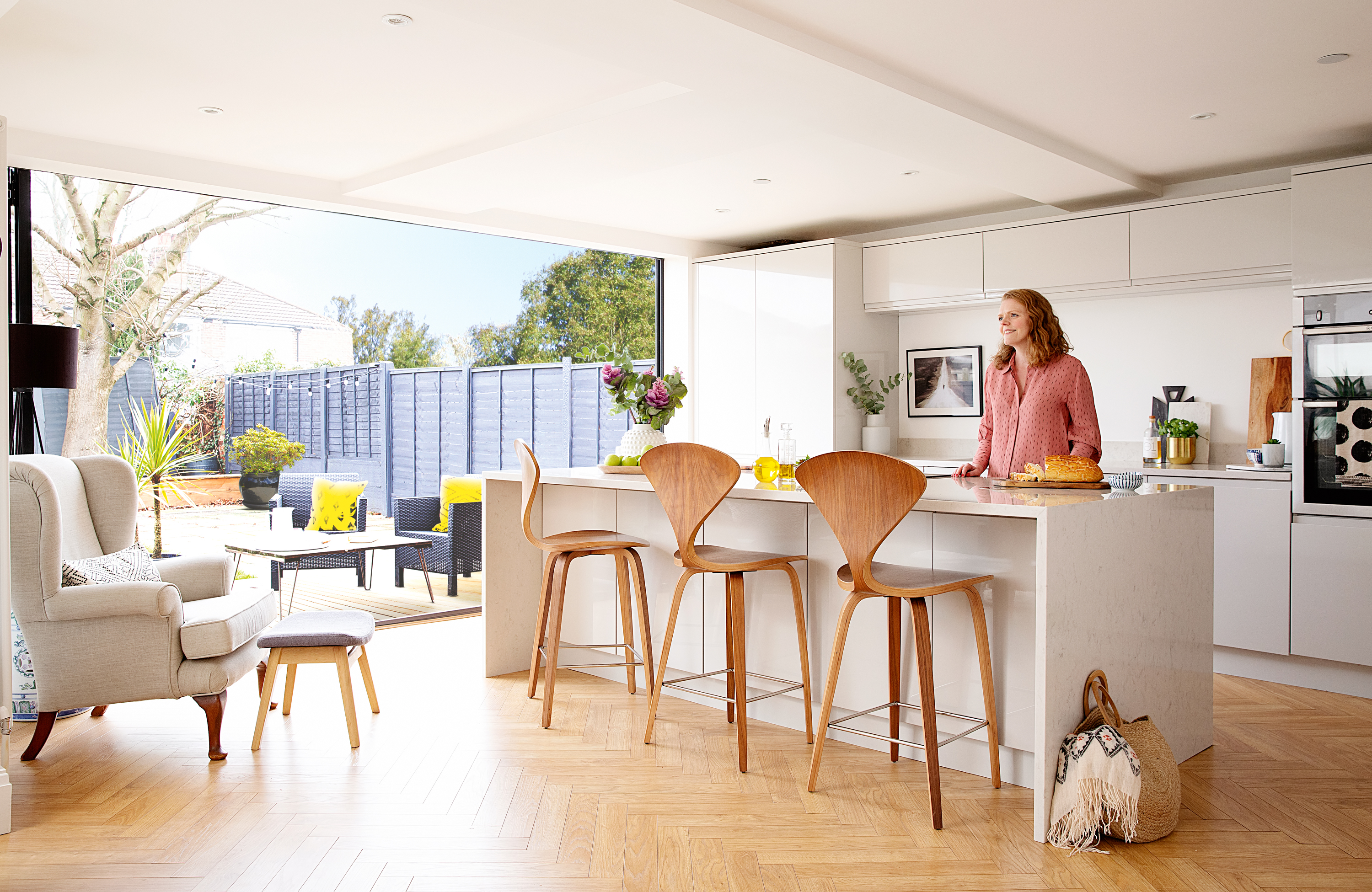
Knocking several rooms together rather than extending is one of those satisfying home improvements that gives you the most bang for your buck – as first-time buyers Amanda and Lee discovered.
The couple have transformed the three-bedroom 1930s semi they bought in 2013 simply by opening up the reception room, galley kitchen and dining room at the rear. They’ve also gained two separate cosy snug spaces by converting the garage into a cinema room and erecting a wall between the front lounge and rear reception room.
Read on to discover how Amanda transformed her home. Need more renovation inspiration? Check out all our real home transformations, and read our guide on renovating a house, too, for more guidance.
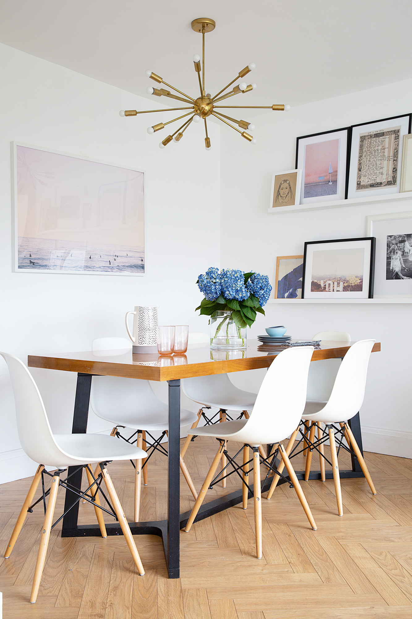
Dining table, Habitat. For similar replica DSW Eiffel chairs, try Swivel UK. For a similar ceiling light, try the Sputnik chandelier from Beautiful Halo. Max Wanger screensaver print, Design Love Fest
Although Amanda splashed out on worktops, taps and bi-fold doors, she’s saved a bundle by upcycling furniture, finding Ebay bargains, downloading free artwork and buying replica design classics. Making things look more expensive than they are – for instance, by adding skirting boards to Ikea bookcases – adds a designer feel on a budget.

Kitchen units, Richard & Richards of Stockport. Lagoon Silestone worktops, Cosentino. Norman Cherner-style stools, Swivel UK. Oak laminate flooring, RGN Flooring Supplies. Oven, Neff. Border #8 print by Michael Rovner, free download from The Metropolitan Museum
'After viewing 28 properties in a week, this house really stood out. It had been extended and we knew it could be knocked through to make a fantastic open-plan space. We decorated when we first moved in, but we had to save up for a few years before tackling the big ticket structural work.
'Originally we were only going to knock down one wall between the galley kitchen and dining room, but the longer we lived here we realised it would make sense to knock all three rooms together at the back.'
'We considered lots of different layouts to fit in a kitchen island, dining table and seating area. After getting three quotes from builders that friends had used, we hired 9Point8 Construction for the three-and-a-half month project and chose a simple light gloss handleless kitchen.
Get small space home decor ideas, celeb inspiration, DIY tips and more, straight to your inbox!
'We went slightly over budget because I wanted quartz worktops with a particular graining that looks like Carrara marble. The samples were too small to get the full effect, so we even visited the Cosentino factory in Manchester to see the large slabs before they were cut.
'One of the kitchen walls is slightly diagonal and I was concerned that engineered oak planks would emphasise the odd angle. After several sleepless nights, I decided a herringbone design would disguise it. It’s now one of my favourite things about the kitchen.'
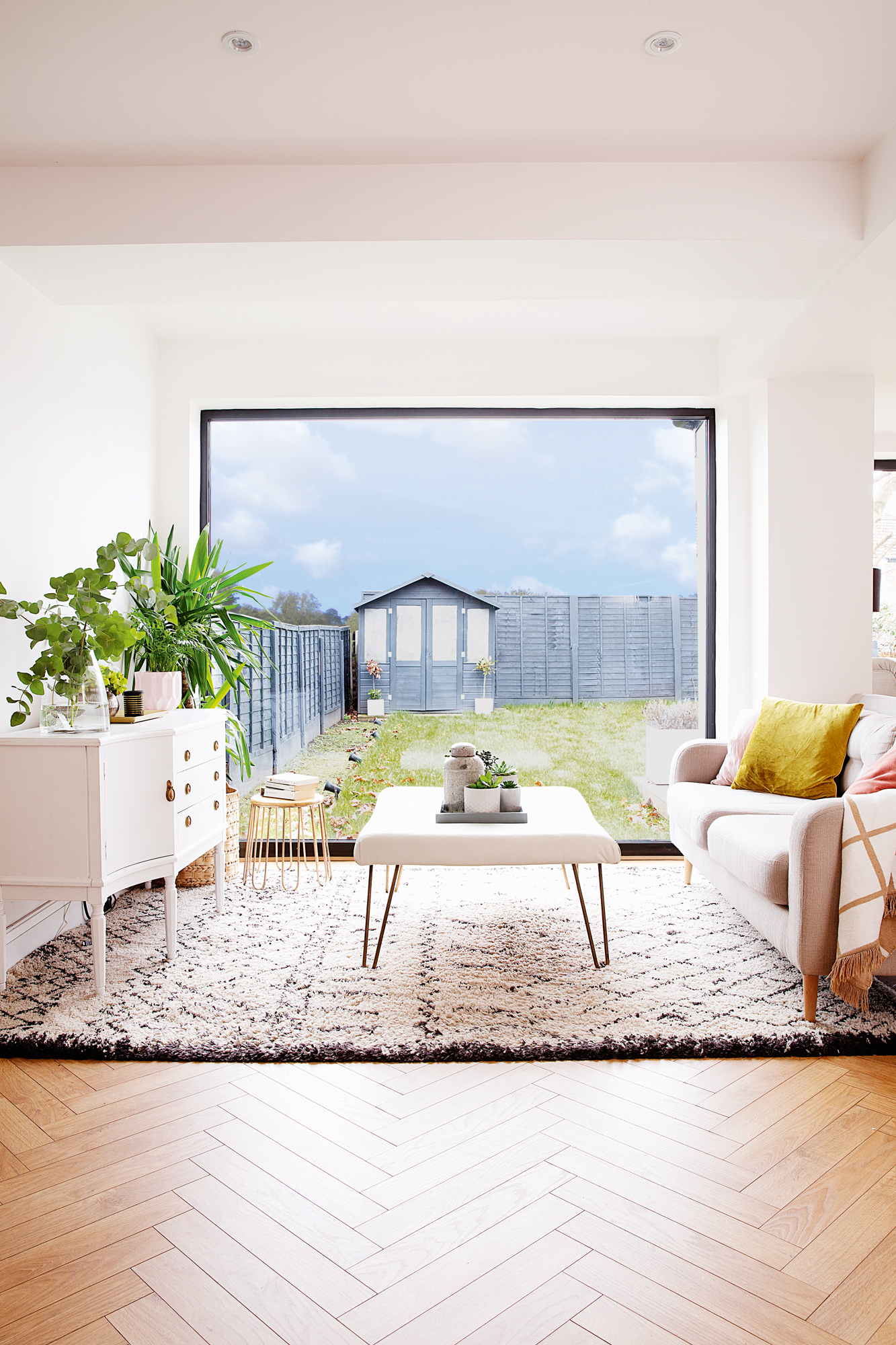
Try the tasselled hairpin bench, Cox & Cox, for a similar look. Sofa, Sofology. Rug, La Redoute. Floor lamp, Ikea. Check throw, HomeSense
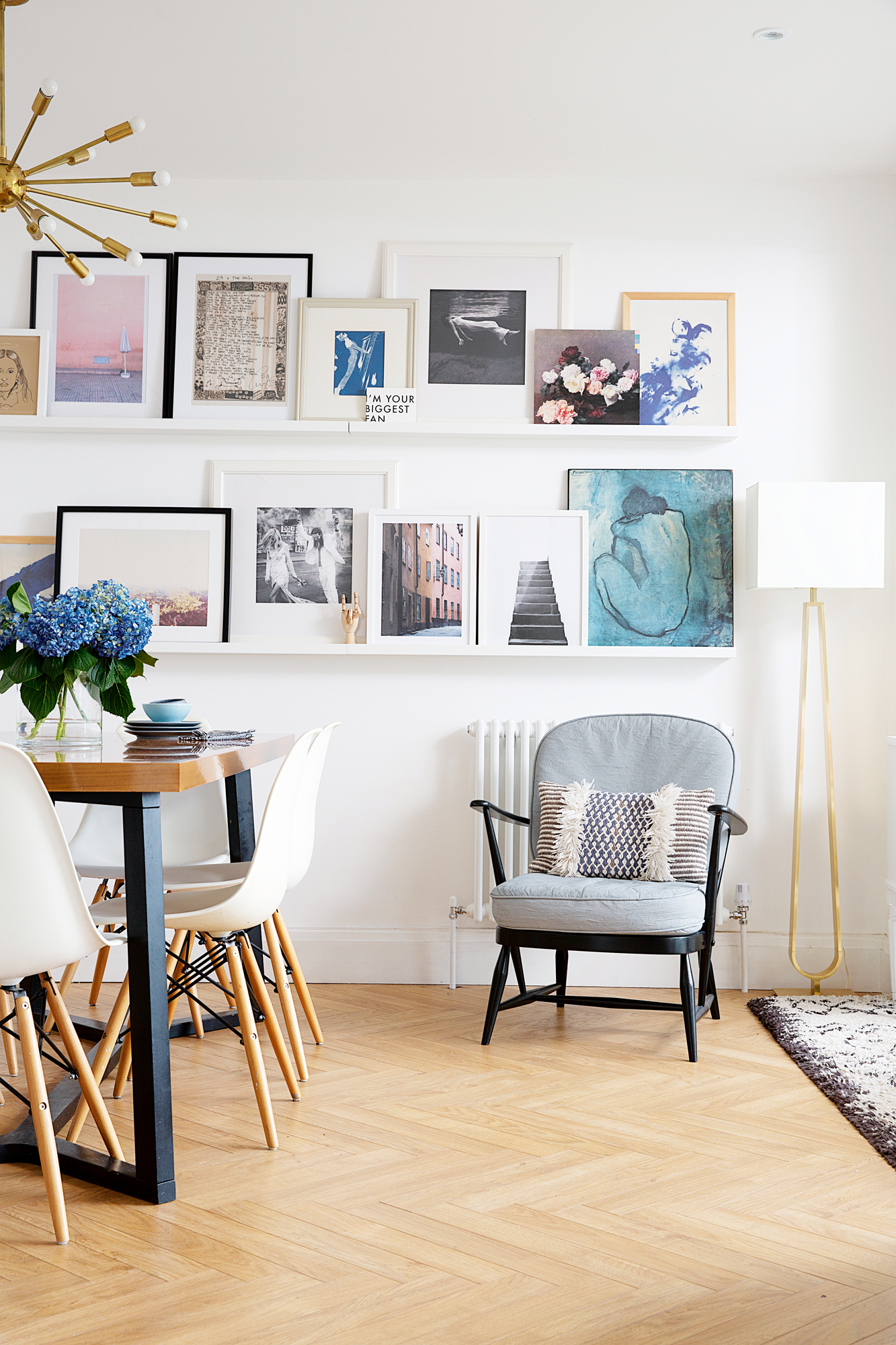
'My gallery wall features lots of bargain artwork that’s free or low cost. Some pieces are from charity shops or car boot sales, mixed in with posters from online retailers like Desenio. I love using postcards or vinyl LPs – like the floral picture, which is a New Order album cover. Having one or two colours that tie the art together creates a consistent thread – I’ve gone for pink and blue – and different coloured frames makes sure it’s not overly uniform.
'This room features my favourite thing in the whole house – a replica Sputnik light I bought on Ebay. It’s a place holder until I win the lottery and can buy an original!'
'Because we have bi-fold doors by the kitchen, we didn’t need another access point to the garden so we decided to replace the two old aluminium patio doors with one big square picture window. It gives a lovely view of the garden, which we worked so hard on last summer. We finished it all just in time for my 40th birthday party.
'There are a few upcycled pieces here. The sideboard from Ebay was painted white and I made the DIY coffee table from wood covered with foam and leather, then finished with hairpin legs from Amazon.
'I’m a real advocate for standard white paint so I’ve gone for Dulux Brilliant White everywhere. People worry about how paint will work with different light in different rooms, but I’ve never found that to be an issue. It never looks cold if you layer it with lots of soft furnishings, artwork and plants.'
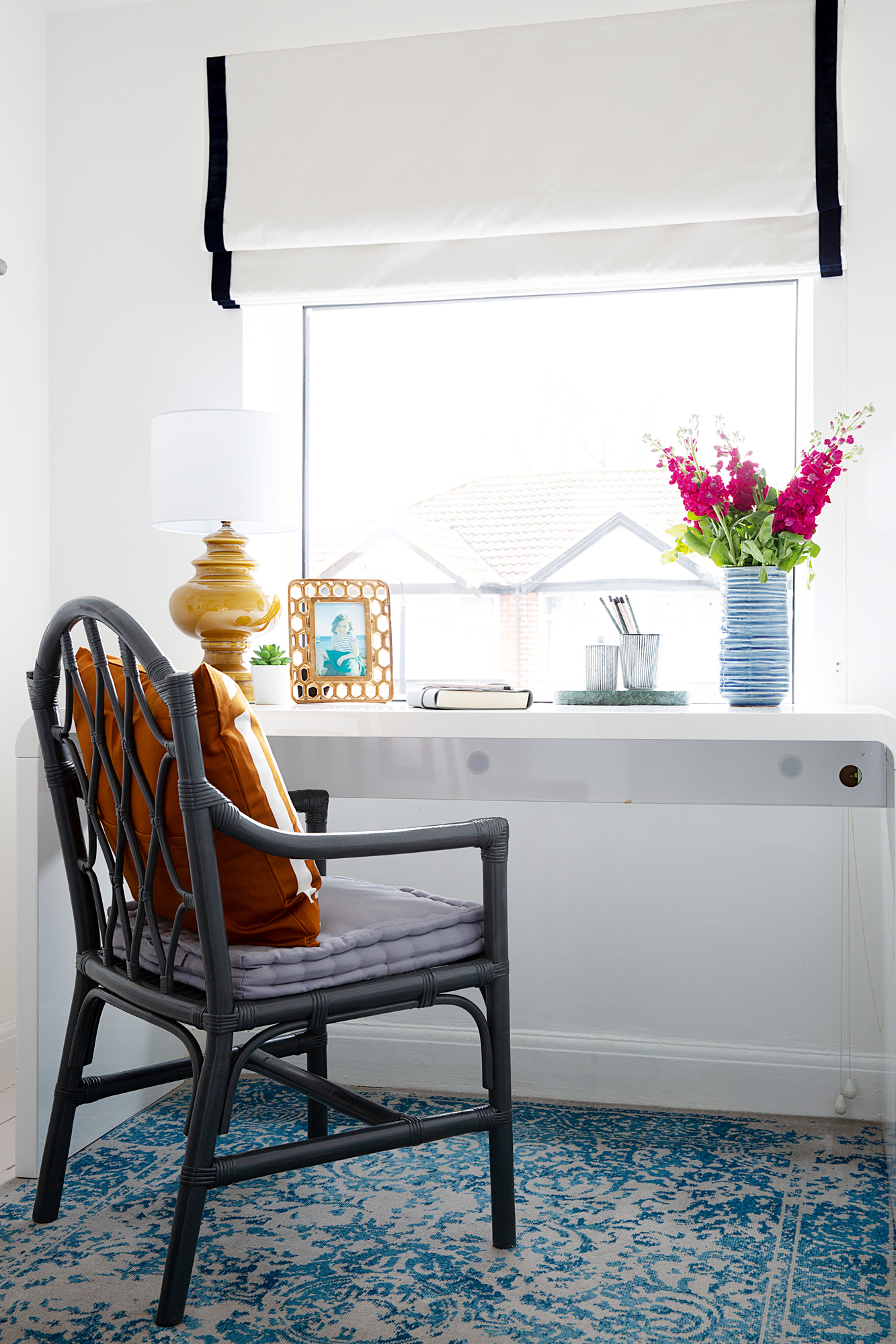
Desk, Dwell. Blind, John Lewis & Partners. Rug, Benuta. For a similar chair, try the Pia armchair, Tikamoon
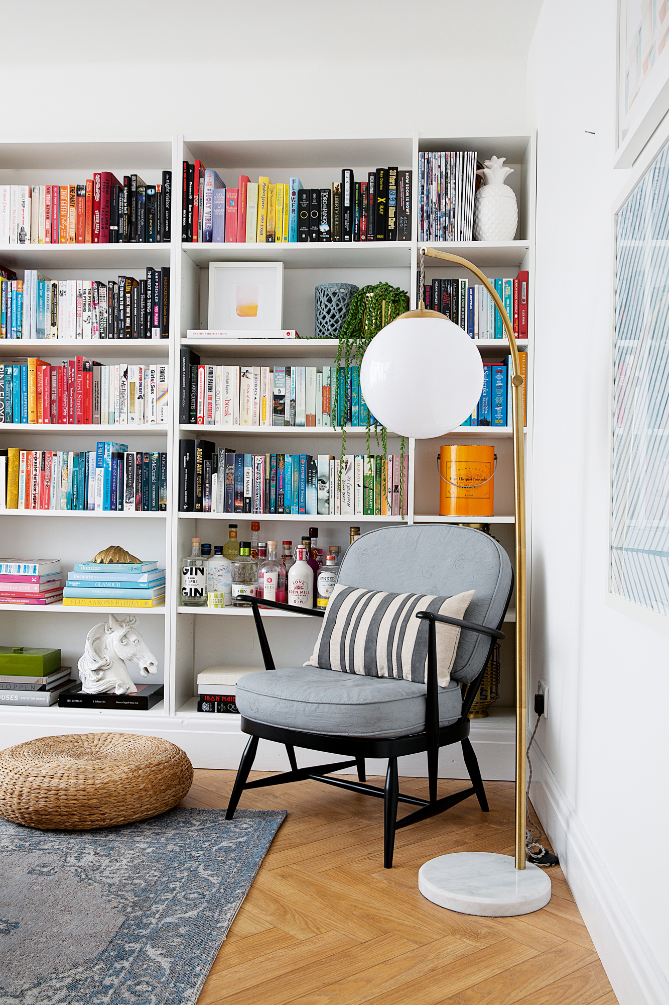
'The front living room used to be open to the reception room at the rear, but we felt it was a good idea to have a separate living space. In reality though, this room gets used less because we live in the new family kitchen-diner most of the time. To make it more useable, we replaced the dividing wall with Crittall-style windows so it feels more open plan but is still separate.
'I love the Ikea bookcase my dad fitted across one wall. We added skirting boards along the bottom so it looks like a bespoke design. The Ercol chair is one of a pair that I’ve revamped with black paint on the woodwork and grey upholstery.'
'Because I sometimes work from home, I wanted a nice light, bright feel in the front bedroom with an elegant look. It’s quite a small room so the rug almost fills it and feels like a luxurious carpet.
'I can’t resist adding my own twist to things, so I put blue velvet trim on the blind, painted a unit behind the door and spray painted the chair, which I bought on Ebay.
'I’m also a big lover of second hand bargains. The lamp is from a charity shop and so are three pictures from a Mark Rothko art book, which I put in Wilko frames and hung up opposite this desk.'
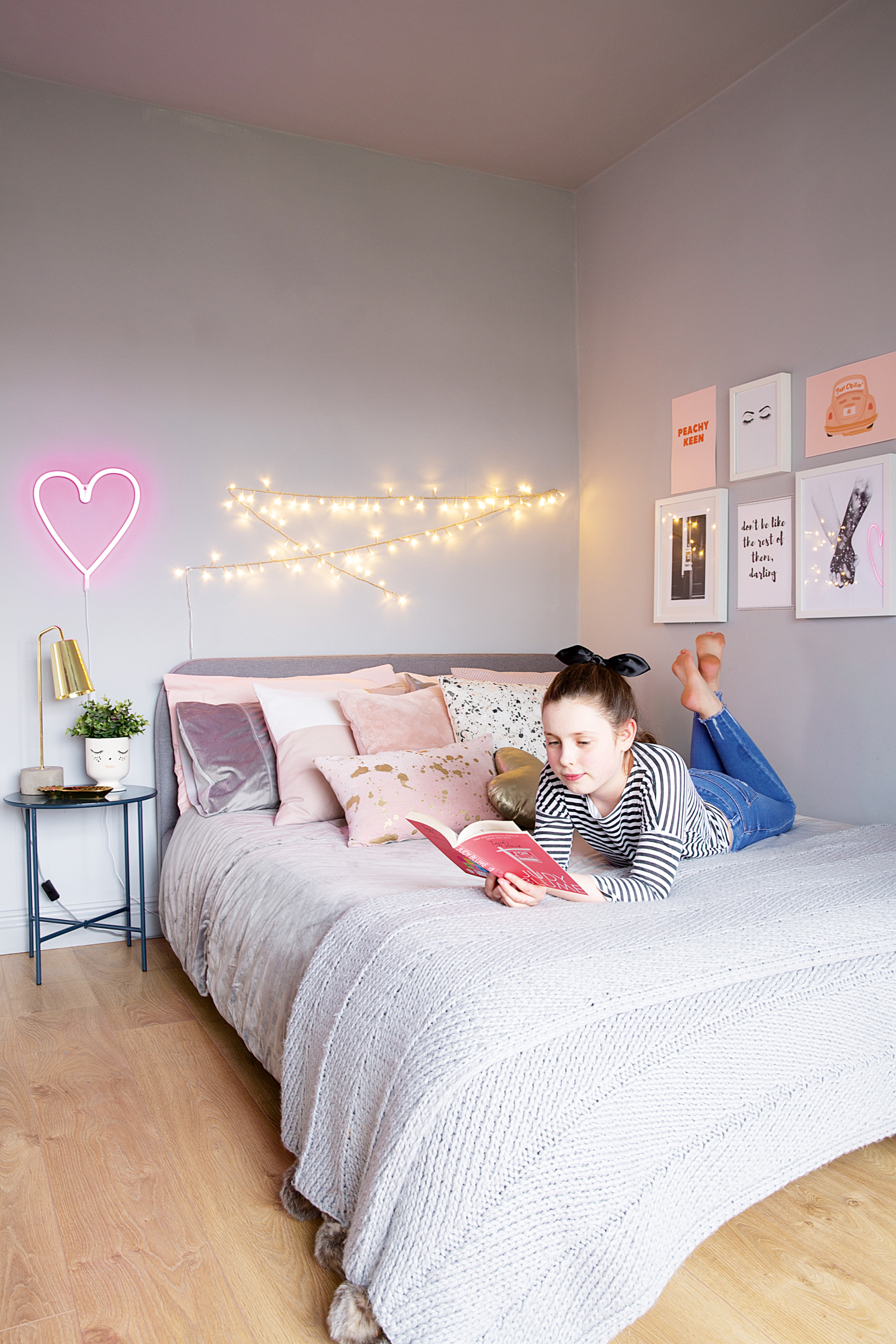
Walls painted in Chic Shadow, Dulux. Bed, Beds.co.uk. Bedside table, Sostrene Grene. Neon heart light, Trouva. String lights, Tesco. Cushions, H&M Home and Oliver Bonas. Bedside lamp, HomeSense
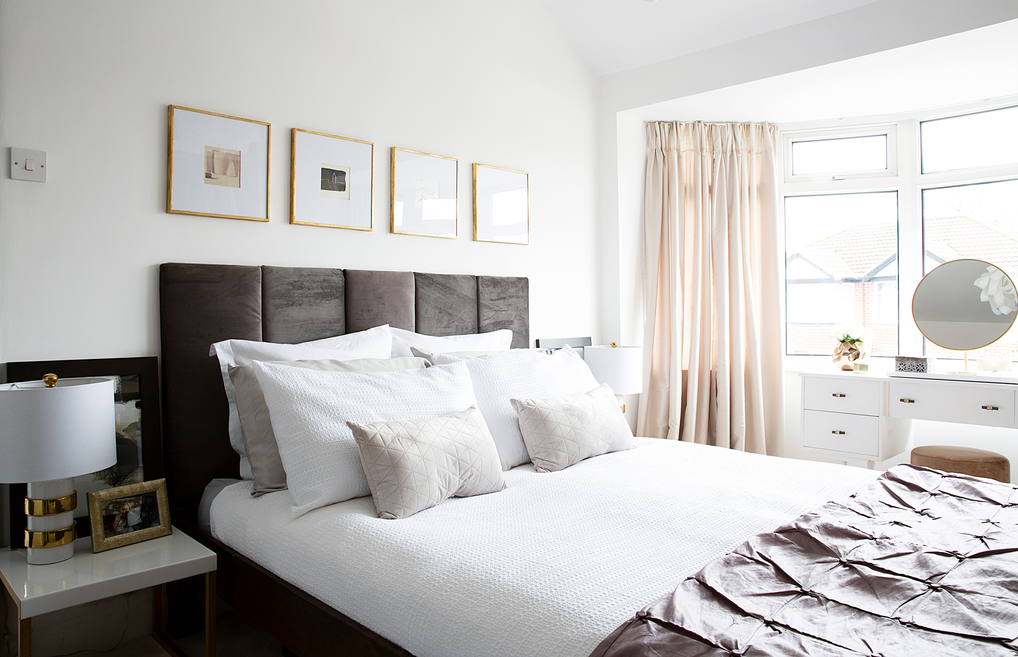
'The master bedroom has been redecorated four times; it’s been dark grey, light grey, pinky grey and now it’s white. Although I like grey and navy walls in other people’s house, it’s just not me. I wanted an elegant, sophisticated and luxurious look in here, so the white backdrop with muted tones works well. It’s less colourful than elsewhere in the house – it feels like a separate, very restful space of our own.
'I’ve got a thing about black doors so I painted the white door to fit with the tone of the room, and I added a cover to hide the wonky radiator – which gives another surface to style up. The art above the bed is actually postcards from a museum we visited in Palma when on holiday.
'Some items are homemade or upcycled, like the dressing table from Ebay that I painted and revamped with handles from Zara, and the headboard I made with wood cut into five pieces and covered with wadding and velvet. An electric staple gun is absolutely key, otherwise you end up breaking your hands using a manual one!'
'Ava was only five when we moved in so her bedroom was painted pink and then mint green with dotted wallpaper. Now she’s 12 and wanted a new look. She has strong opinions on what she wants – namely dark grey and not too much colour.
'I’ll admit I found it a bit of a challenge having to consult with someone. Lee always trusts my judgement so I’m normally used to doing my own thing!
'Ava choose all the artwork in her room herself. Some is from Desenio and I did the typography on Canva.'
Contacts
- Construction: 9point8 Construction
- Glazing: Clear View
