Real home: a Scandi-style extended semi in Sheffield
Maria Norberg's minimalist, open-plan home is inspired by her Swedish roots
Get small space home decor ideas, celeb inspiration, DIY tips and more, straight to your inbox!
You are now subscribed
Your newsletter sign-up was successful
Maria Norberg took a slow and considered approach when renovating her 1930s semi in Sheffield. Originally from Sweden, the hallmarks of Scandinavian design that Maria added are evident even in the wood-clad side extension.
Sparked by the arrival of Bo, who needed space to play, the house is a masterclass in pared-back open-plan living, with large windows, white walls, touches of wood, plants and graphic prints converging to create a relaxing, harmonious vibe.
Profile
The owners Maria Norberg, who works in child welfare and makes macramé wall hangings, lives with husband David Jenkinson, a sales manager, and son Bo, four.
The property A four-bedroom 1930s semi in Sheffield.
Project cost £120,000.
The couple took out a £15,000 loan and knocked together the kitchen and dining room before installing clean-lined white units with wood worktops and white tiles. The simple design turned out to be futureproof when the house was expanded some years later.
Article continues belowBy getting inspiration from magazines, Instagram and websites, then replicating the looks she loves with high street buys, Maria has successfully achieved a high-end look on a modest budget.
Read on to find out how Maria created her Scandi sanctuary, then see more real home transformations for more inspiration.
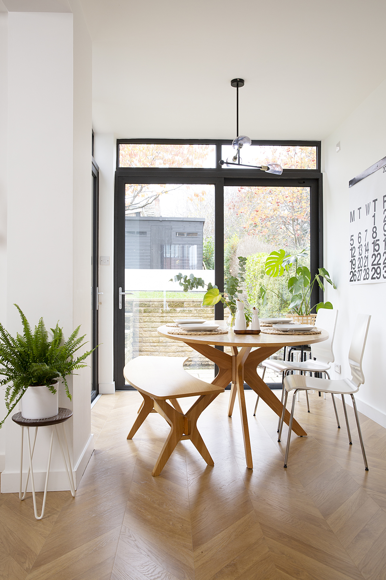
Laminate flooring, B&Q. For a similar dining set, try Frances Hunt. For a similar dining chair, try Ikea. Chandelier light, Made.com. Salt and pepper set, Sagaform
'I’ve always loved the open plan, light and bright feel of houses in Sweden – it’s what I’ve grown up with. So when we designed the extension, I knew I wanted a glass corner to bring the outdoors in.
'Another thing on my wishlist was parquet flooring, but in the end we had laminate to save money. It might not last forever but I don’t think it’s compromised the look. We added underfloor heating, which makes a huge difference when walking around with bare feet.
Get small space home decor ideas, celeb inspiration, DIY tips and more, straight to your inbox!
'I don’t like having the main lights on – I prefer little pools of light – so I planned where every light fitting would go, even making sure there was an electric fitting above the seating area, even though we hadn’t chosen a sofa yet.
'The dining table gets a lot of comments on Instagram. It nearly got ruined when turps was spilt all over it, but it’s cleaned up fine. This is where I make macramé wall hangings, although I might move production to the spare bedroom.'
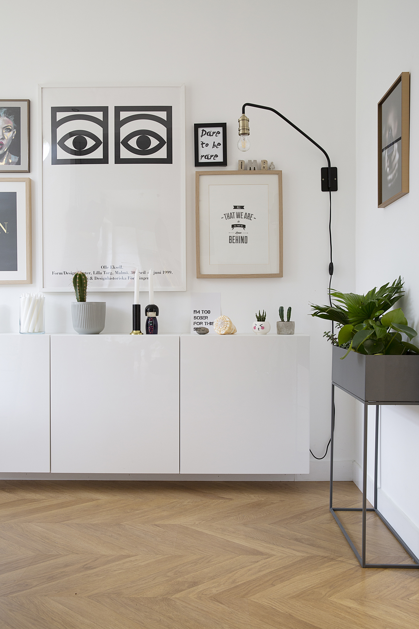
'The gallery wall above the wall-hung cabinets is another favourite spot. I’ve added a few quirky pieces that spark discussion. The One Eye print by Olle Eksell reminds me of my childhood as it used to be on the cocoa packs in Sweden, so everyone knows it.'

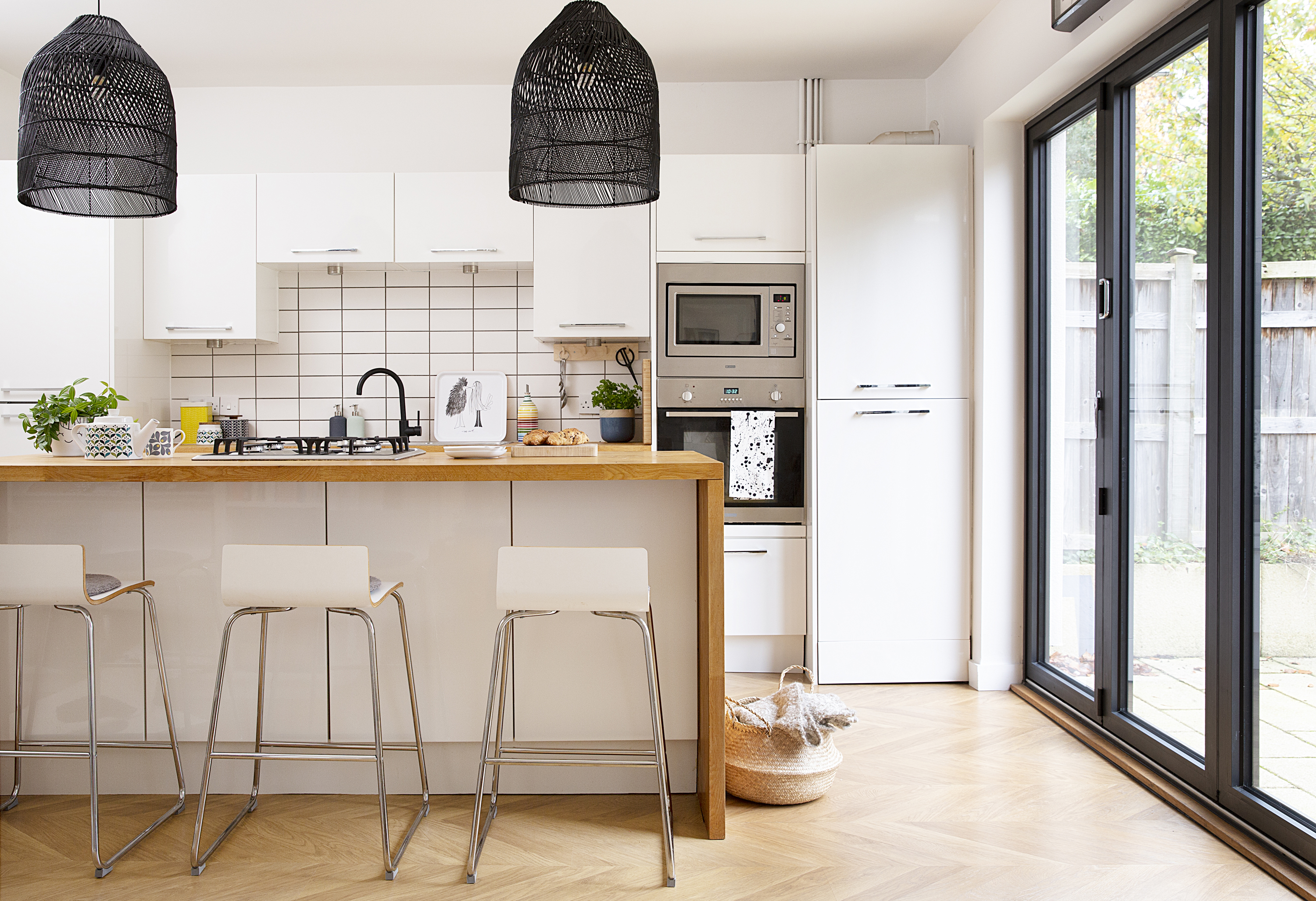
White kitchen units, microwave and oven, Howdens. Pendant shade, Made.com. For similar bar stools, try Atlantic Shopping. Tap, B&Q. For similar wall tiles, try Tiles Direct
'Our first priority when we moved in eight years ago was knocking through and swapping around the kitchen and dining room. The old grotty kitchen was straight off the hallway where the mini sofa is now. Another door, which we blocked off, led into the dining room. Sorting this has made a huge difference to the way we live.
'The builders had to pull down the ceiling to treat woodworm and dig out the uneven concrete slab the flooring was laid on to prevent movement in the future. We lived upstairs with a makeshift gas stove and microwave, washing dishes in the bath. My brother is a builder and he came over from Sweden to fit the £4,000 Howdens kitchen, which saved us money.
'When Bo came along, we had an extension built at the side. As well as new flooring throughout, we also made some tweaks to the kitchen. We had understated ceramic pendant lights above the island, but they weren’t doing much for the space, so we’ve added much larger black shades. They’re about 20 times bigger than the old lights but, thankfully, when they were up we both really loved them. This is the space I’m happiest with, and I’m always adding to it.'
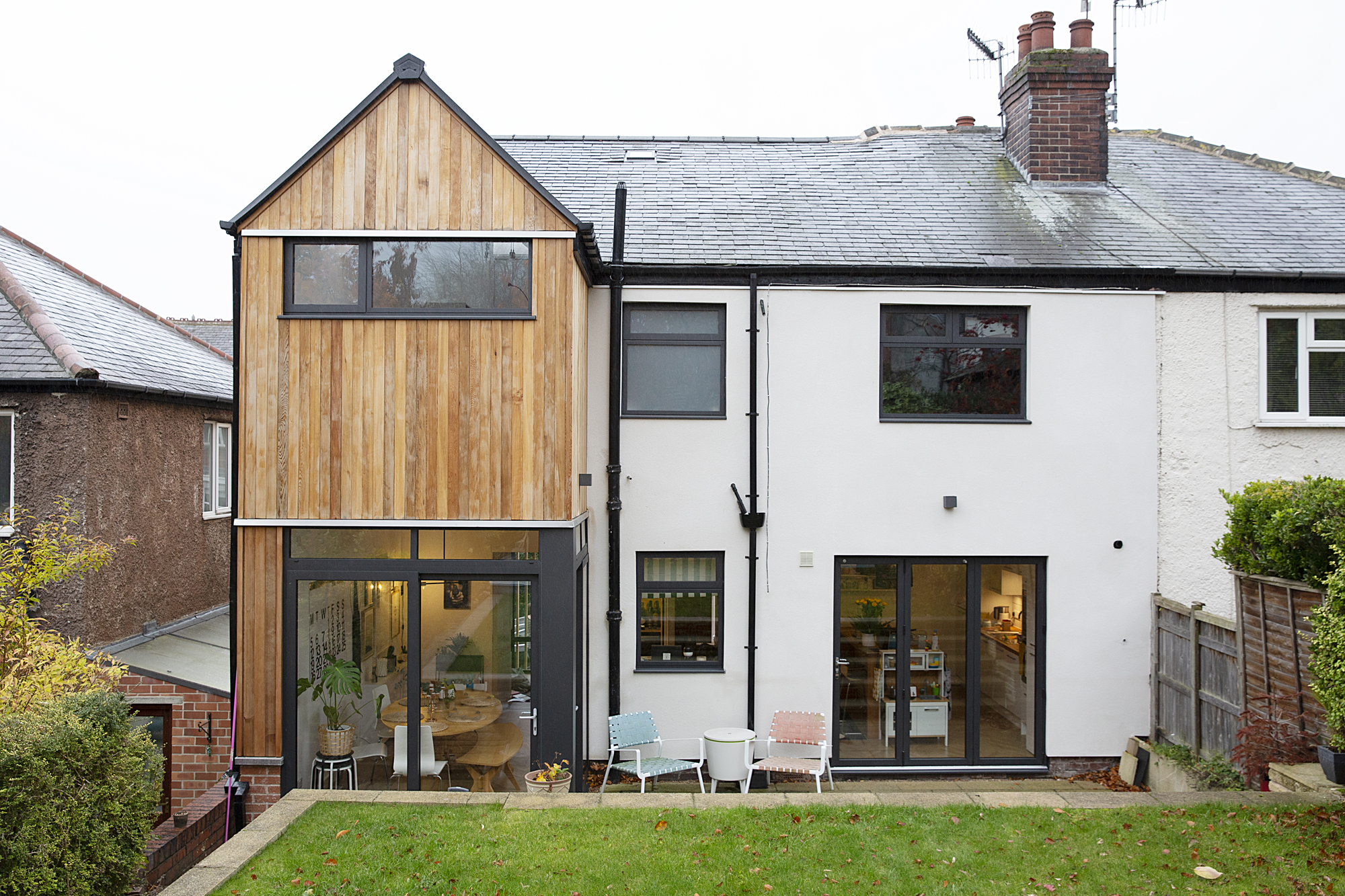
'When planning the extension, I knew the layout I wanted and was keen to have wood cladding, but it was our brilliant architect who suggested the floor-to-ceiling window at the front which everyone comments on.
'We got a loan and cashed in some bonds to pay for it, and we did go over our £80,000 budget by around £20,000. This is mostly because we changed all the windows to match the new ones and insulated the whole house before re-rendering the pebble dash exterior. I didn’t want to compromise on the windows or the cladding, as they’re such key features of the build.'
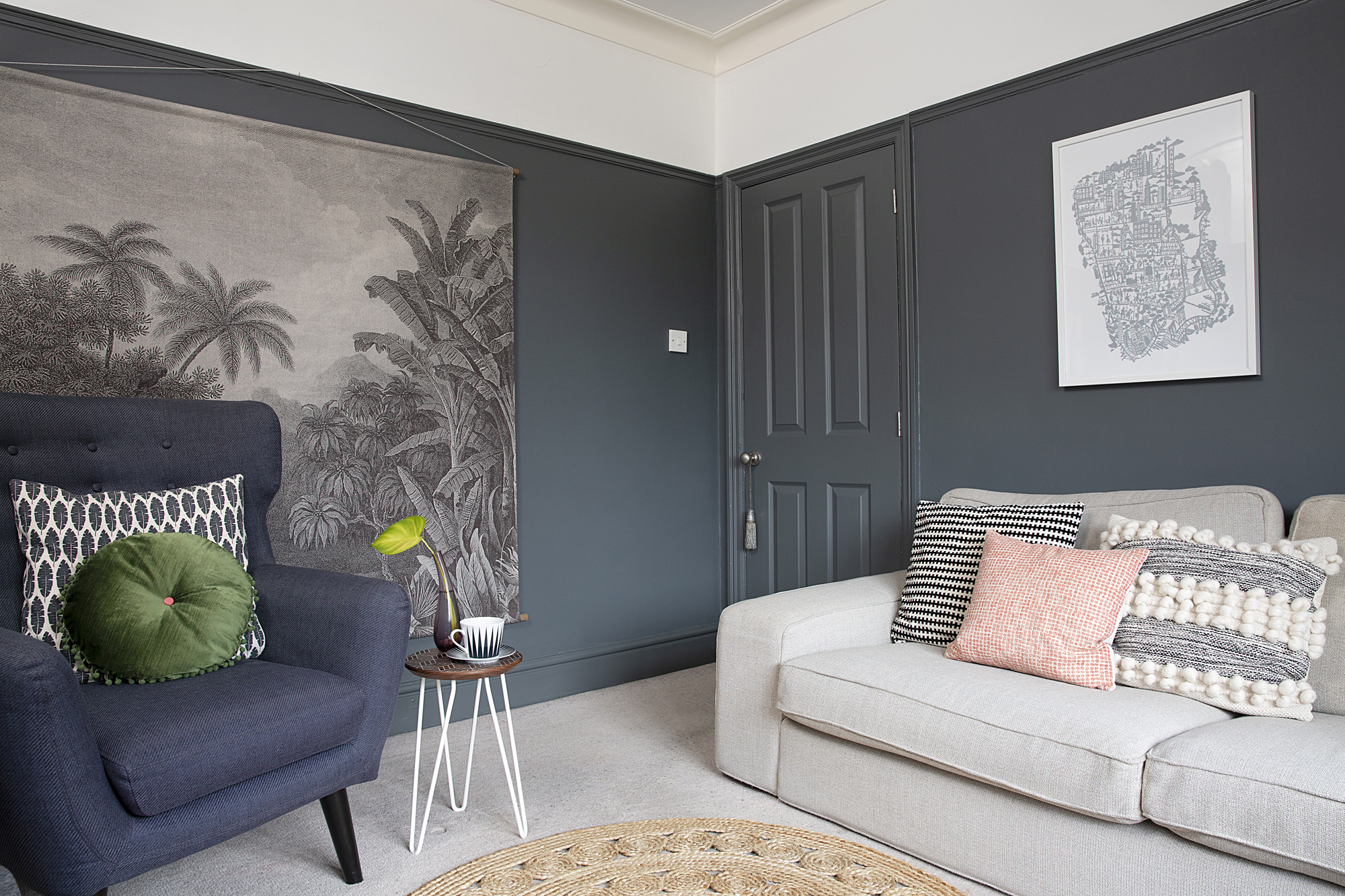
Walls painted in Down Pipe, Farrow & Ball. For a similar sofa, try Ikea. For a similar wingback chair, try Made.com. Jungle print wall chart, Rose & Grey. Cushions, H&M and Ikea
'I’ve started to experiment a bit more with colour recently, and I’ve painted the living room darker to make it cosier since the rest of the ground floor is light and bright. It works well with the wall hanging I found on Instagram, and my vintage console table I discovered on the street outside a pub. A mirrored wall brings light to the alcove by the chimney breast, and I’ve hung some prints from Casa Batllo in Barcelona over the sofa.'
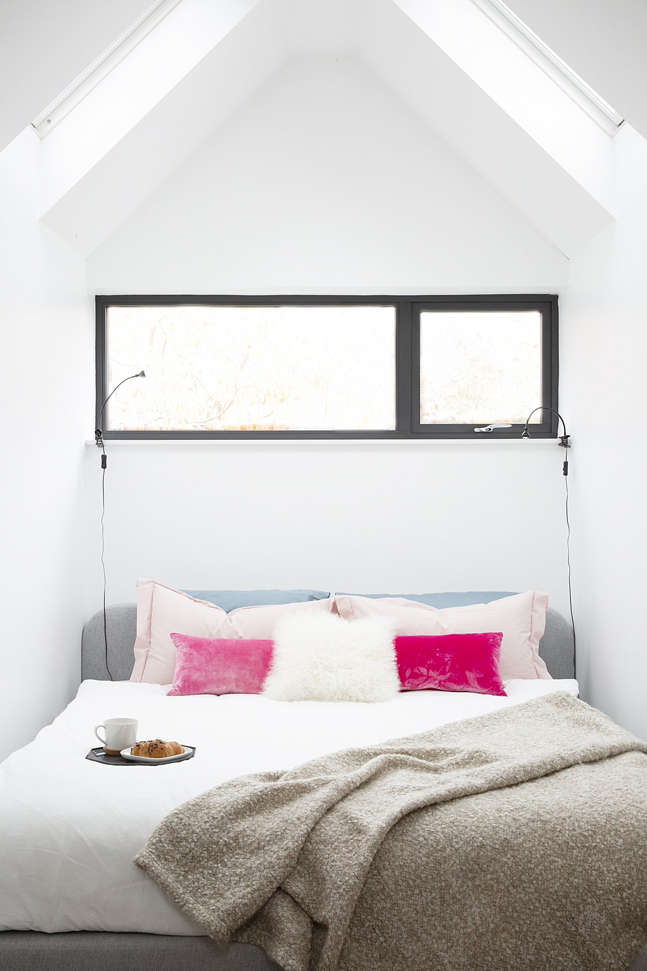
For a similar bed, try Habitat. For a cerise cushion, try Andrew Martin. For a throw, try Ikea
More from Real Homes
Get inspiration, ideas and advice straight to your door every month with a magazine subscription
'Although we did the extension mainly for the ground floor space, an extra bedroom upstairs was a nice bonus. We had earmarked this as a spare bedroom as we were worried it would end up feeling long and narrow, but the architect suggested opening the ceiling up into the eaves to create more height. It makes the room feel much bigger, so we were happy to make it our bedroom in the end.
'I’ve dressed this room with several of my macramé wall hangings in shades of green, grey and pink. I also sell them on Etsy. The room’s not quite finished yet as I’m struggling to find things like bedside lights and shelving units. When I find the right things, I’ll know.'
- Find out how to macramé in our guide.
'I used Pinterest to narrow down my ideas for the en-suite shower room. The starting point was the hexagonal wall tile, and I definitely wanted a large walk-in shower.
'The biggest challenge was finding a black steel-framed shower screen, as the ones we loved were too expensive at around £2,500. Our architect put us in touch with a glass company and a frame company who would make the two components separately. The glass arrived, but unfortunately, the frame company went bust and we lost the money we’d paid them. In the end we found a simple black shower screen online for under £800. We adapted the vanity unit with a custom-made countertop.'
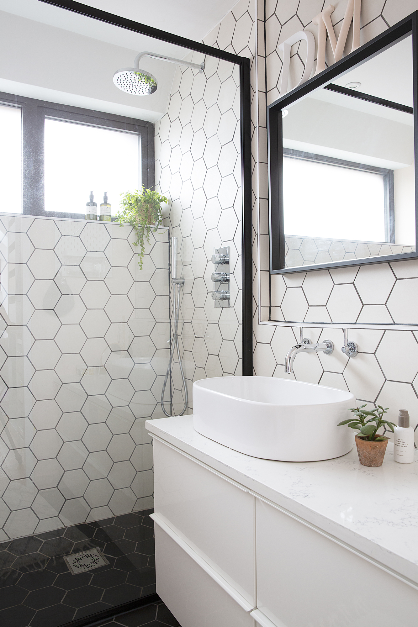
Hexagonal tiles, Tiles Direct. Matt black shower frame, Drench. Basin, Victoria Plum. Vanity unit, Ikea
'The guest room used to be our bedroom before we had the extension. I was never really happy with the décor as it didn’t have any character or feel to it. I was inspired by using colour and pattern in Bo’s room to experiment in here, too.
'At first I considered a bare plaster colour on the walls, then I saw a new shade from Farrow & Ball called Sulking Room Pink and decided to brave it. I made the headboard myself to contrast with it. The spotty wallpaper finishes it off nicely and creates continuity with Bo’s room.'
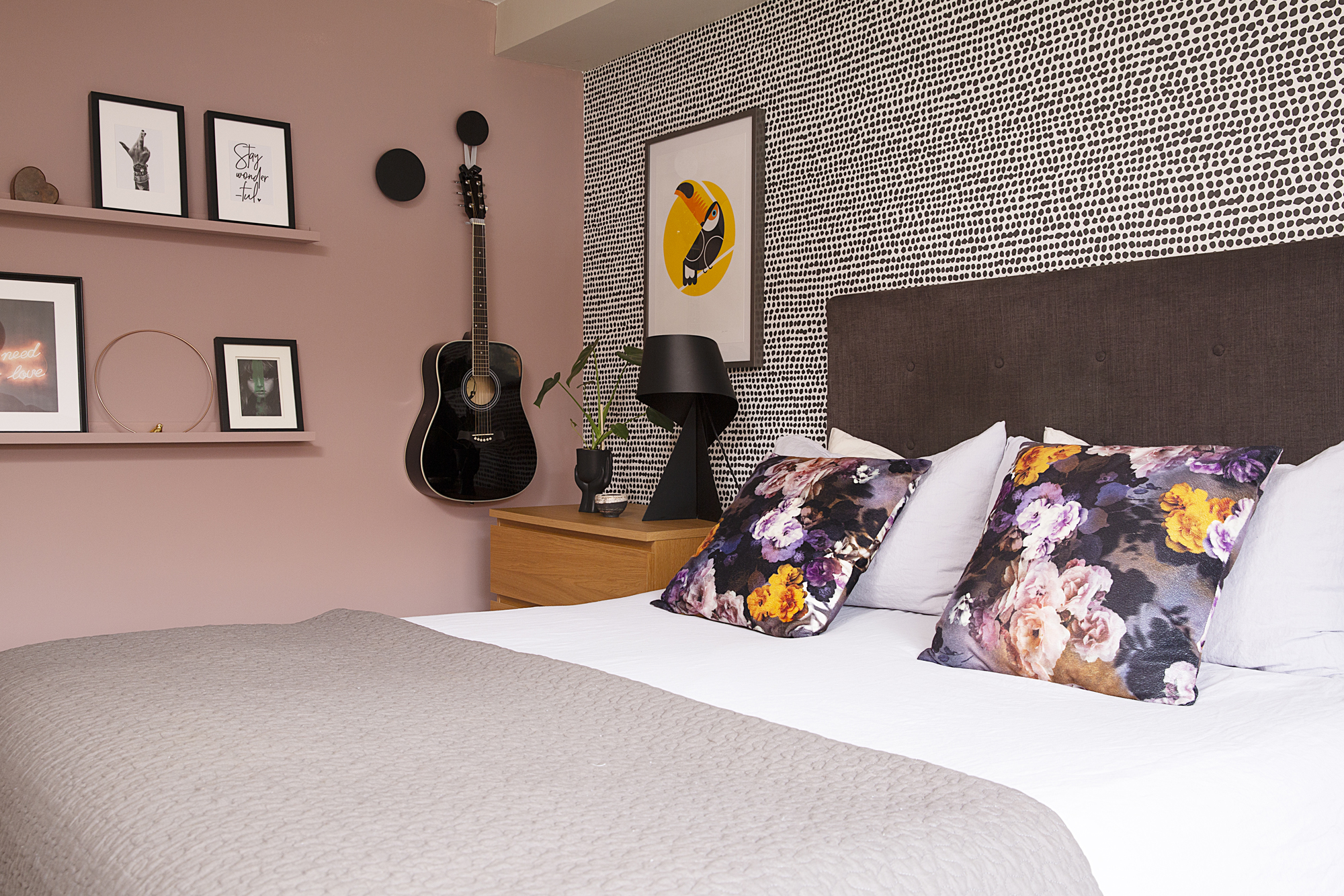
Wallpaper, Graham & Brown. Walls painted in Sulking Room Pink, Farrow & Ball. For a similar floral velvet cushion, try Amara. Peacock print, The Lost Fox. Table lamp, Habitat. For similar oak veneer drawers, try Ikea
'It took a long time for Bo to get his big boy room while we were doing the extension, and he loves it. It’s one of my favourites, too. Although he got a new bed, much of the furniture and pictures are from his nursery.
'We deliberately haven’t got much toy storage in here, as we wanted to keep this room mainly for sleeping and relaxing. He does have book storage next to his bed so he can easily pick his bedtime story, and a little craft area where he can entertain himself. This bedroom has lovely views over Sheffield, so I often find myself chilling in here if I get a few minutes during the day.'
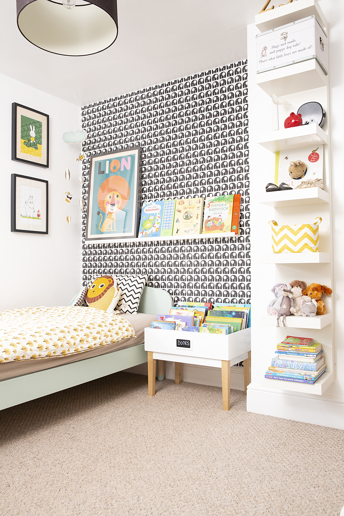
Rachel Powell wallpaper and Ingela lion print, This Modern Life. Shelving and notice board, Ikea. Duvet cover, Ferm Living. Library table, Great Little Trading Co
Contacts
- Architect Thread Architects
- Kitchen Howdens
- Laminate flooring B&Q
- Tiles Tiles Direct