Real home: a luxurious extension to a Victorian home
A combination of smart extensions, clever layout changes and deep, moody colour schemes has turned a dated Victorian house into a joyful family home
Project notes
The owner: Stephanie Peltier, a happiness consultant (thehappinesssociety.com), lives here with her daughters, Juliette, 14, and Manon, 12.
The property: A four-bedroom, detached Victorian house in west London.
Project cost: £354,000.
Despite the fact that there was little going for this dated Victorian house in west London, Stephanie and her ex-husband knew they could turn the property into something special. ‘Honestly, there was nothing right about the house, but it felt right somehow,’ Stephanie says. The house hadn’t been touched for 50 years, so the layout comprised a series of cramped, dark rooms and no proper garden access. ‘Despite this,’ she adds, ‘there was a sense of spaciousness in the high ceilings that could be improved upon.’
Stephanie began talks with 3s Architects before the sale had even completed in January 2012. They spent six months on the design, discussing how to remodel the entire house so it could work for them and daughters Juliette and Manon.
Find out how they transformed it, then browse through more real home transformations and learn more about extending a house.
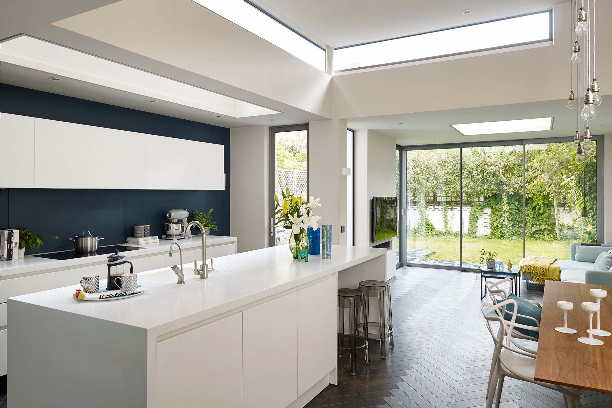
The kitchen floor has been lowered to be level with the garden, and is filled with light from the glazing around the room, including a band of glazing above the island and large roof light over the units. At the end, the rear door wraps around the corner and slides into the wall, leaving space to mount a television. Wall painted in Hague Blue, Farrow & Ball. Smeg mixer, John Lewis. Chevron wood flooring, Edward James Oak. Cesar Lucrezia wall-hung cupboards, Absolute Kitchens. Worktop, Corian. Kartell Charles Ghost bar stools, Nest
A light-filled kitchen-diner and TV room extends the house and opens onto the garden. The front living room remains, but the middle room has been turned into a clever juncture for the loo and cloakroom cupboard, connected by the hallway and a new passage on the other side.

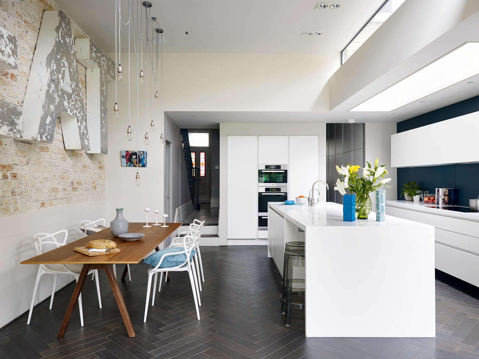
The exposed brick wall was an aesthetic that evolved during the project. Stephanie had the wall painted in Farrow & Ball’s Skimming Stone and then distressed with sandpaper. Along with the brick, the wood floor and dark blue feature wall give texture to the white kitchen. Kitchen, Absolute Kitchens. EAT sign, The Old Cinema. Pendant lights, Urban Cottage Industries. Stockholm table, Ikea. Philippe Starck for Kartell master chairs, John Lewis
This radical shake-up was only made possible by moving the staircase. ‘The stairs were in the middle of the house and now they’re on the side,’ says Stephanie. ‘Even though I’ve lost the middle room, the house feels so much bigger because redesigning the layout has created a visual connection from the front door to the garden.’
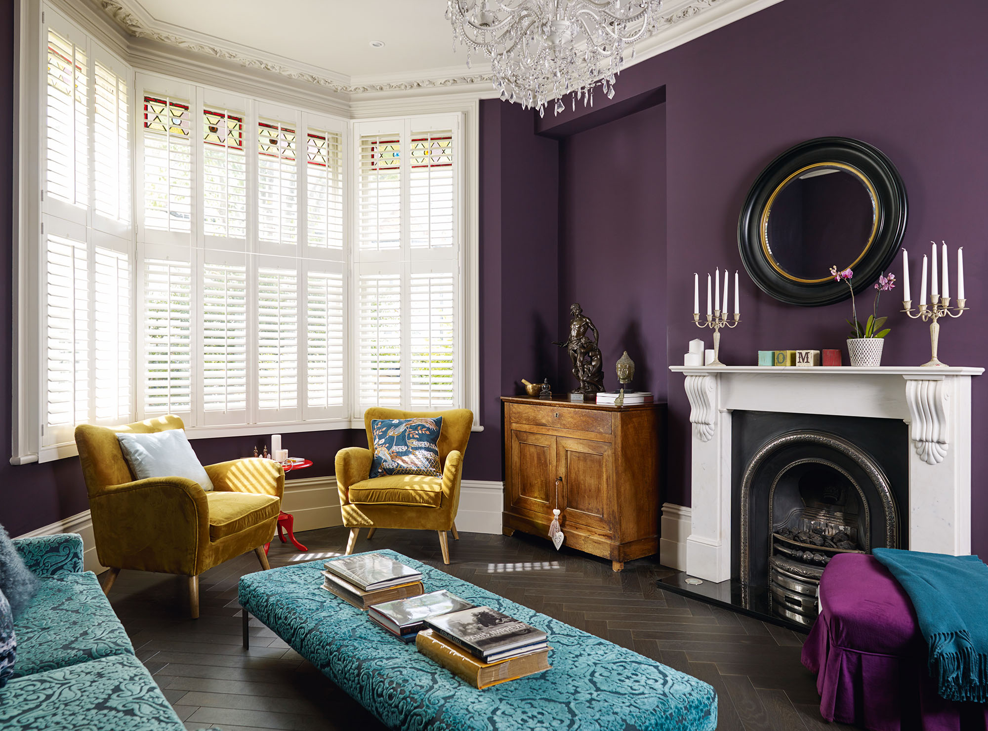
Stephanie likes to meditate in the living room, and it’s where she works with clients. The purple chaise belonged to her grandmother and the candlesticks are from a Parisian market. Walls painted in Pelt, Farrow & Ball. Ophelia bird cushion, Marks & Spencer. For a similar coal-effect gas fire, try Capital Fireplaces. For a similar mirror, try Houseology. Mustard velvet chairs, TK Maxx. Sofa, Designers Guild. For a similar footstool, try the Harper at Marks & Spencer. Chandelier, Maisons du Monde
The third bedroom – now Manon’s room – was enlarged by removing
a separate toilet and bathroom. Another bedroom is now a bathroom, while the architects also created a narrow en suite in the guest bedroom. ‘It’s only 900mm wide with the shower opposite the loo,’ Stephanie says. ‘We’d seen one in a hotel and did our measurements,so we knew we could make it work.’
More from Real Homes

Get inspiration, ideas and advice straight to your door every month with a magazine subscription.
On the top floor, although the loft had already been converted, the ceiling sloped steeply to the eaves, leaving little floor space. ‘It was like a shoe box with a tiny bedroom and bathroom,’ Stephanie says. ‘We wanted to optimise the space with a dormer and make this the master bedroom.’
With a budget of around £350,000, the family went through a tender process and the building contractor came on board in September 2012. ‘Matt, the owner, was friendly and honest and knew where to save money,’ says Stephanie. ‘For example, he designed our bedroom wardrobes with Ikea fittings and bespoke doors.’
Matt also helped Stephanie plan the loft layout. ‘I wanted to be able to see the whole room but with separation between the en suite and bedroom,’ she says. ‘My idea was a full-height wall with sliding doors either side. Matt’s joiners designed and made this for me.’
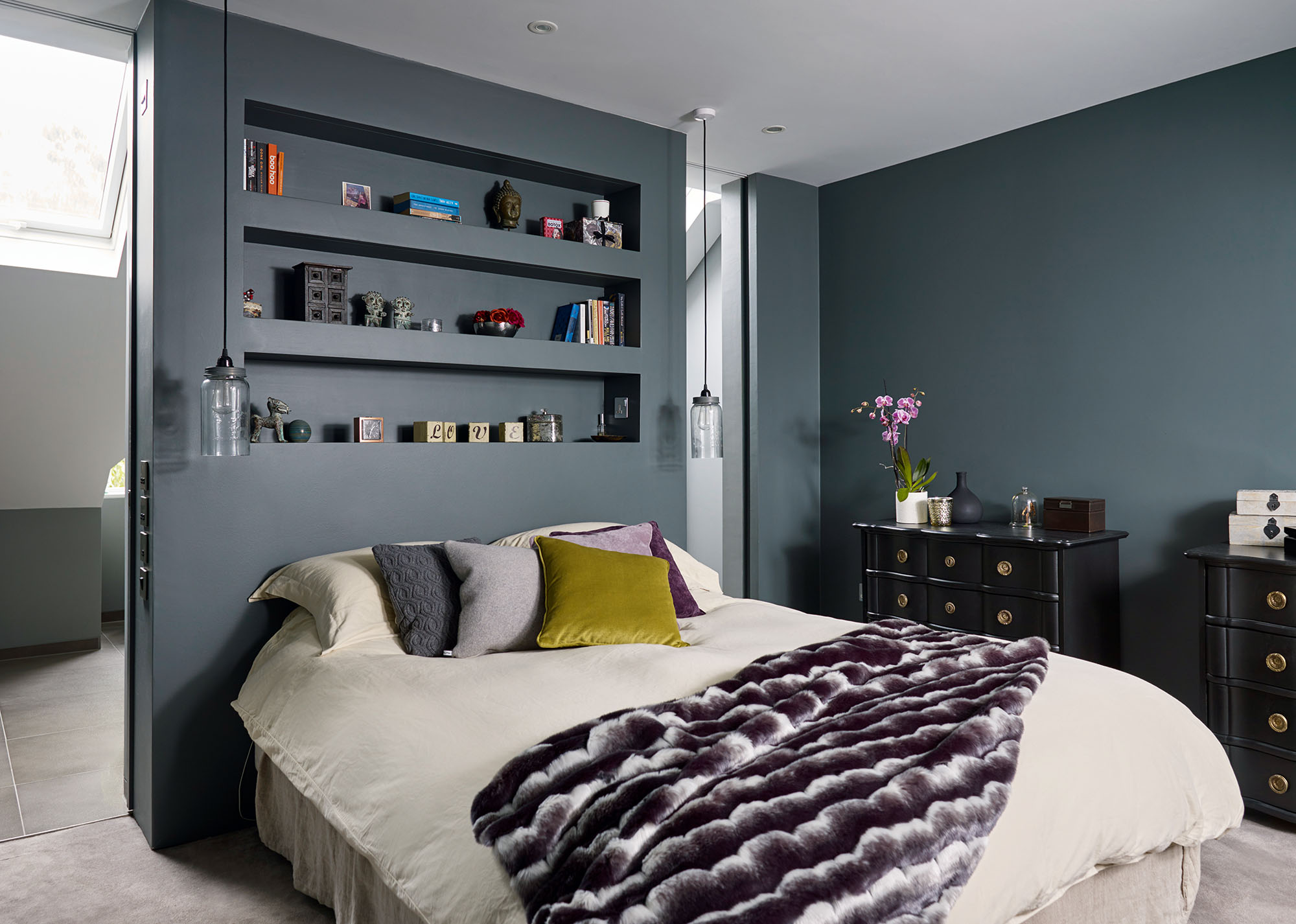
The master bedroom is a sanctuary at the top of the house, which Stephanie decorated in a dark, cocooning shade of
grey. The dividing wall doubles up as a practical headboard with recessed shelving. Walls painted in Down Pipe, Farrow & Ball. Cushions, Next. Faux-fur throw, Habitat. Mason Jar pendant lights, Rockett St George. Bamboo carpet, RH Carpets. Mango French Versailles-style drawers, Maisons du Monde
Although the dormer could be built within permitted development, Stephanie wanted to install a triangle window within the gable end roof, thus changing the front façade. She sought planning permission for changes, but didn’t make a final decision until the loft structure had been built. ‘My instincts were right,’ she
says. ‘Once the old walls had been removed, I could see the window would look amazing with a freestanding bath beneath it.’
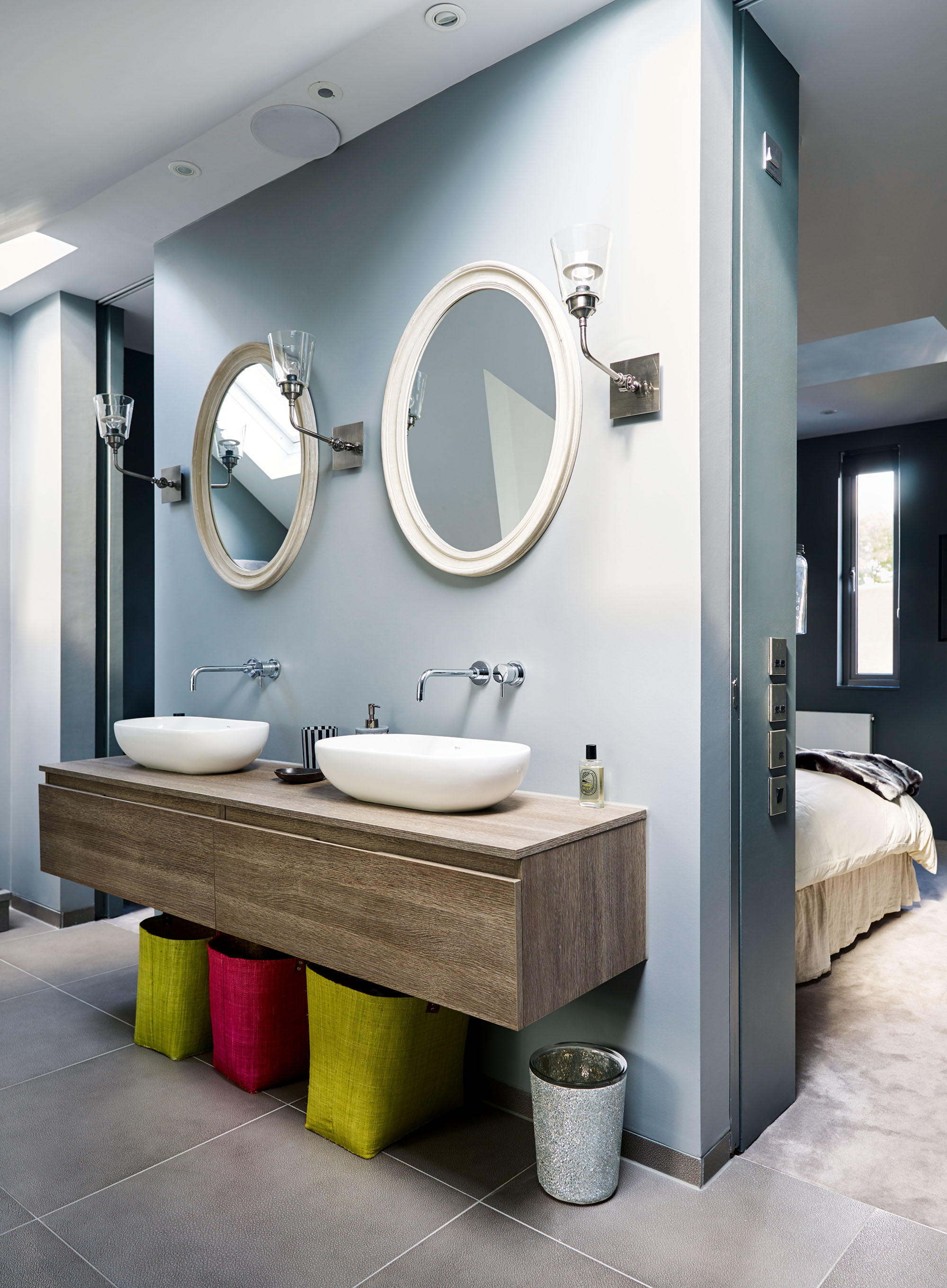
The dividing wall hides the pipework and sliding doors, which can be left open to enlarge the master bedroom and share the light. Acre basins, Aquaplus. Oak Oxy vanity unit, Adatto Case. Kai taps, Crosswater. Baskets, TK Maxx. Oval Louis mirrors and Isaac Mer Indus metal wall lights, Maisons du Monde
The downstairs has its fair share of striking glazing, too. A rooflight stretches along the kitchen galley, and there’s a high band of glazing around the dining area thanks to a stepped roof extension. Sliding doors overcome space limitations in the WC and cloakroom as well as closing off the kitchen-diner when needed. It’s this kind of functional thinking that Stephanie returned to time and time again. ‘I wanted the kitchen “experience” to be right,’ she explains. ‘The designer asked me how I use the kitchen, which made a lot of sense. The layout is perfect – I even have a breakfast area with drawers that store everything we need.’
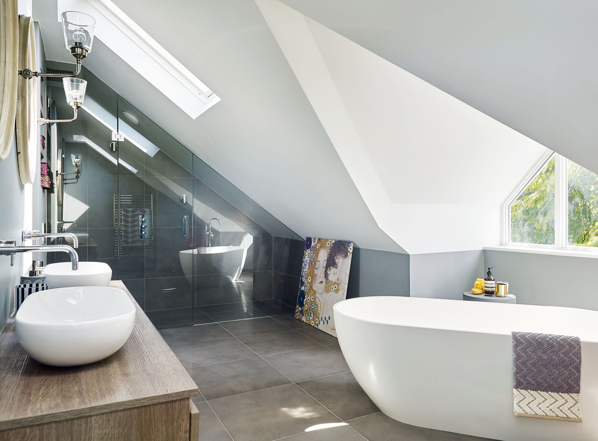
The sloping en suite accommodates a walk-in shower, two basins and a freestanding bath, which has a view out of the window in the gable roof. Walls and ceilings painted in Blackened and Plummet, both Farrow & Ball. Rawhide Snakeskin grey tiles, Stone & Ceramic Warehouse. Formoso bath, Clearwater. For a similar chevron towel, try Marks & Spencer
Stephanie chose an all-white kitchen warmed with an exposed brick wall, chocolate brown chevron wood flooring and a striking blue-black painted wall. Through the rest of the house, the intensity of colour continues. Rich purple envelopes the living room, studded with jewelled turquoise and mustard furniture. Deep grey walls in the master bedroom have a cocooning effect, opening onto the cool tones of the en suite. ‘There are very few white walls in the house,’ Stephanie says. ‘I like dark, moody walls and bold colours.’
The project was finished in eight months and the house is unrecognisable from how it was before. ‘Although we kept virtually nothing of the original, we’ve created purposeful space,’ Stephanie says. ‘It’s multifunctional and I love the strong identity and atmosphere in each room.’
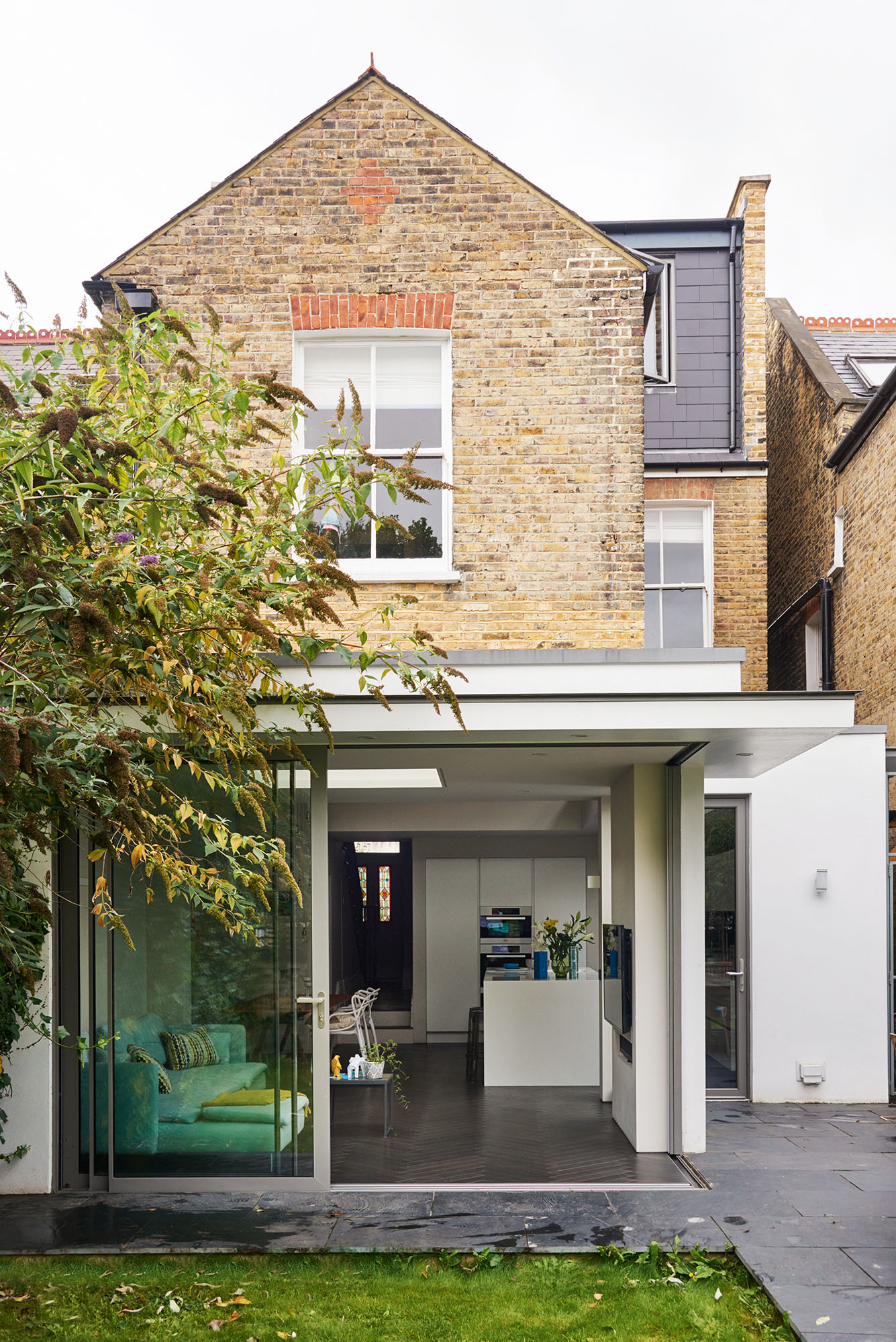
The stepped roof on the new extension separates and defines the kitchen-diner and TV room. An open corner creates a wonderful link to the garden. At the top of the house, remodelling the original loft conversion by adding a dormer has increased the usable space to include a stylish master en suite. Sliding doors, Schueco
Contacts
- Architect 3s Architects
- Builder Analytic Building Contractors
- Sliding doors Schueco
- Flooring Edward James Oak
- Kitchen Absolute Kitchens
More gorgeous homes to browse:
Get small space home decor ideas, celeb inspiration, DIY tips and more, straight to your inbox!