Real home: an ultra modern double storey extension to a Victorian house
Nicola and Adam Harvey's dynamic style has created a sleek and on-trend family home
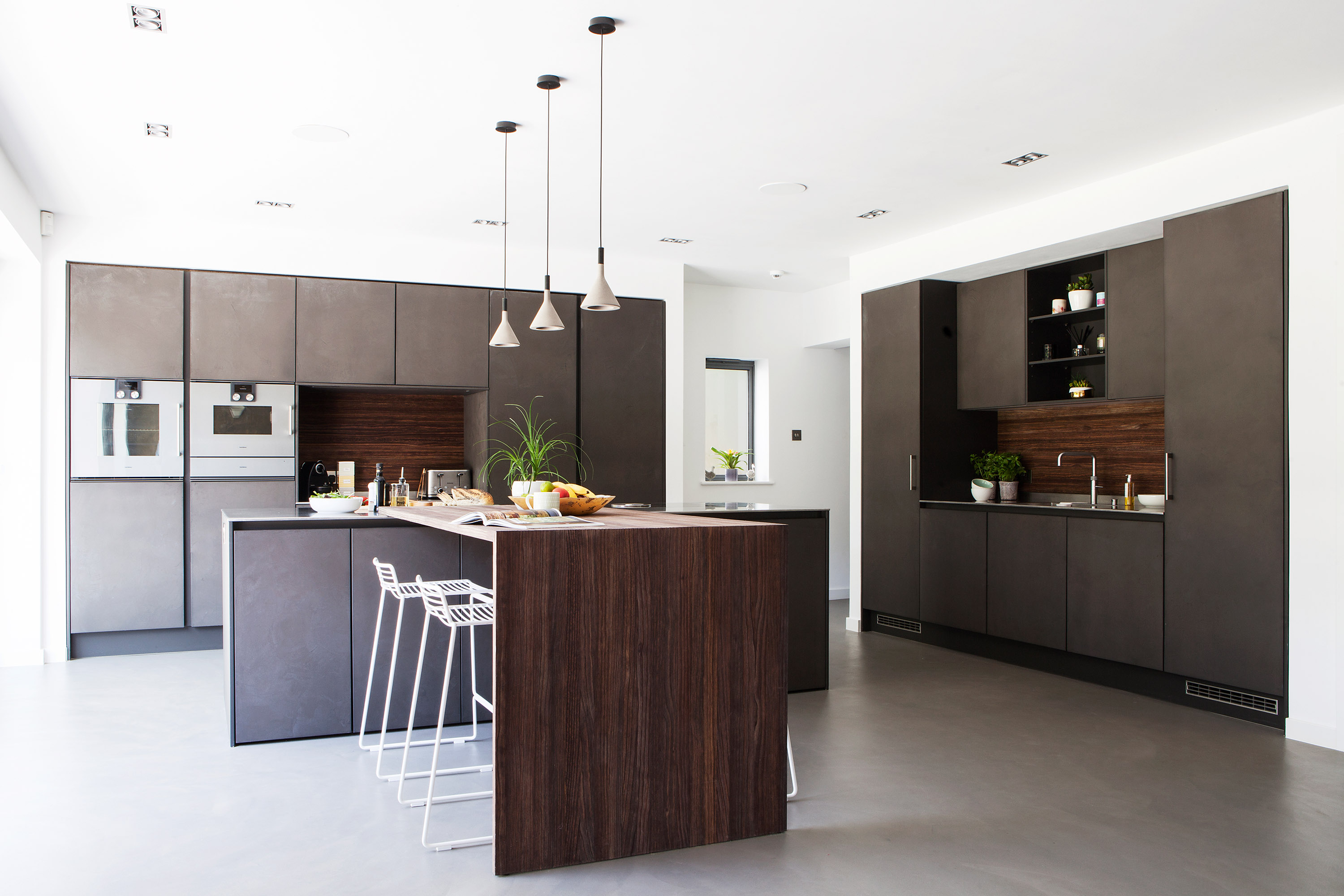
Nicola and Adam Harvey are design aficionados, enthused by their respective jobs in interior design and property investment, so when they finally found an ambitious renovation project, they couldn’t wait to get stuck in. ‘We spent two years looking for the right house in the right location,’ says Nicola. ‘This one was completely uninhabitable, but we weren’t scared of taking on a big project.’
Read on to find out how they did it, then browse the rest of our real home transformations. Read our guide on how to cost, plan and design a double storey extension, too, for more guidance.
Profile
The owners Nicola Harvey, an interior designer (designbynicola.co.uk), her husband, Adam, who owns a property investment company, and their daughters, Mia, seven, and Summer, four.
The property A four-bedroom detached 20th-century house in Radlett, Hertfordshire.
Project cost £200,000.
With 300 square metres of space and a big garden, it isn’t hard to see why
the Harveys were drawn to the bones of the property. They sketched out ideas, drawing on their experience to push the boundaries of conventional renovation design and find ways to create visual impact. A hidden gem revealed itself in the
roof. ‘The high pitch formed a huge loft area, which would have been a waste not
to use,’ Nicola explains. ‘Rather than convert, the height sparked the idea to have
a mezzanine floor in our bedroom and a playroom above Summer’s bedroom.’
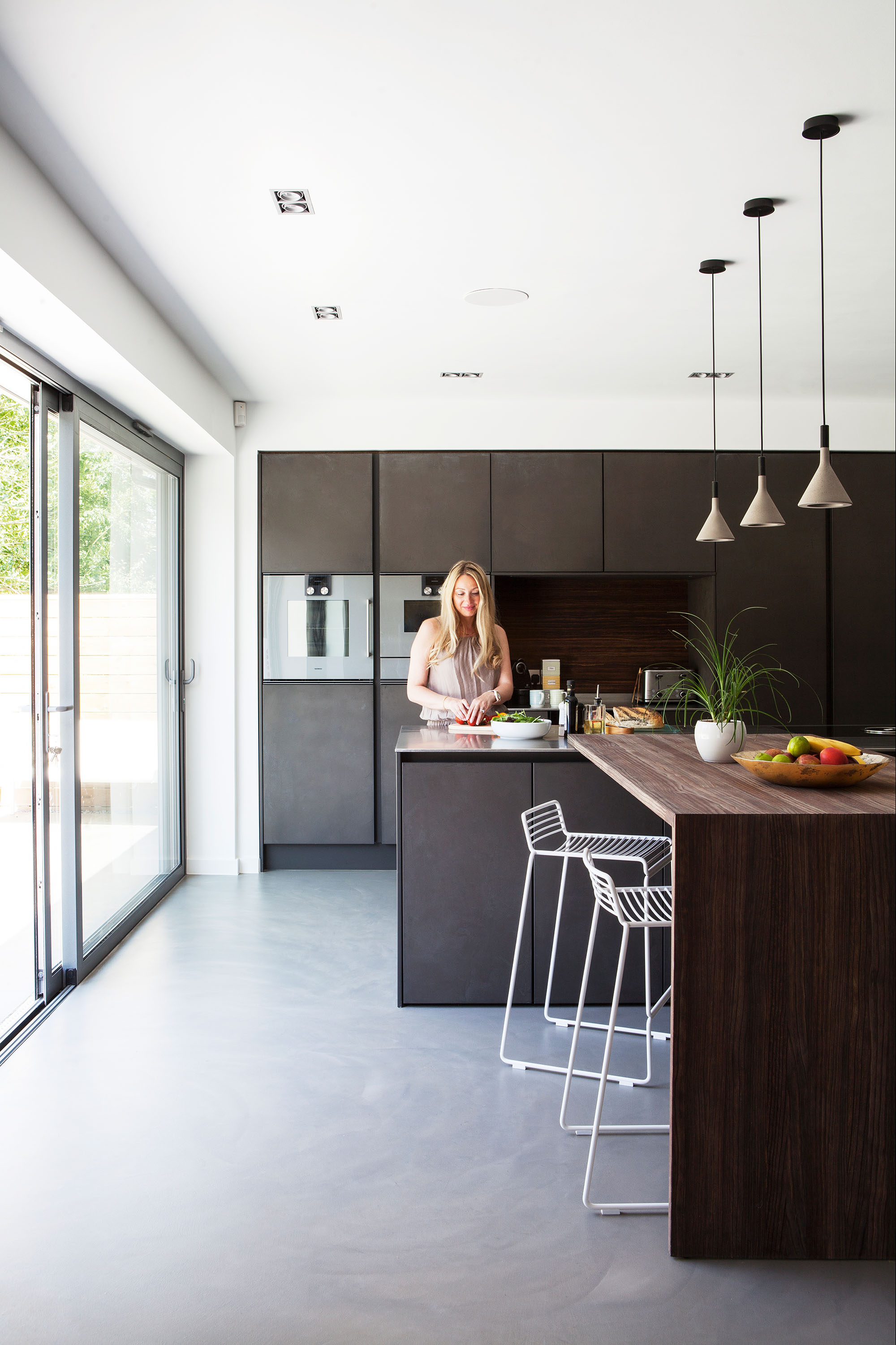
A seamless concrete floor is paired with Leicht’s Concrete-A kitchen cupboards and stainless-steel worktops, which have a ‘rough brush’ finish so scratches aren’t noticeable.
The breakfast bar is a dark wood to add warmth to the utilitarian scheme. Bar stools, Hay. Aplomb mini suspension pendants, Foscarini Lighting
The couple also opened up the ceiling above the landing with a big roof lantern. They added to the openness by changing the staircase – making an industrial design statement in the process. ‘The original staircase split left and right onto the landing,’ says Nicola. ‘My new design is a single flight and wider by 100mm, with a steel case, open timber treads and a glass balustrade.’
Light, openness, and space form the bedrock of Nicola and Adam’s design approach. In the entrance hall, a ceiling-height sliding door closes off Nicola’s office, and glass doors link seamlessly through to the 11-metre-wide kitchen-diner-snug. Here, a four-metre, double-storey extension increases the space and has helped turn their bedroom into a luxurious sanctuary.
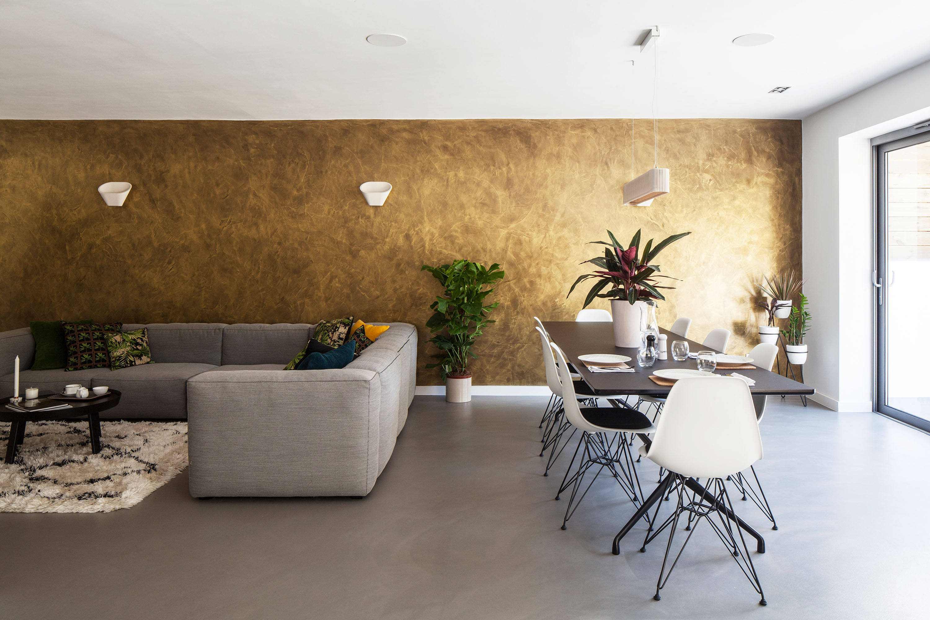
The gold wall looks stunning in the open-plan room and is made with microcement. For a similar wall material, try Microcement Supplies UK. Dining table, Hay. Eames chairs, Vitra. Pendant light, Skandium
This master suite is the jewel in the design. ‘We wanted the wow factor so
I designed a mezzanine dressing room and staircase,’ says Nicola. ‘I found a
local firm to make both staircases as they were competitively priced.’
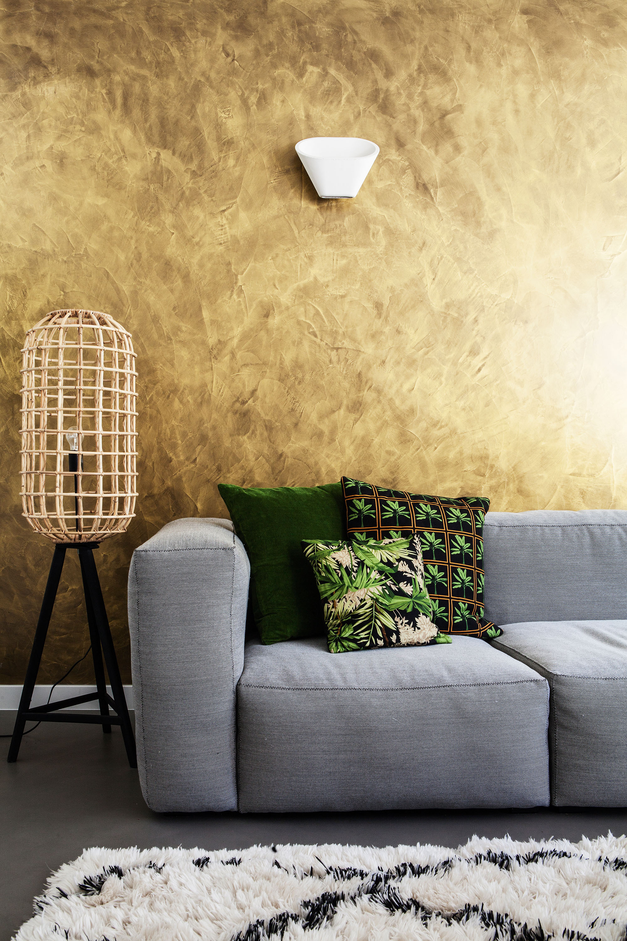
The shaggy rug and lattice wood shade add texture and warmth to the concrete floor. Green patterned cushions draw out the wall’s rich tones. Rug, John Lewis. Light shade, Graham & Green. Cushions, Black Parrot. Wall light, Foscarini Lighting. Hay Mags sofa, Pink Apple Designs
The demands of changing the upstairs layout meant few of the walls remain – the Harveys even sacrificed a bedroom. But the remodelled look is better balanced, showcasing four en suite bedrooms and a laundry room. ‘It made more sense to put it upstairs as this is where most of our washing is,’ says Nicola. ‘Downstairs, we have a small utility with a dishwasher and extra sink.’
Get small space home decor ideas, celeb inspiration, DIY tips and more, straight to your inbox!
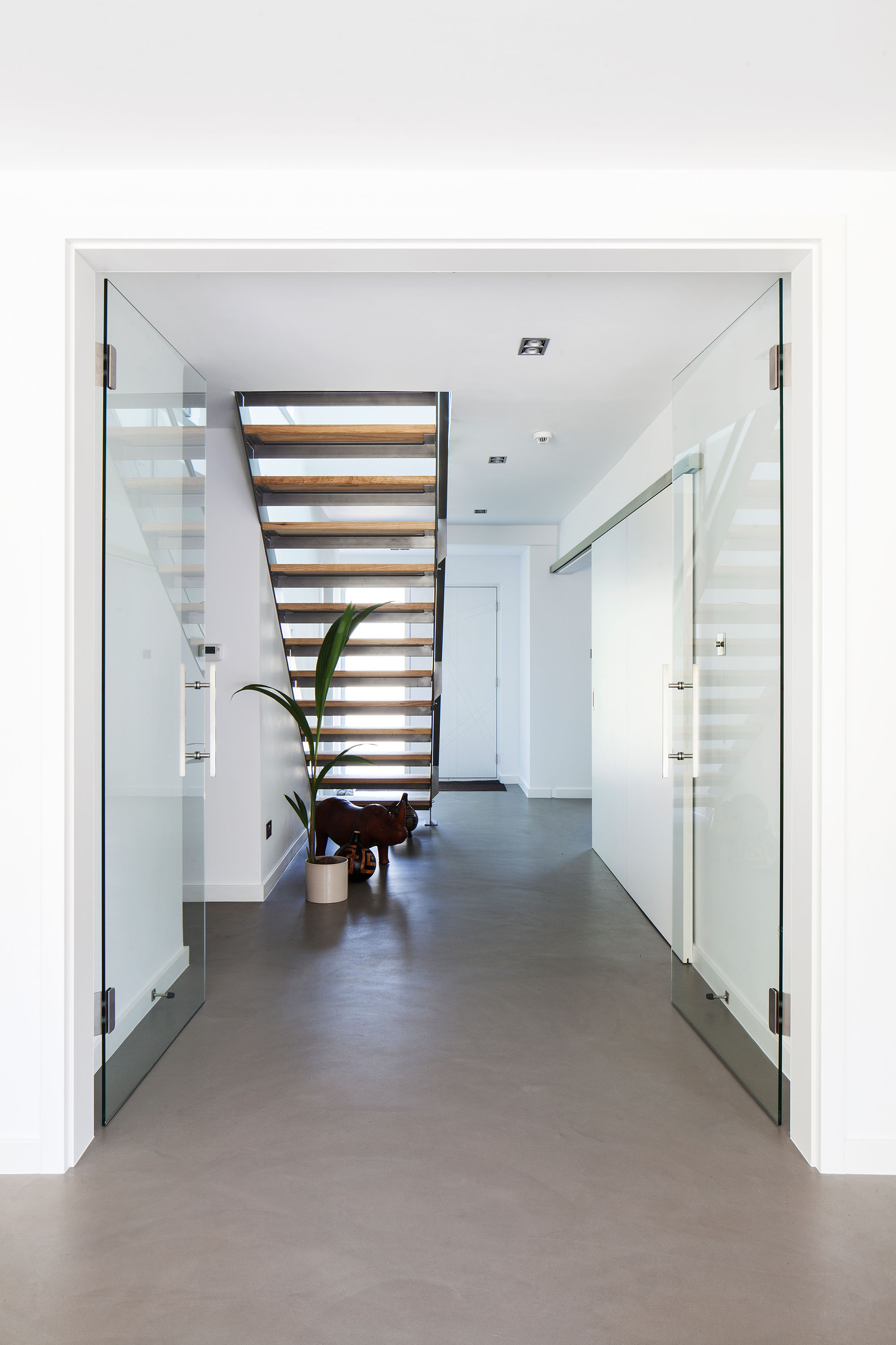
Glass doors fold back to the wall for a streamlined feel between the kitchen and hallway. To the right, a sliding door reveals Nicola’s office. For similar doors, try Space Slide. For similar stairs, try Contemporary Steel Staircases
MORE FROM REAL HOMES
Get inspiration, ideas and advice straight to your door every month with a magazine subscription
The couple enlisted designer and structural engineer Laurence Goodman, from Frampton-Martin Sage Design, to draw up their ideas. Plans for the double storey rear extension were submitted as soon as the Harveys completed on the house. The family moved in with Adam’s mum during the renovation. ‘To save money, I sourced contractors for the plumbing and heating, who conveniently had their own bathroom company,’ she says. ‘They recommended an electrician they’d worked
with before, which was great because I wanted the team to gel together.’
Nicola also found a screed company to be sure the quality and application was compatible with the concrete flooring they’d chosen. ‘We used a thin concrete product applied with a trowel,’ says Nicola. ‘We laid it on our downstairs screed subfloor and upstairs on double-layer plywood.’ Concrete became an unexpected design aesthetic elsewhere, too. ‘We decided to have a microcement metallic gold
feature wall in the dining-snug area and in our bedroom,’ says Nicola. ‘We’ve also got dark grey microcement in our downstairs loo. We bought the concrete by the square metre, and the more you buy the cheaper the unit price.’
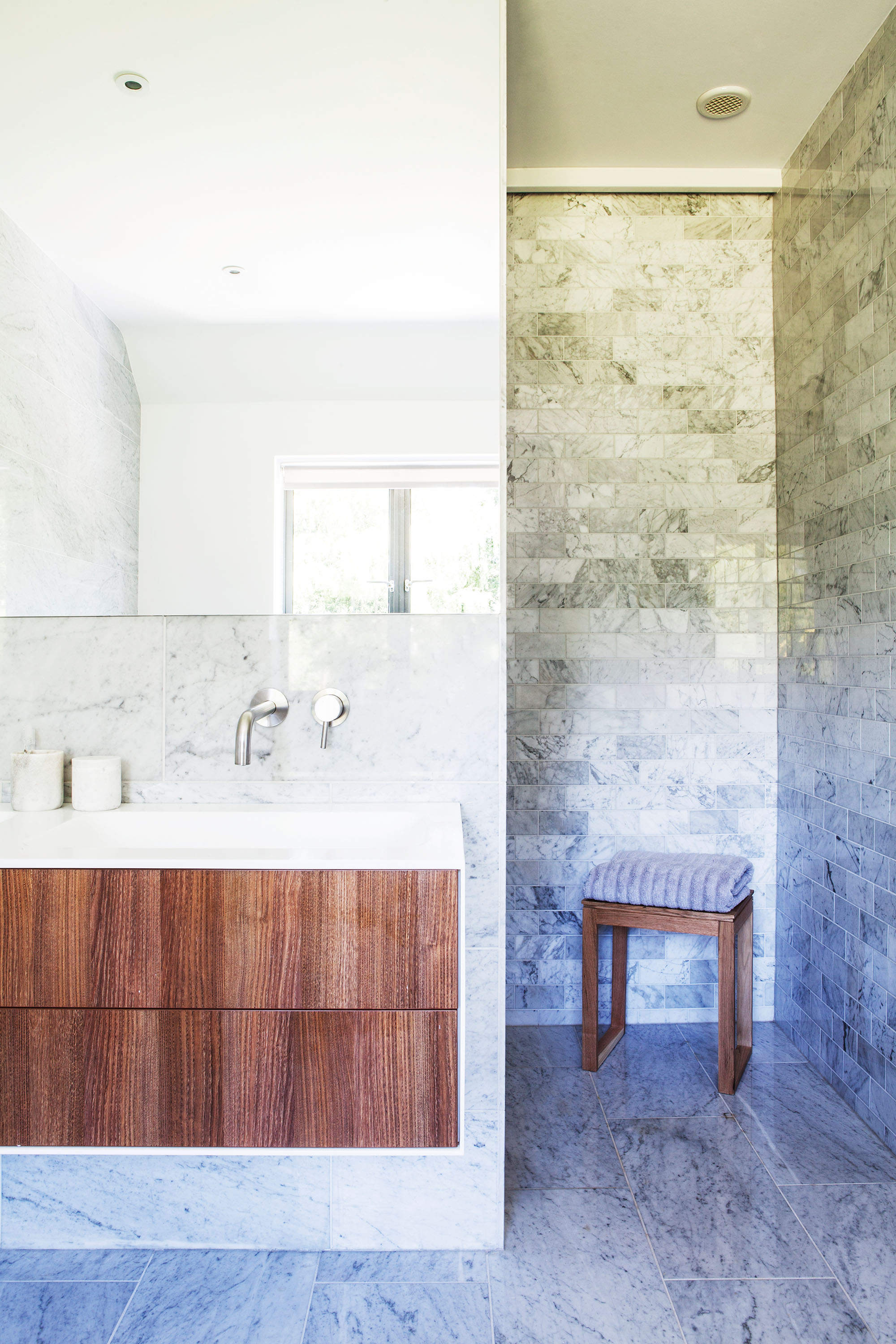
The master bedroom en suite was created by knocking the old bathroom and toilet together, and benefits from the added space of the extension. Nicola carefully planned the layout to fit in a curved bath, double vanity and walk-in shower. She chose Carrara polished marble tiles in different sizes for the floor and walls. A separate brick pattern defines the wet room shower. For similar tiles, try Walls & Floors. For a double vanity unit, try the Mode Burton at Victoria Plum. Try the Lusso Luxe wall-mounted basin mixer for a similar tap
The swathe of gold softens the utilitarian concrete and steel aesthetic, and balances out the industrial-style kitchen cupboards and stainless-steel worktops. Elsewhere, the remaining walls are painted white for a unified feel, with warmer colour accents in soft furnishings and accessories.
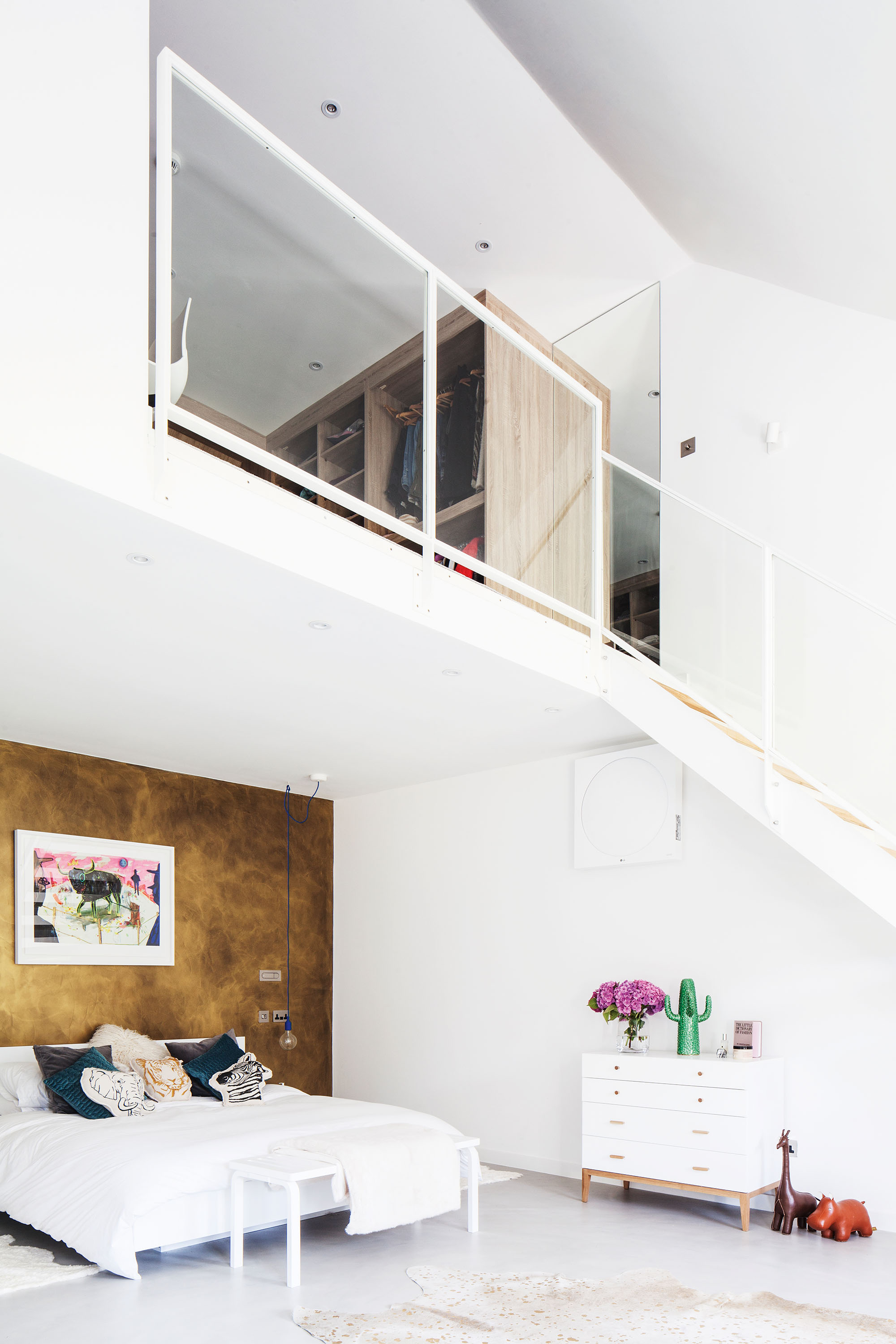
The gold microcement wall adds glamour, enhanced by layered lighting. Reading lights are built in either side of the bed with spotlights above the bench. Reading lights, Astro Lighting. Bedside pendants, Muuto. Spotlights and bench, Artek. Animal cushions, Smallable. Artwork by Ally McIntyre, Jealous Gallery
‘We started off wanting an industrial look but as the project progressed we’ve moved towards a Scandi minimalist feel,’ says Nicola. ‘Lighting was important, too. We spent a long time working out a plan to create layers of light.’
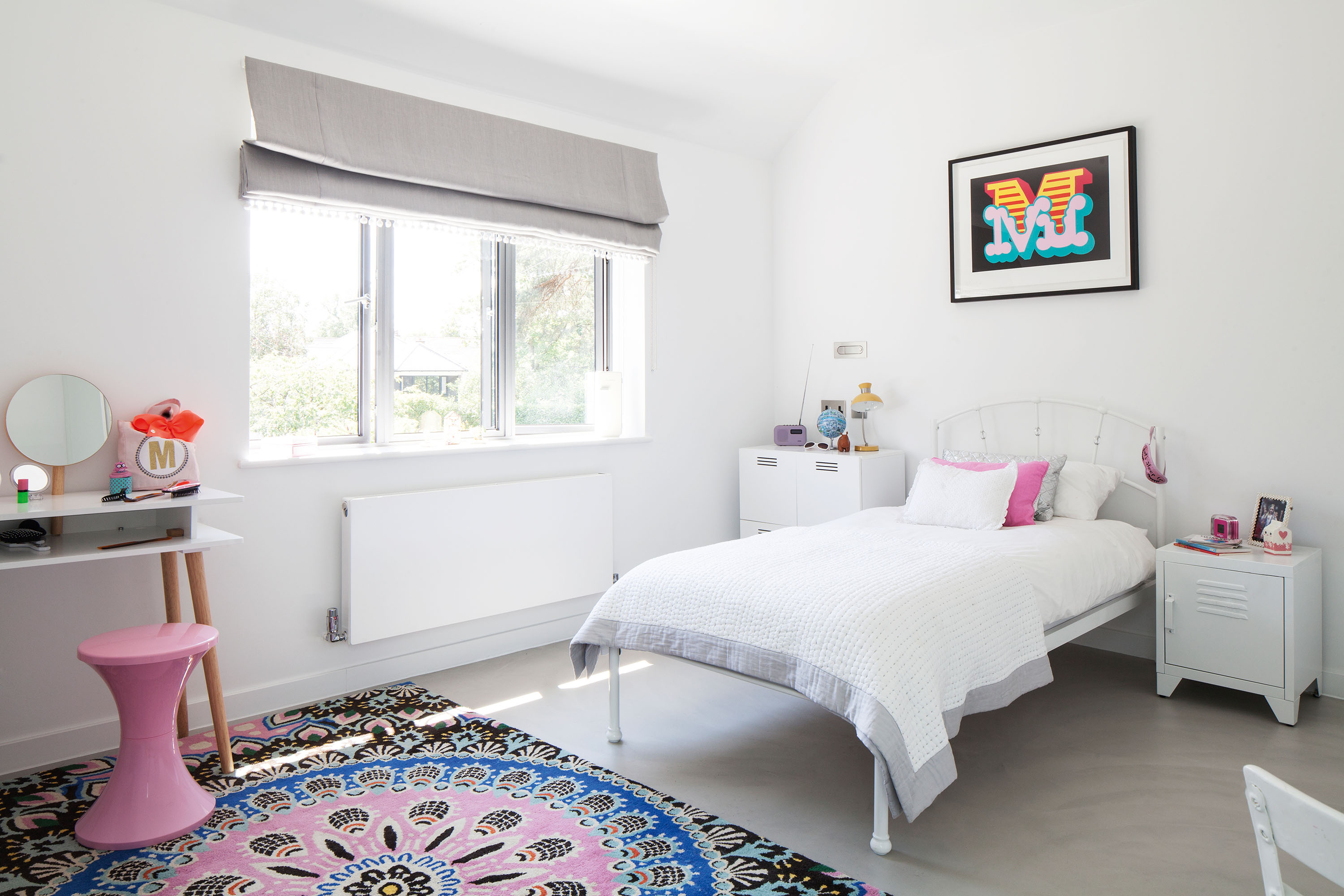
Carefully chosen accessories add colour and pattern to Mia’s simple white room. Rug, Debenhams. Stool and desk, Habitat. Artwork by Ben Eine, Jealous Gallery.
Nicola and Adam hosted a big family party to celebrate finishing the renovation. ‘I love the feeling of space,’ says Nicola. ‘And I particularly love the impact of our bedroom because it’s not what you would expect. The house is great for clients as they’ll come here, get ideas, and see how accessible it is to create unusual design.’
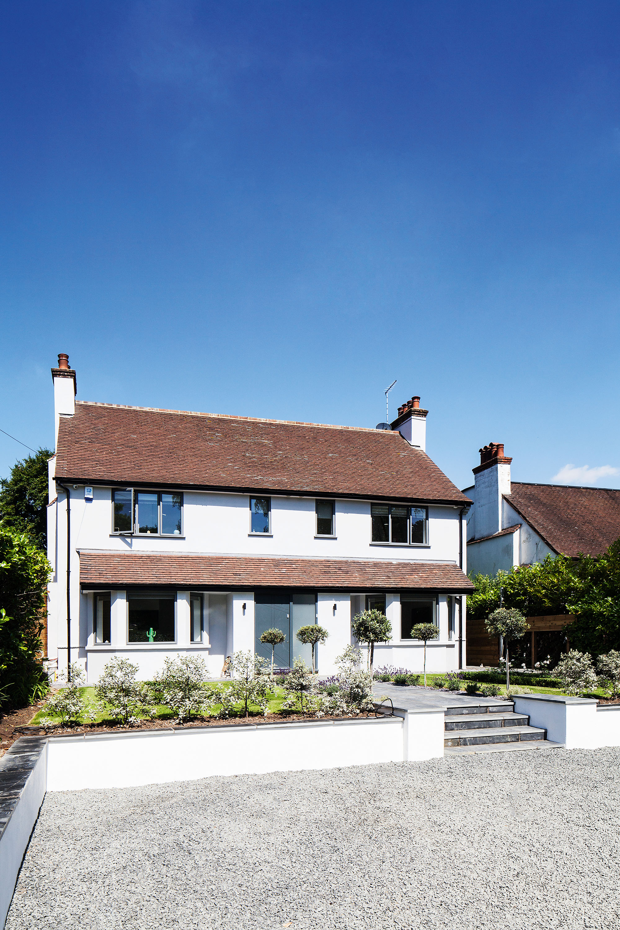
Little has changed outside the house, although the Harveys replaced all the windows with grey textured aluminium double glazing. The timber door was designed by Nicola with sandblasted glass panels. For similar windows, try Velfac. For a similar door, try Jonathan Elwell Bespoke Joinery
Contacts
- Designer and structural engineer Frampton-Martin Sage Design
- Kitchen Leicht
- Artwork Jealous Gallery