Christmas house: a Victorian renovation with a modern festive twist
Lucy and Dan's extended Victorian home sees them through dinner parties, family living and a fair few Christmas gatherings

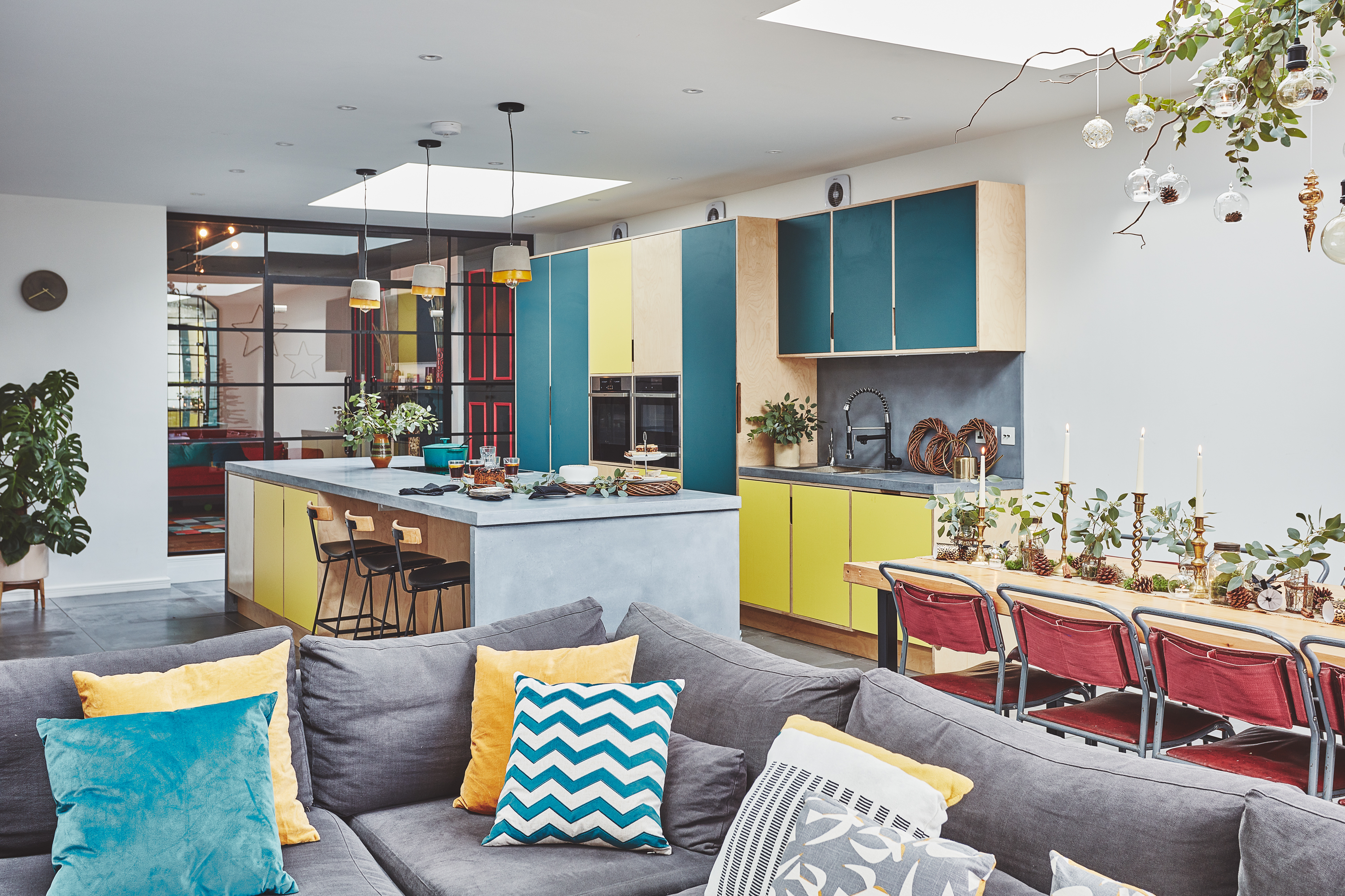
Confidence and bravery in your interior choices often comes with time. This might seem hard to believe when everyone on Instagram seems to be embracing daring trends like dark interiors just like that, but most of us build up to the bigger, bolder moves with months or even years of smaller experimental steps.
That’s what Lucy Kemp found when she was renovating her Victorian home. Each room, filled with clever design details – colour-pop beading, parquet walls, spectacular chandeliers – has taken time, patience and confidence to get right.
It’s paid off, of course. Walking through Lucy’s home, there’s a multitude of beautiful things to look at and clever ideas to, ahem, copy – but it’s also a practical family space that’s taken a lot of thought to get right on a functional level. From the open-plan extension perfect for Christmas parties to the loft suite where Lucy and her husband, Dan, can relax at the end of the day, there’s plenty to inspire you.
Scroll down to take a tour of Lucy's home, then check out more real home transformations to inspire you.

Floor tiles, AB Porcelain. Pendant lights, Ebay. Internal doors, Nash Glass. Mince pies and Christmas cake, Betty’s
Project notes
The owners Lucy Kemp (@victoria_road_restoration), who works in marketing, her husband, Dan, managing director of glass company Nash Glass, their daughter Mabel, 11 months, and their dog, Pascal.
The property A four-bedroom Victorian end-of-terrace townhouse in Harborne, Birmingham.
Project cost £200,500.
'This house hadn’t been properly lived in for over 40 years,' Lucy says. 'Everything was totally retro – it had last been decorated in the 1950s and 1960s, so there was bold wallpaper everywhere – some of it better than others! Luckily, most of the period features had been retained.
‘The kitchen at the back was tiny so we knew it was the first thing we had to change. We’d previously lived in a three-bedroom terrace with a galley kitchen, and with both of us being tall, there was no space for us to be in there at the same time.
'We wanted a big family space with an island. I visualised having people round for dinner and chatting to them as I cooked. We also wanted a snug area. Essentially, the extension was to be a huge living space.'
Get small space home decor ideas, celeb inspiration, DIY tips and more, straight to your inbox!
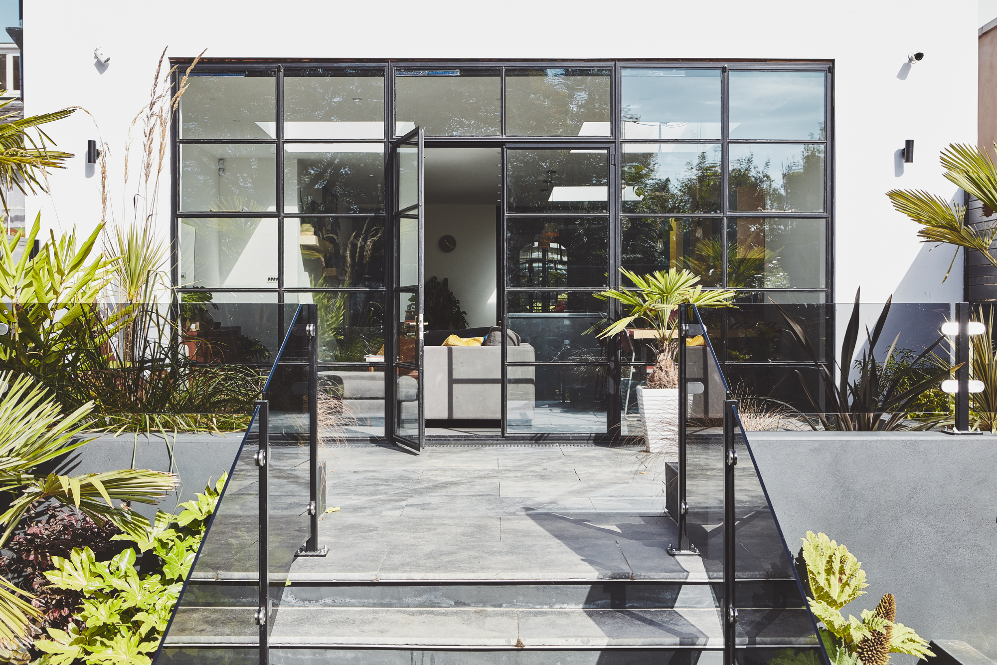
Planters painted in Gunmetal Grey, Graham & Brown. Tiles, AB Porcelain. Doors, Drury Casement
‘As you move through the house, it gets more contemporary. You have the Minton tiles in the hallway, the deep skirting boards in the front room, but then concrete, plywood and big steel windows at the back.
‘We got the keys in August 2017 after waiting for two years for the sale to go through because the previous owner’s only living relative was in a care home. It gave us time to plan and budget, though, and when we did get the keys, the builders were all lined up.'
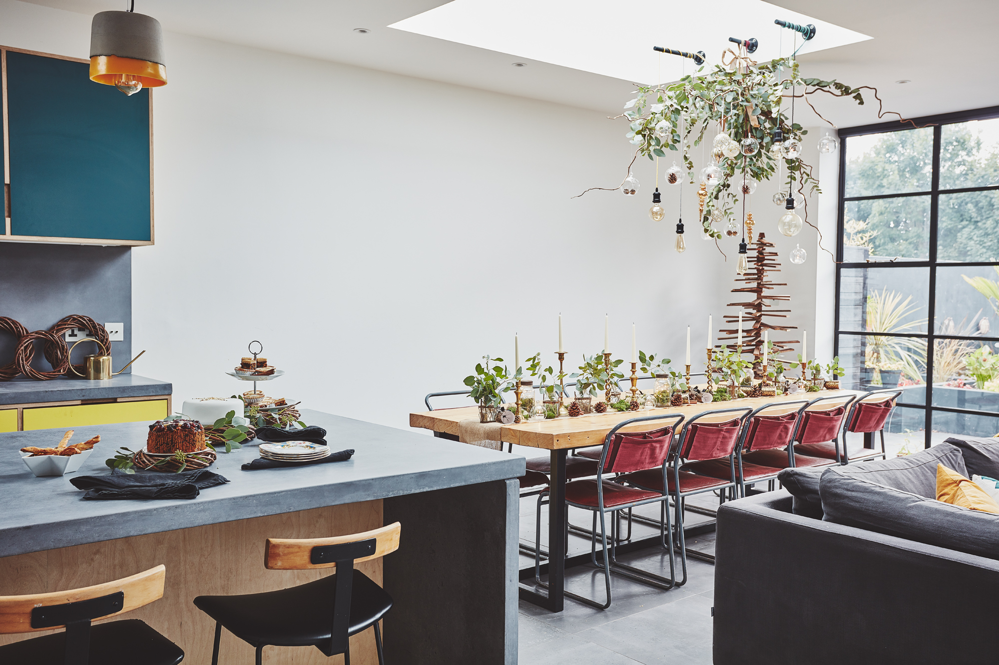
Linen napkins, Rockett St George. For old church chairs, try Vinterior
'They stripped the house back to bare brick, knocked down the rear elevation to prepare for the extension, and replaced all the windows. The plan was to do the renovation in two years, but we quickly realised that the project was bigger than we thought.'
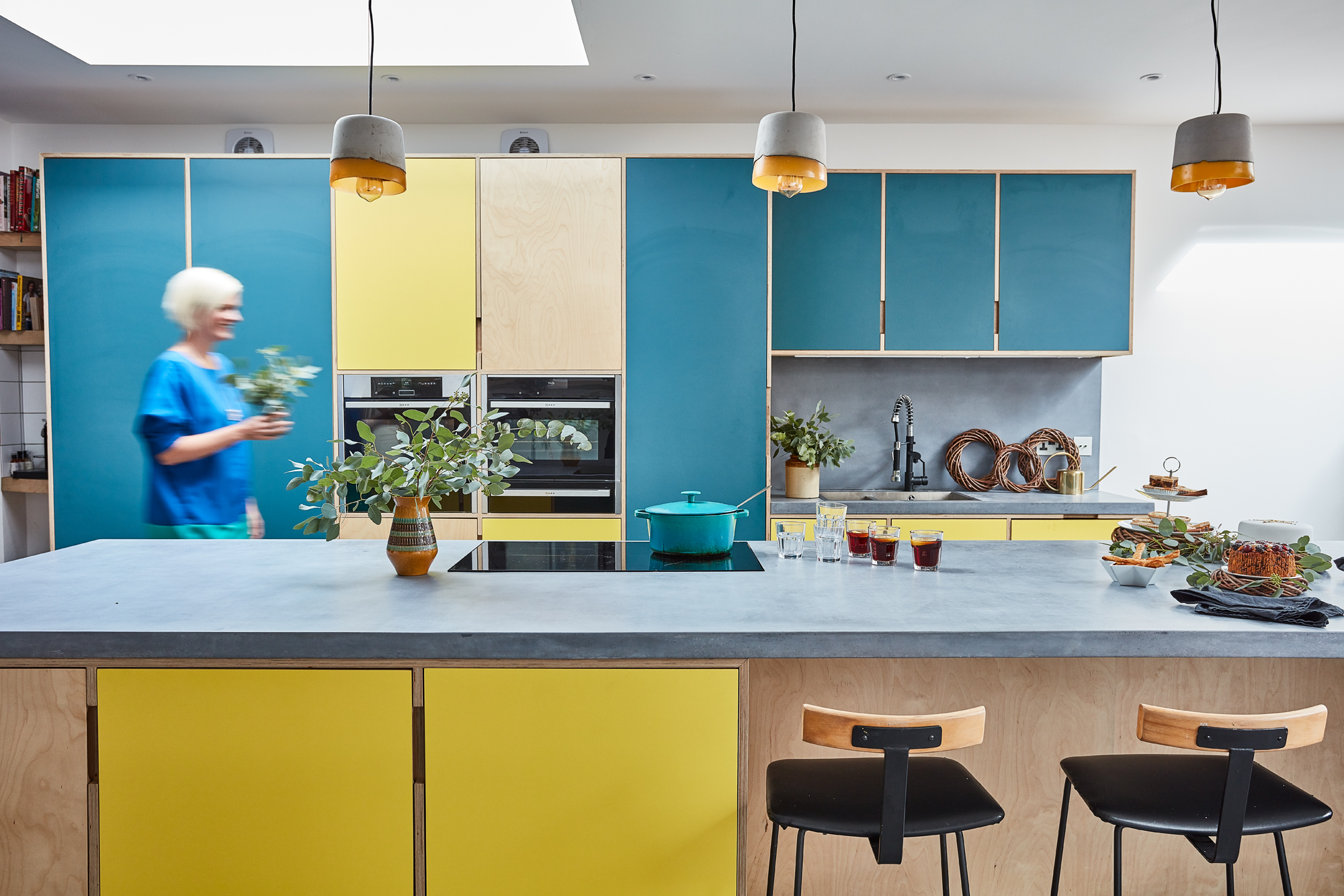
Kitchen, Abbey Joinery. Bar stools, Sits. Concrete worktop, Cheshire Concrete
More from Real Homes
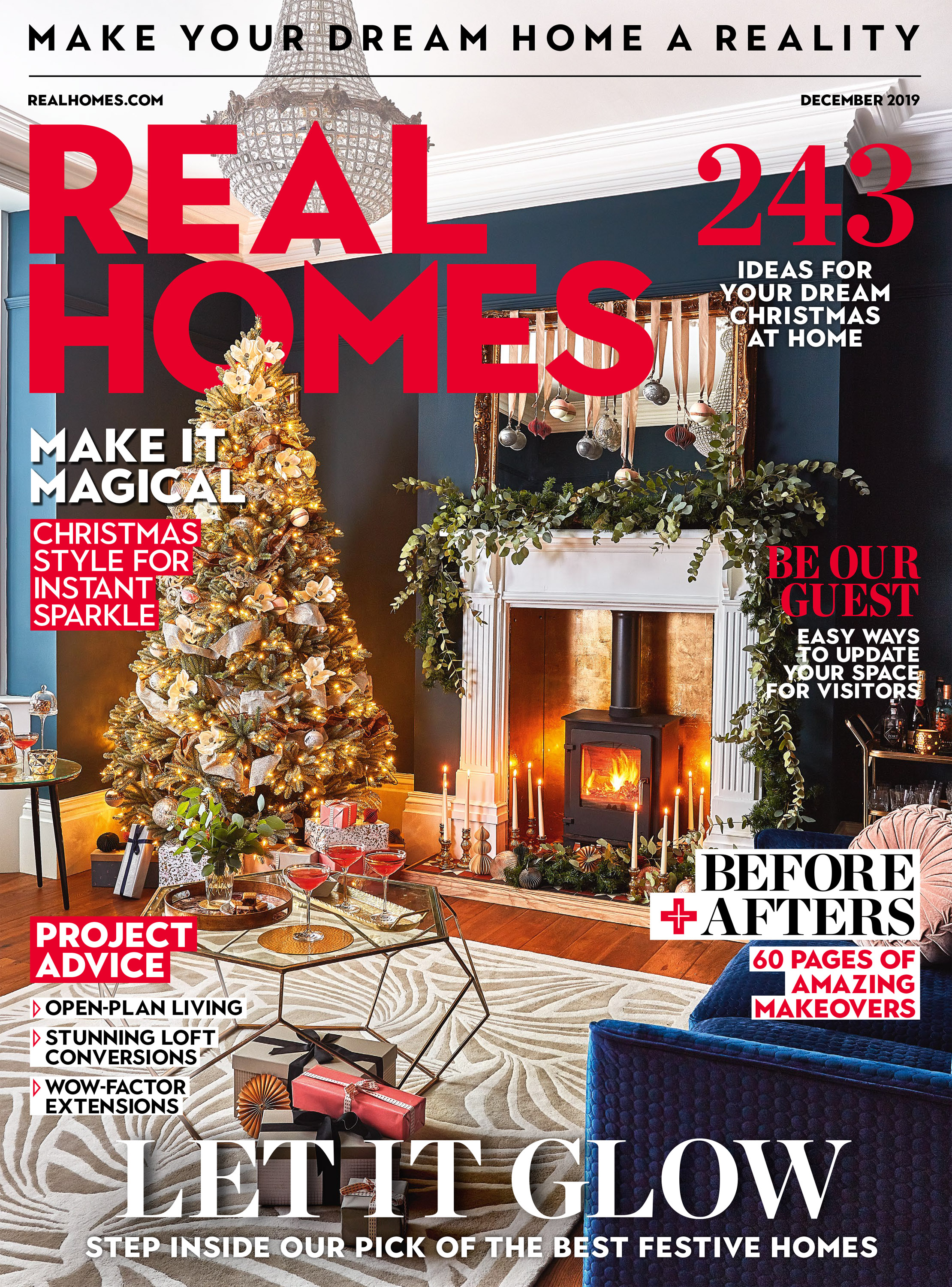
Love your daily dose of Real Homes? Then why not subscribe to our magazine? Packed with fabulous readers' homes, trend features, project advice and easy updates, you'll wonder how you ever lived without it.
'For the extension, we wanted more of a contemporary space. We had an architect draw up plans, but Dan spent hours designing it all. Planning was relatively easy because our neighbours applied for similar works at the same time.
'In our old house, we ate with our dinner on our laps every night, so the dining table is a real luxury. We used timber from the old roof and added legs. The dining chairs are church chairs from Ebay and they still have pockets on the back where the bibles went. I bought the wires and bulbs for the lights online and had an electrician put it all together for me. It’s a real centrepiece for the table.'
‘I love the look and texture of concrete and wanted it for the floor, but it would’ve cost something like £100 per square metre! Instead, we went for the largest porcelain concrete-effect tiles we could find. It’s all about compromise – our budget wasn’t endless. We had concrete for the worktop. It’s bespoke and it took 16 people to lift it onto the island.
‘I love plywood and I’m very drawn to bright colours. Dan loves petrol blue and my favourite colour is yellow, so we decided to go for a mixture of the two for the kitchen cupboards. Our carpenter made the raw plywood frames to stand out against the bright cupboard doors.'
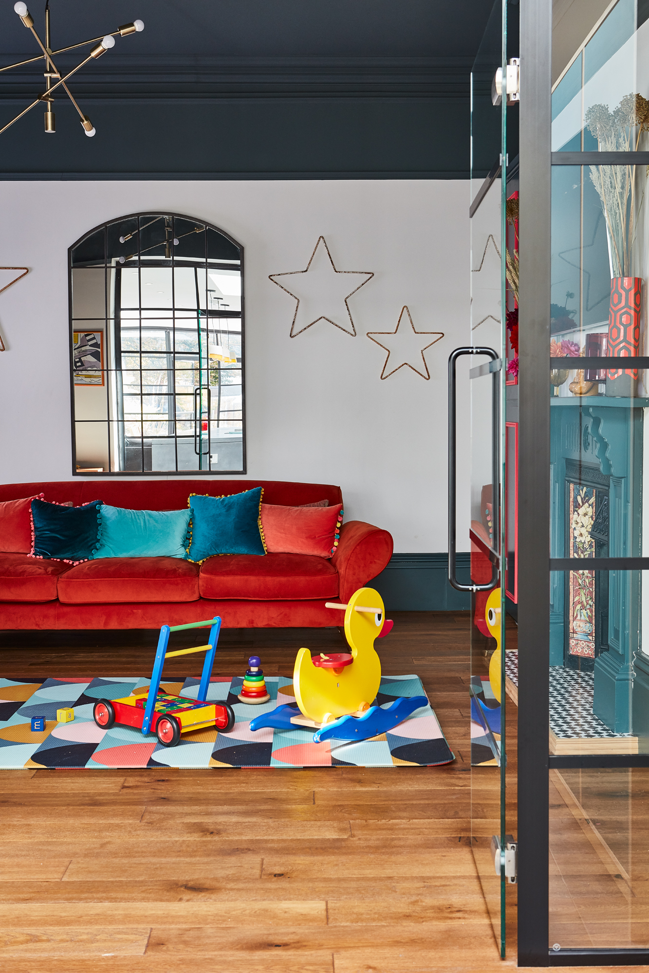
Sofa, Lee Longlands. Cupboards and fire surround painted in Inca Blue, Farrow & Ball. Mirror, Laura Ashley. Stars, Ava Events Styling. Mat, Munchkin & Bear
'We were in a bit of a quandary with the middle room. I didn’t want the space to go to waste when we added an extension on the back. We decided to keep the room separate by retaining the step down into the kitchen, but Dan added glass doors so you can see in from the kitchen.
‘Before we had Mabel, we talked about making it into a games room, but it works perfectly as her playroom as I can keep an eye on her from the kitchen. It also means that at the end of the day we can shut the doors on the mess and have the kitchen-diner as our grown-up space.'

Eight-foot Royal Blue spruce tree, large baubles and tree ribbon, Balsam Hill. Pink and grey baubles, wrapping paper, boxes and ribbons, Cox & Cox. Sofa, Lee Longlands. Table, Minnie & Grouse. Champagne saucers, Amara. Pink cushion and gold tray, Rockett St George. Mirror, Ava Events Styling. Florence Broadhurst rug, Woven. Engineered wood floor, Easy Floors. Stove, Midland Stove Centre. Chandelier, Jack Darcy
I’ve kept this room quite traditional by making a feature of the fireplace, the skirting and the cornicing. Both Dan and I like dark schemes, and this room feels very grown-up – I still can’t quite believe it’s our lounge! I wanted gold tiles for the fireplace, but they were expensive, so Dan installed fire-rated glass and I gold-leafed behind it.'
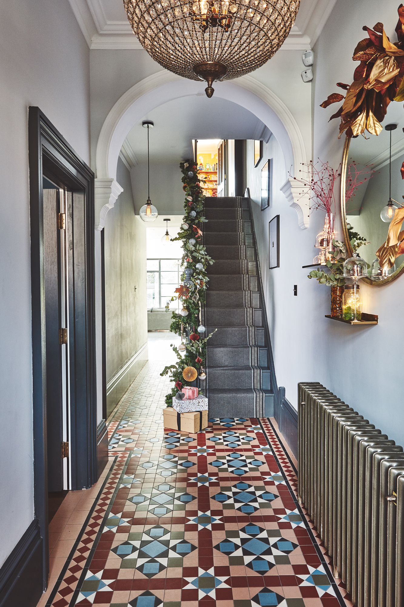
Floor tiles, Victorian Floors. Woodwork painted in Down Pipe, Farrow & Ball. Mirror, Laura Ashley. Shelves, Nordic Nest. Light-up star, Lights4fun. Stair runner, Roger Oates. Garlands and diamanté baubles, Amara. Paper decorations, Rose & Grey. Ceiling lights, Iconic Lights. Light switches, Dowsing & Reynolds
'We ripped up the carpet when we bought the property to see what the tiles were like, but they were too damaged to keep. We wanted their replacements to be in the same style as the originals.'
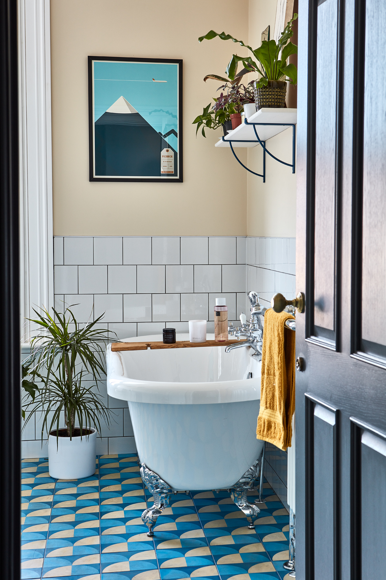
Floor tiles, Best Tile. Bath, Victorian Plumbing. Wall tiles, B&Q. Shelving, Etsy
'Because the bathroom is at the front of the house, we kept it quite traditional to tie in with the front room and hallway. Dan and I stayed at a lovely pub in the Cotswolds with a Burlington sink. I fell in love and spent hours tracking it down.
‘The wall tiles were a bargain at £2 each in B&Q. I wanted a jazzy floor and fell down a rabbit hole of patterns when I was researching. Each of the front rooms is about mixing the traditional with some fun, modern elements.'
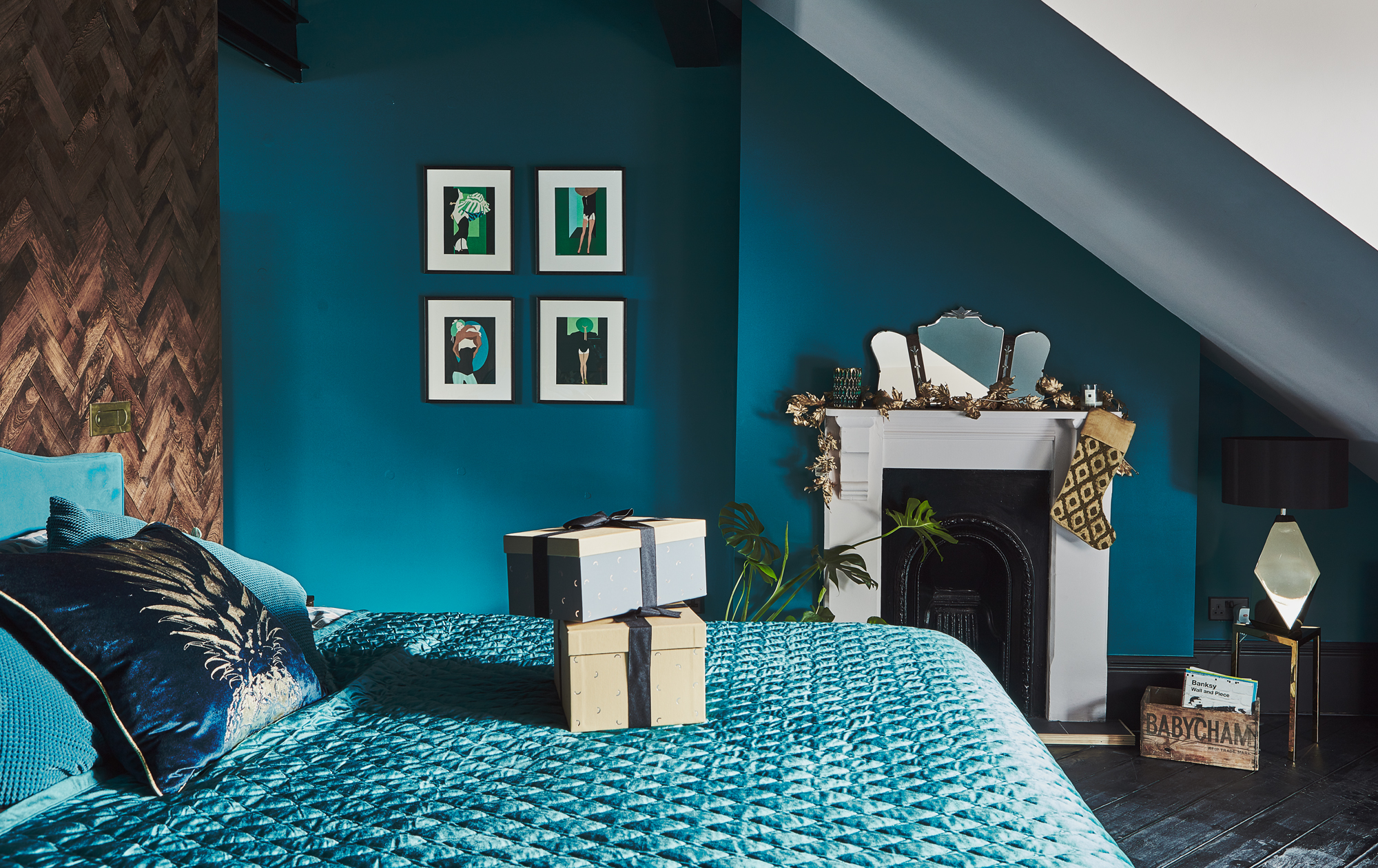
Wardrobes, Abbey Joinery. Handles, Etsy. Duvet cover, La Redoute. Walls painted in Poseidon’s Castle and A Little Bit Demure, both Valspar. Garland and stocking, Amara
'The top floor has seen a huge amount of change. It had two bedrooms, a landing and a kitchenette. We think the previous owner used to rent the rooms out. During the build, we needed to replace the roof. We took all the walls down at the same time, which left us with a huge open-plan space. We decided to create a master suite with a boutique hotel feel.'
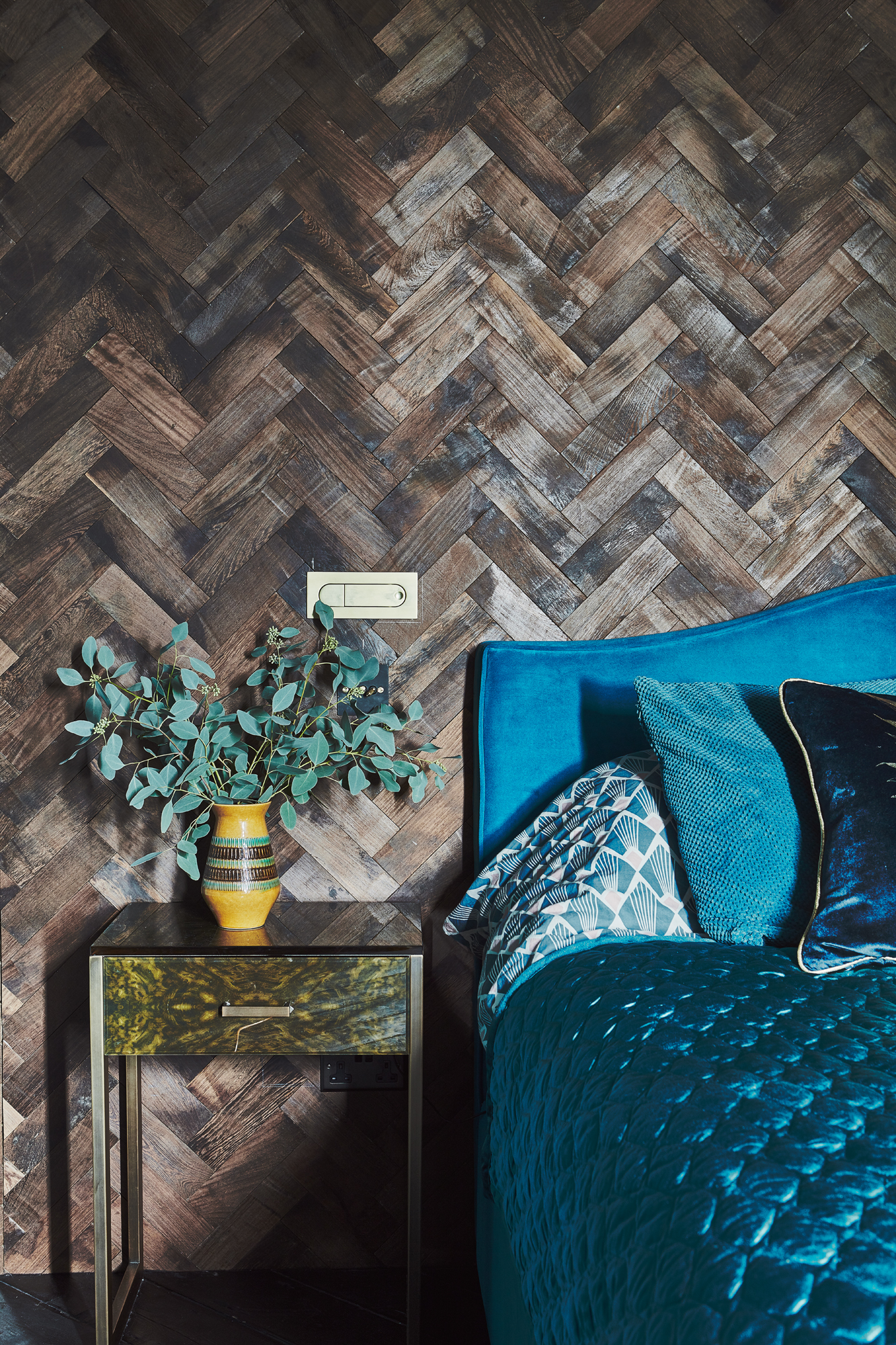
Side tables, John Pye Auctions. Bed, Button & Spring
‘We decided against adding a dormer because we love the sloping ceilings – it makes the space cosy. We painted the walls teal and made the sloping ceiling blush pink to lighten the space. I bought reclaimed parquet flooring from Ebay and stuck it to the
stud wall behind the bed to create that panelling effect.
‘It’s hard to choose a favourite part of the house, but we love our bedroom. We put Mabel to bed then come upstairs to our little bit of luxury. We always have a good night’s sleep!'
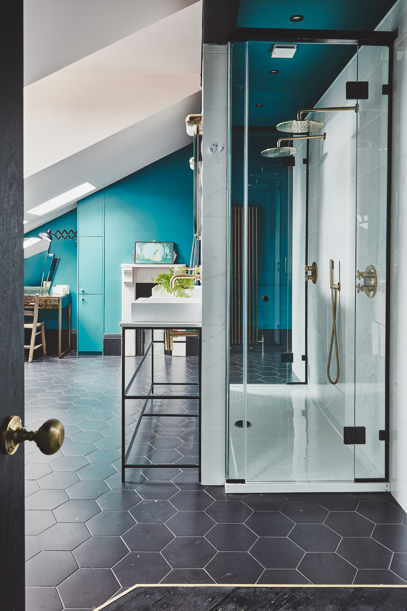
Tiles, Tile Plus. Cabinet and dressing table, John Pye Auctions. Radiator, Mr Central Heating. Bath, Porcelanosa. Bath mixer, Ebay. Sinks, Lusso Stone. Taps, Vado. Lights, Holloways of Ludlow
The en suite is slightly separated from the bedroom by a stud wall. In our old house, there was nowhere for me to sit down and do my make-up in the morning, so I wanted to create a nice area where I could get ready.'
Contacts
- Carpentry: Abbey Joinery Solutions
- Aluminium doors: Drury Casements
- Rooflights: Panoroof
- Accessories and styling: Ava Event Styling

Formerly deputy editor of Real Homes magazine, Ellen has been lucky enough to spend most of her working life speaking to real people and writing about real homes, from extended Victorian terraces to modest apartments. She's recently bought her own home and has a special interest in sustainable living and clever storage.